Pentagram’s clean brand identity for Zeff recycling bins
Interlinking sustainability and good design, Zeff wants to be at the forefront of a new world of improved recycling
As the realities of overconsumption push us to look towards a future with less waste, the maker of the first recycling bin made from post-consumer plastic is hoping to broaden its appeal as it branches out from the B2B world (used in schools, offices and leisure centres across the UK and Europe) and directly into people’s homes.
Ahead of new UK legislation devised to simplify the process of recycling, Zeff enlisted Pentagram’s help to better communicate its meticulous design focus and sustainability credentials.
Uri Baruchin and Rebecca Lynch handled the strategy and naming behind the forward-facing brand identity. They used a minimalist design language, colour palette, and technical, engineered visual language to convey Zeff’s sustainable design benefits cleanly and concisely.
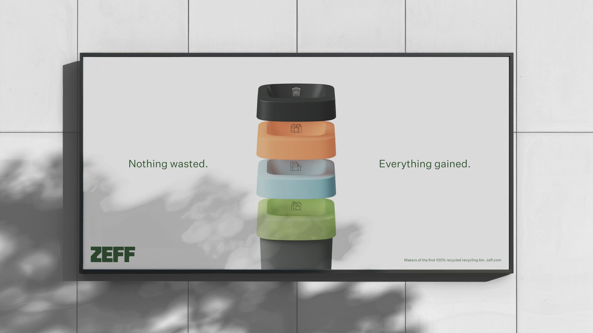
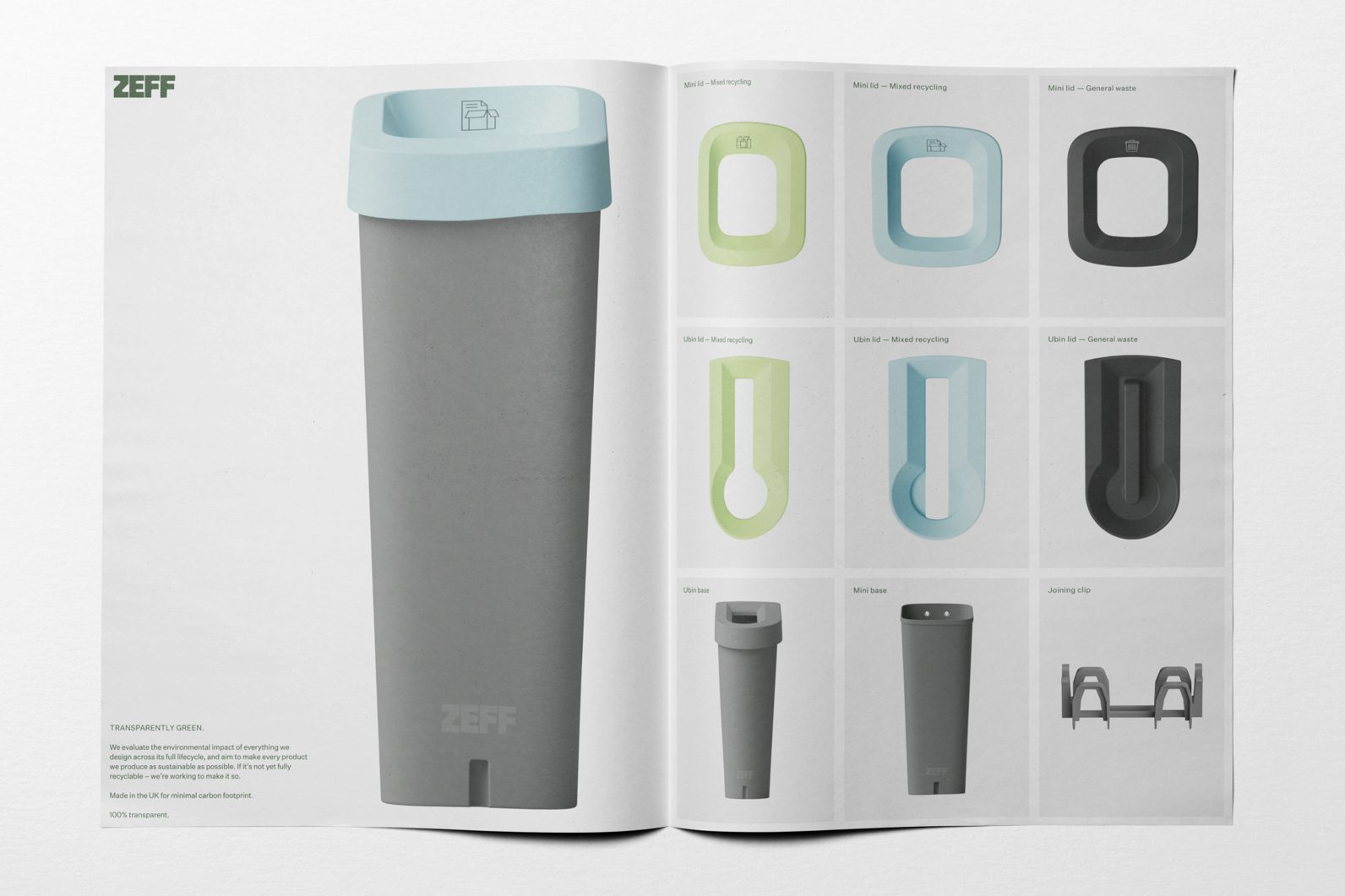
The eye-catching wordmark looks in the bin for inspiration – Zeff’s Ubin recycling bin, to be exact. In dark forest green, the bold logo imitates the Ubin’s signature curves while allowing space for future innovations.
The sustainable, design-led products feature a technical-feeling grey and white base, which Pentagram complements with lids in earth green and seafoam blue hues. The bold Zeff wordmark sits proudly on the front.
In the pursuit of clarity, the brand identity includes diagrams that spell out the bins’ features, motion-led product renders that reflect the brand’s precision, and bespoke icons that demonstrate various waste streams and sustainable practices.
The ‘technical and transparent’ brand core concept has been devised to allow the brand to serve both a B2B and future B2C audience.


