
A fresh look for insole brand Superfeet
Mlti NYC has led an extensive redesign of the brand that emphasises its performance credentials
Superfeet was founded in 1977 by the sports medicine division of Northwest Podiatric Labs. While the name may not immediately be familiar, its legacy in the sports science space remains an important feature of Superfeet’s credentials and its new branding by Mlti NYC.
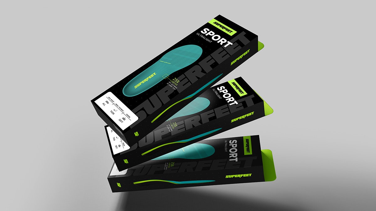
The agency worked on a complete overhaul of how Superfeet turns up in the world, including a new strategy, visual identity, packaging, motion design, and art direction.
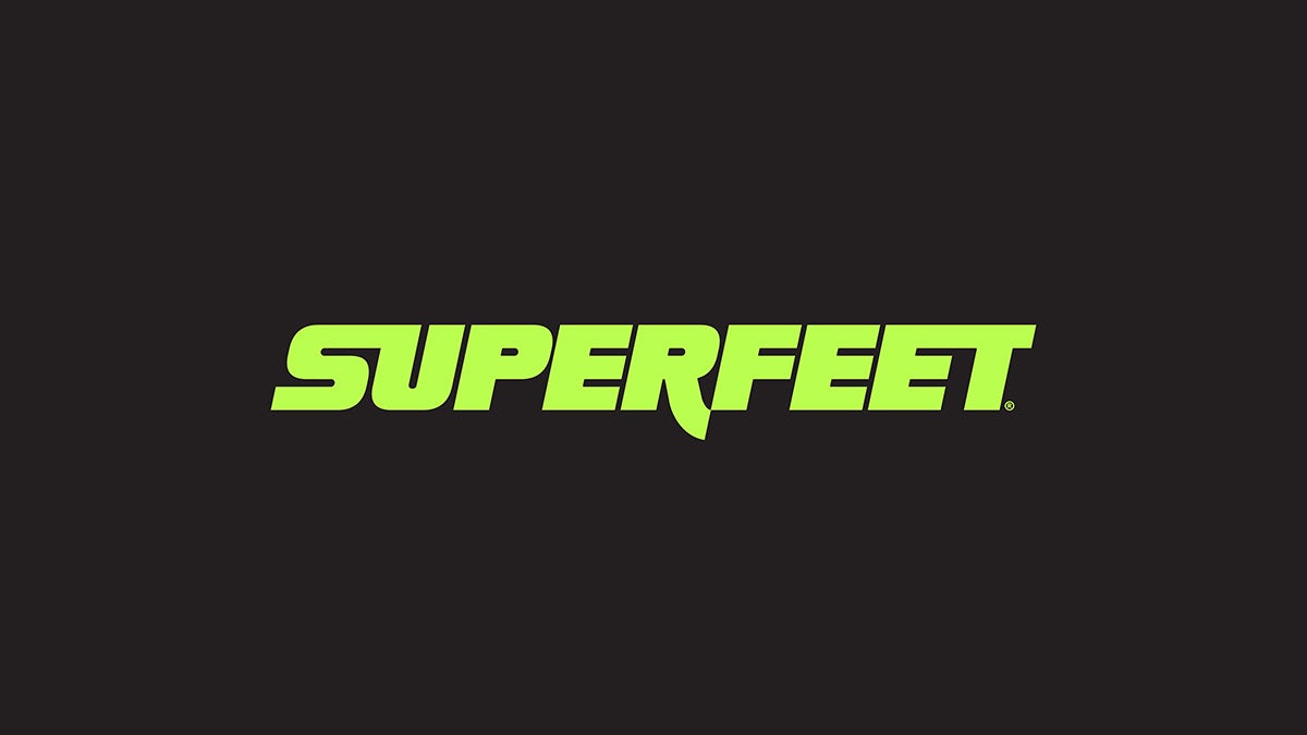
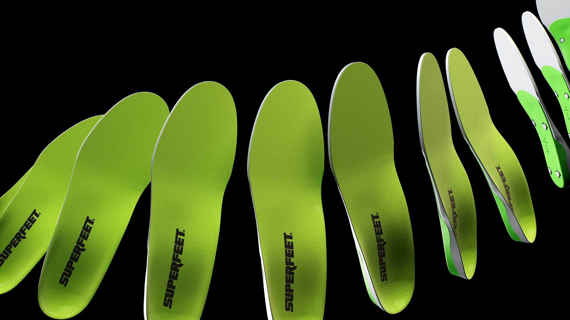
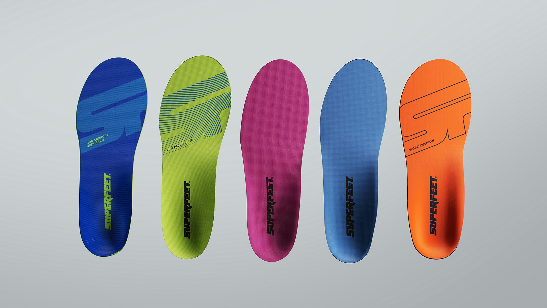
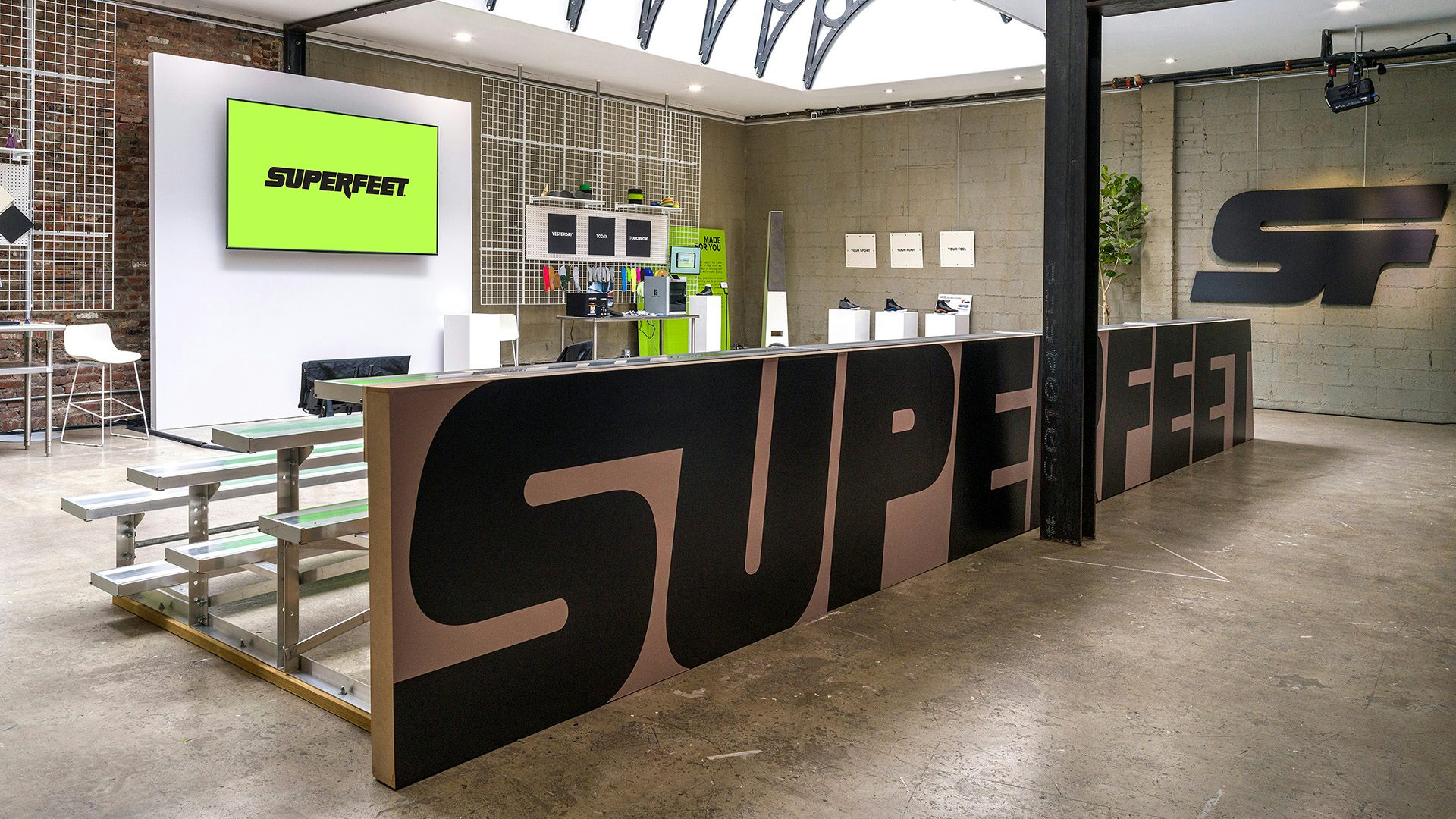
The old multi-font wordmark has been replaced by a chunky italic featuring ligatures, all designed to communicate speed and innovation. The ‘SF’ logo is more abstract, with the negative space from the ‘S’ cutting through the stem of the ‘F’, parallel to the ligature. This comes to life in a sharp palette of black and ‘Super Green’, which stems from its bestselling insole.
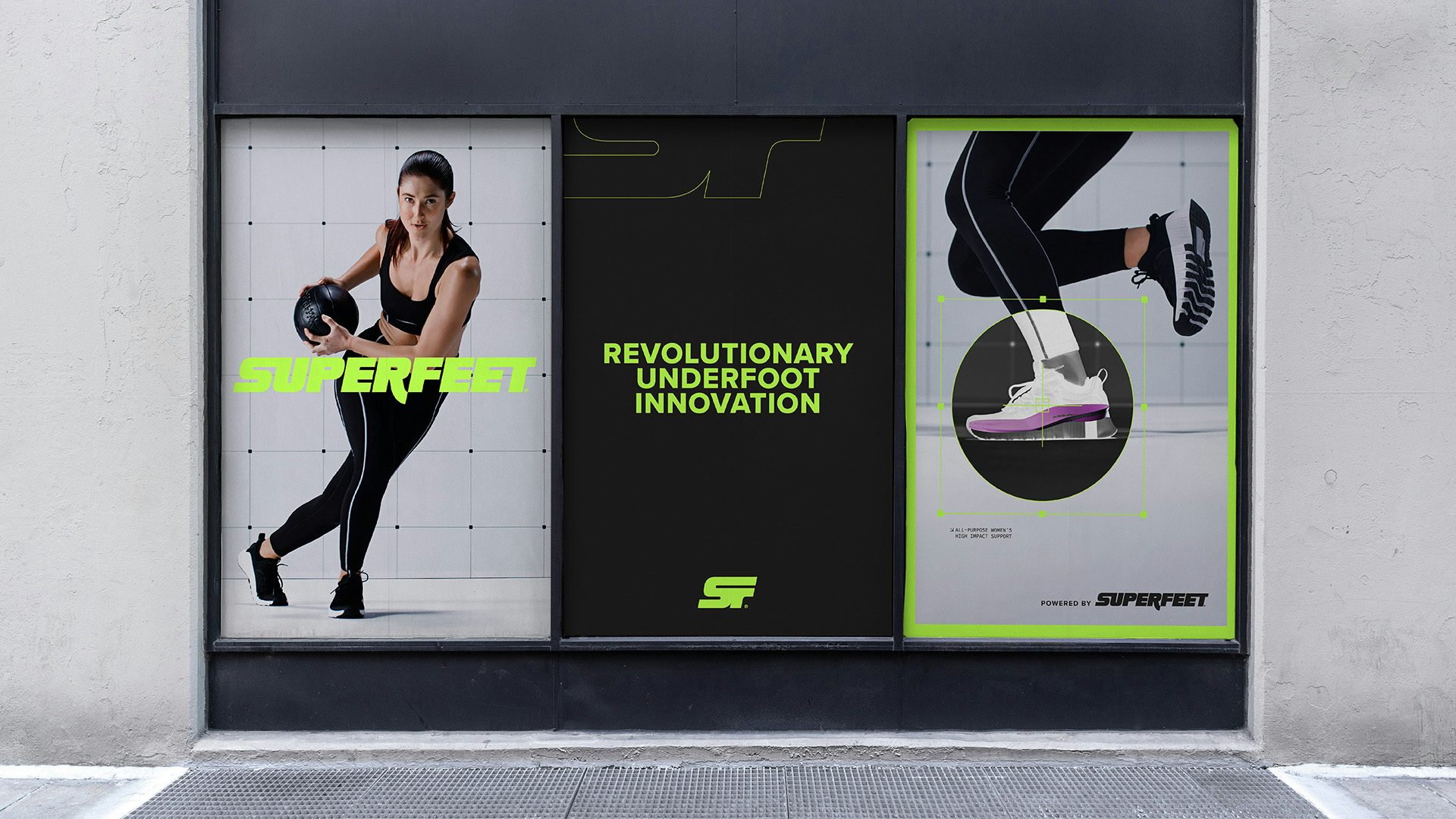
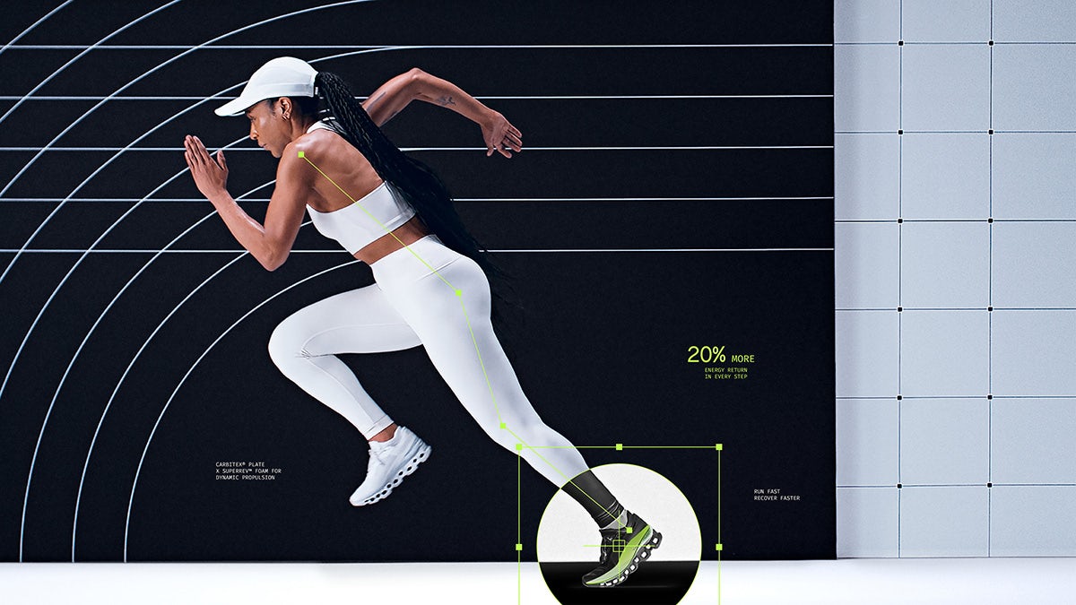
The brand’s scientific heritage has fed into the typographic choices, which are designed to channel the idea of science labs and research reports. This has also informed the use of technical motifs like grids and X-rays, which also handily address a practical hurdle of advertising insoles.
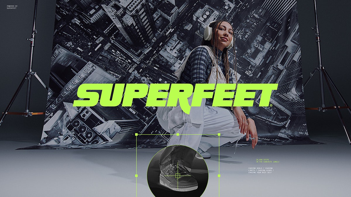
“I love the way the imagery turned a disadvantage (the lack of product visibility) into an advantage,” says Kristen Shenk, the agency’s founder and creative director. “By showcasing the product in a cool, tech-y way it makes the unseen seen and gives the feeling that Superfeet insoles are this unseen advantage – this secret weapon – to make you better.”
Interestingly, the brand is taking a fairly democratic approach to audience segmentation, gearing itself towards performance athletes as well as people going about their everyday lives – “from the factory floor to city streets”, as Superfeet’s VP of marketing Mike Donnelly puts it.
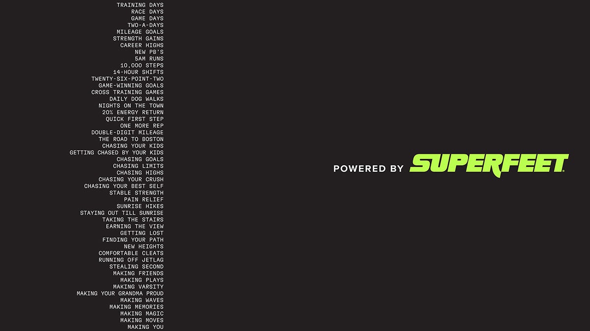
The updated identity features in a new brand film, also created by Mlti NYC, named after its new tagline: Powered by Superfeet.


Latest from CR


