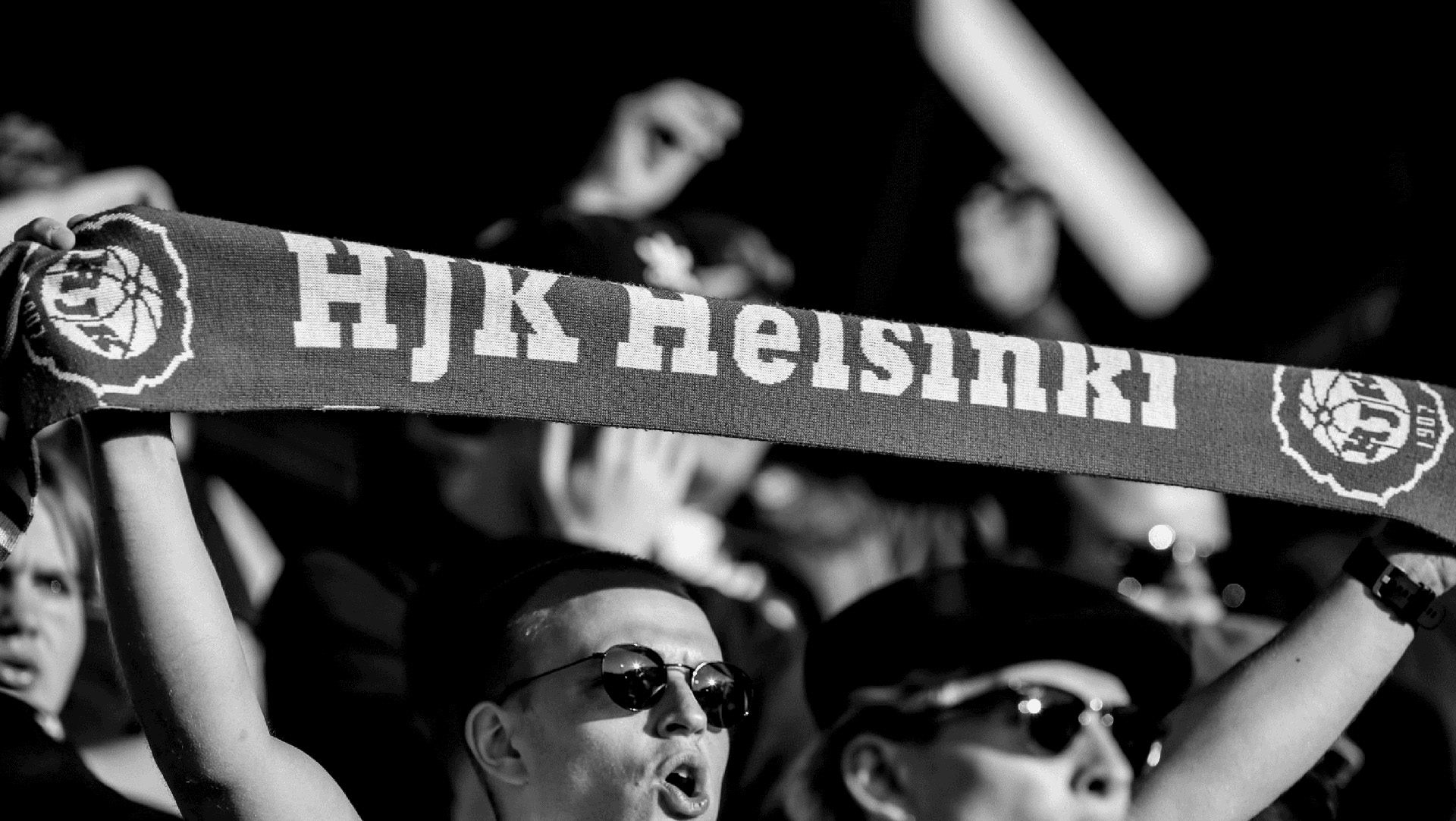
Fandom celebrated in Finnish football league branding
Veikkausliiga’s visual identity revolves around a new typeface based on the shape of football scarves
A lot of brands make thin claims that they highlight fan culture. However, the Finnish top flight has launched a new identity by Bond that really does put fandom at the centre of things.
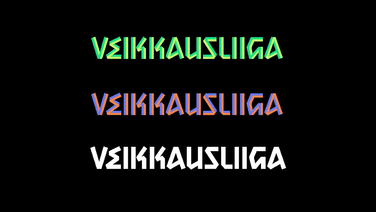
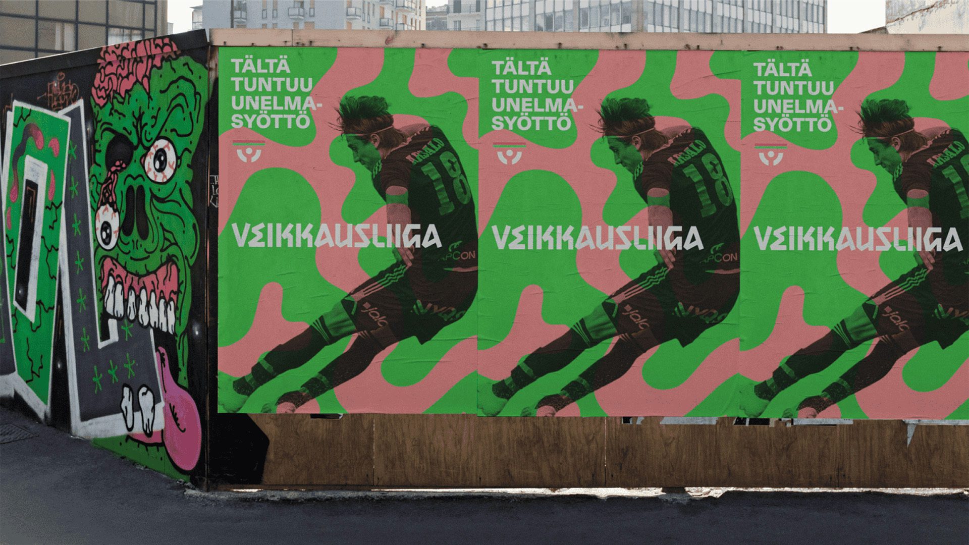
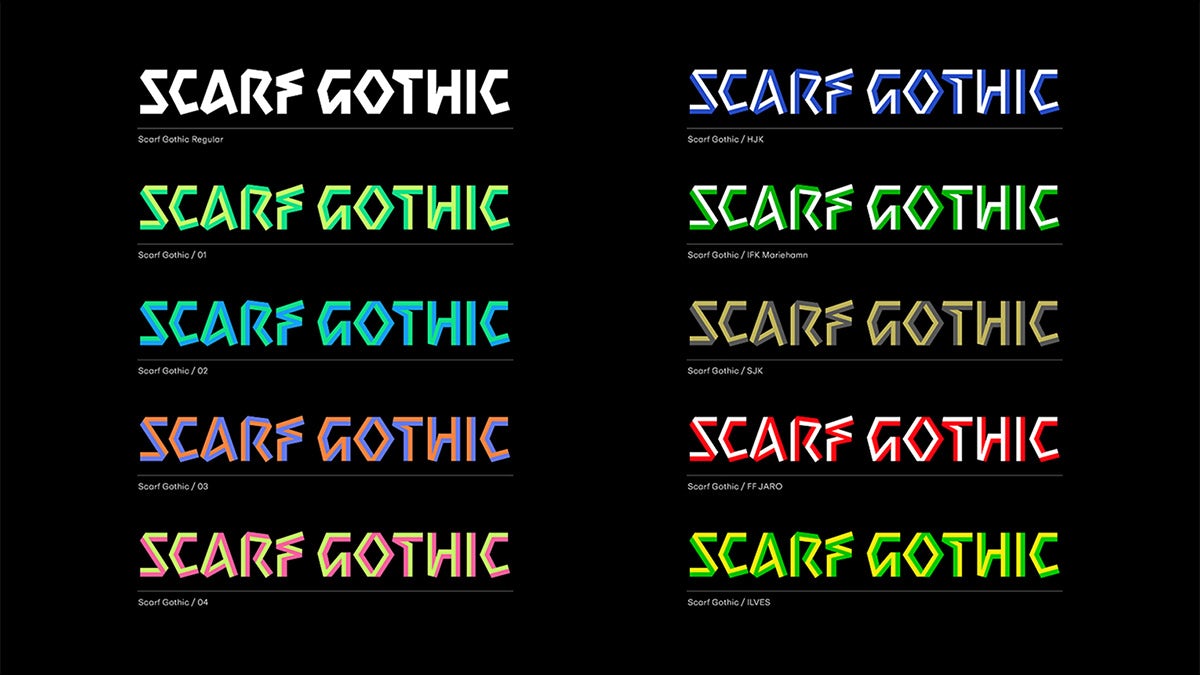
This is in large part down to its new bespoke typeface, Scarf Gothic, used in its wordmark and as a display font. Its unusually sharp angles and lack of curves are down to the fact that the lettering was constructed based on the shape of scarves laid out flat.
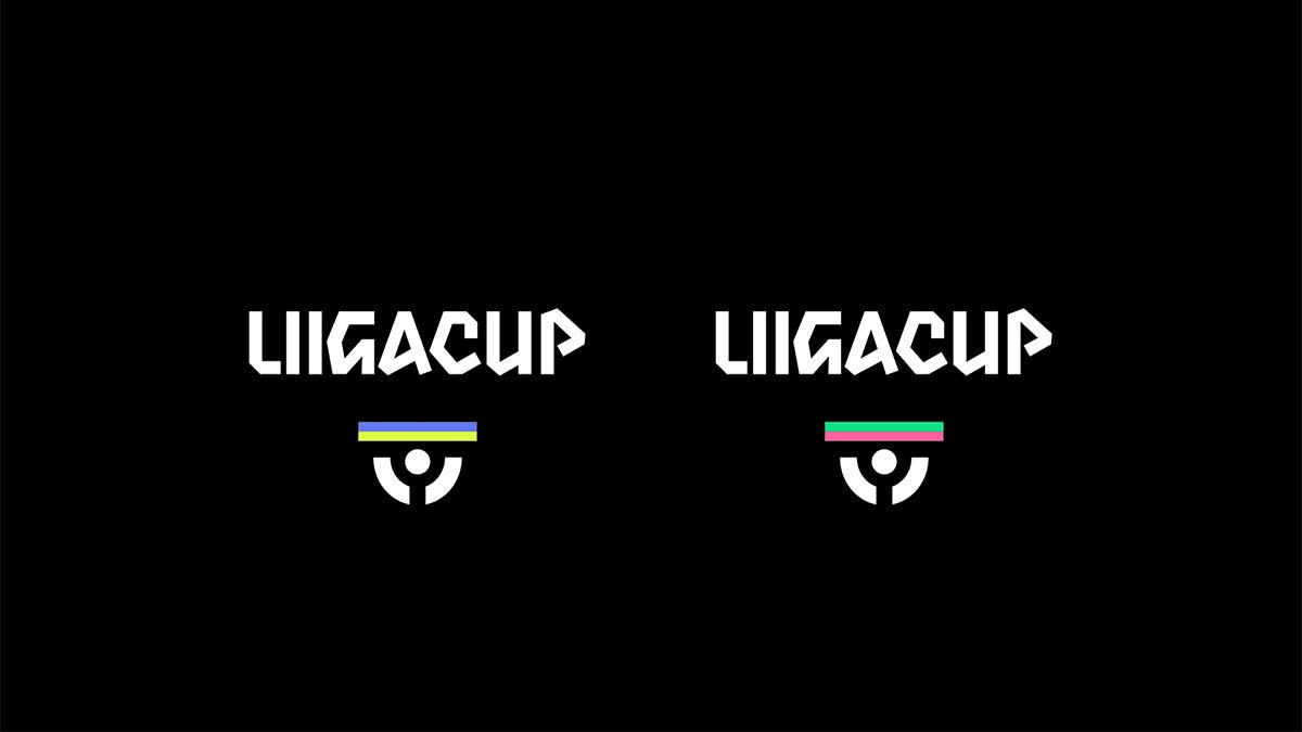
The league is home to the 12 best teams in Finland, whose club colours are reflected in the customised versions of the wordmark, creating a sense of individuality.
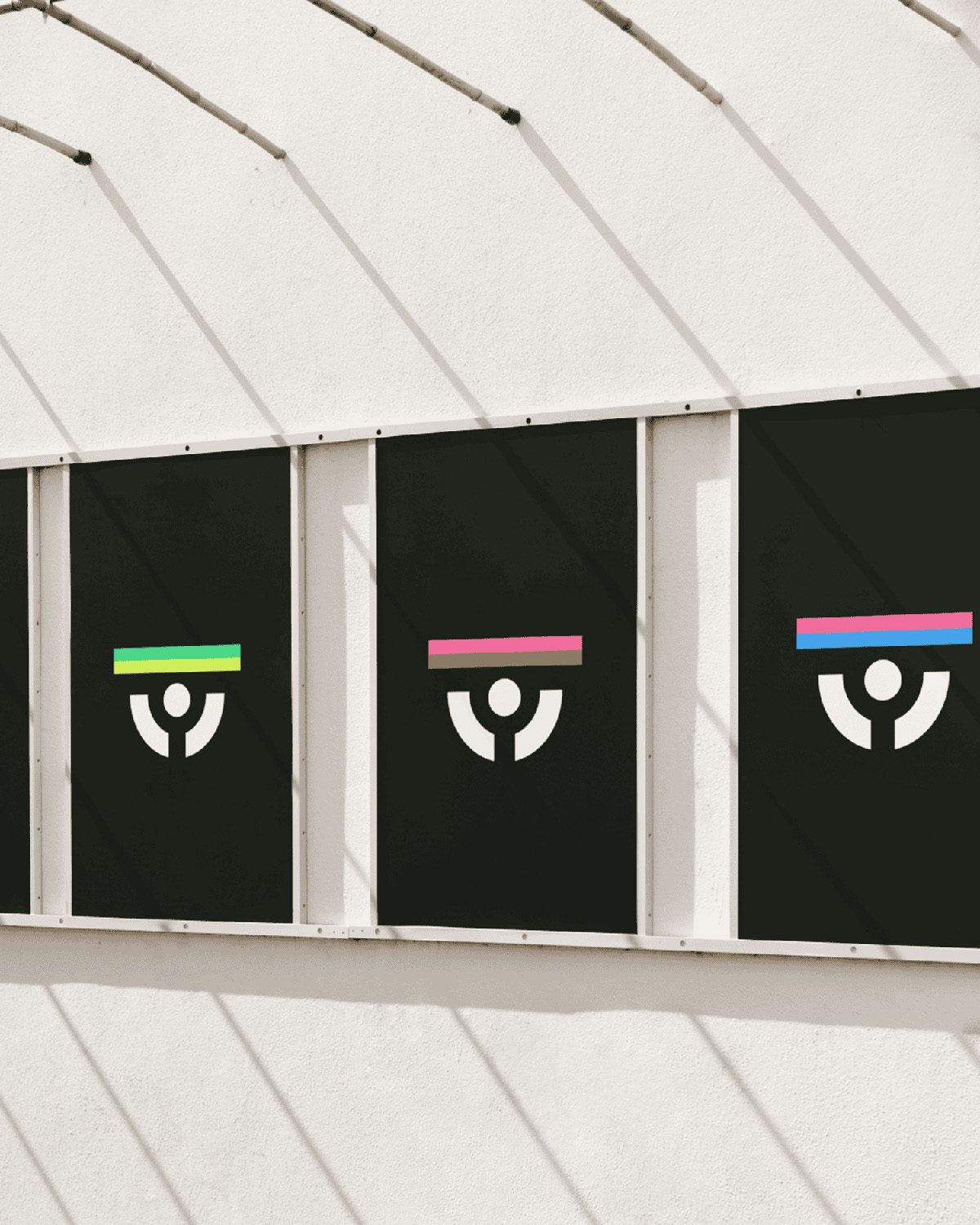
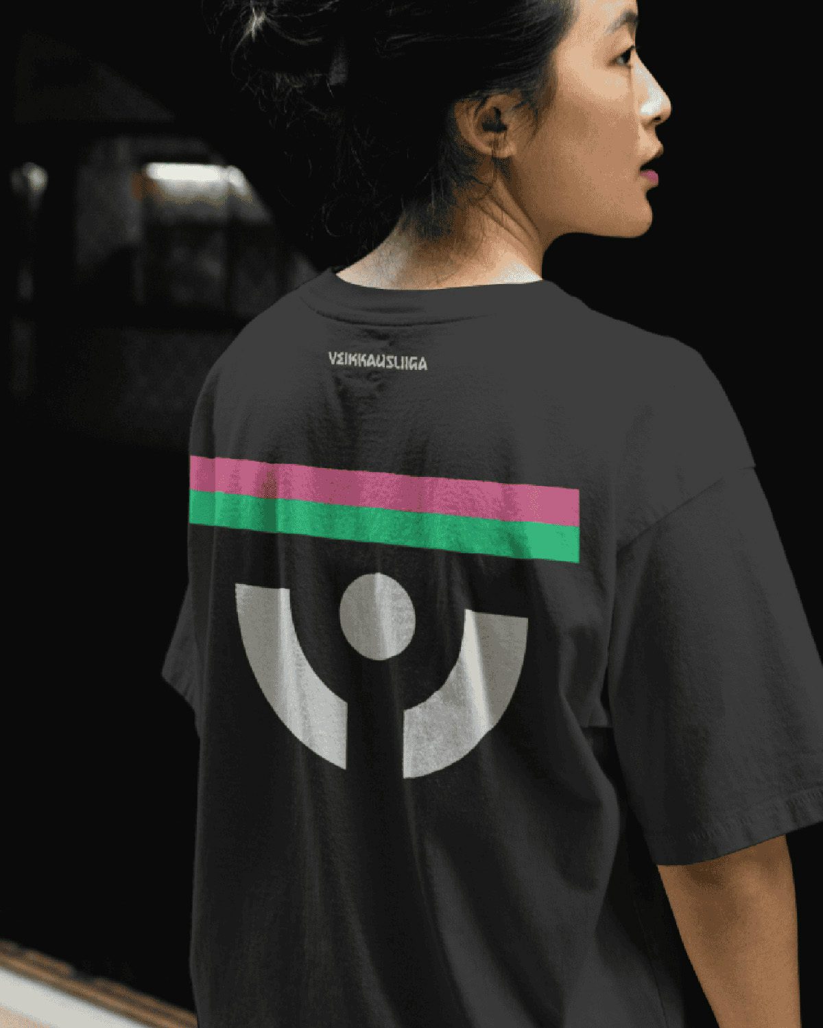
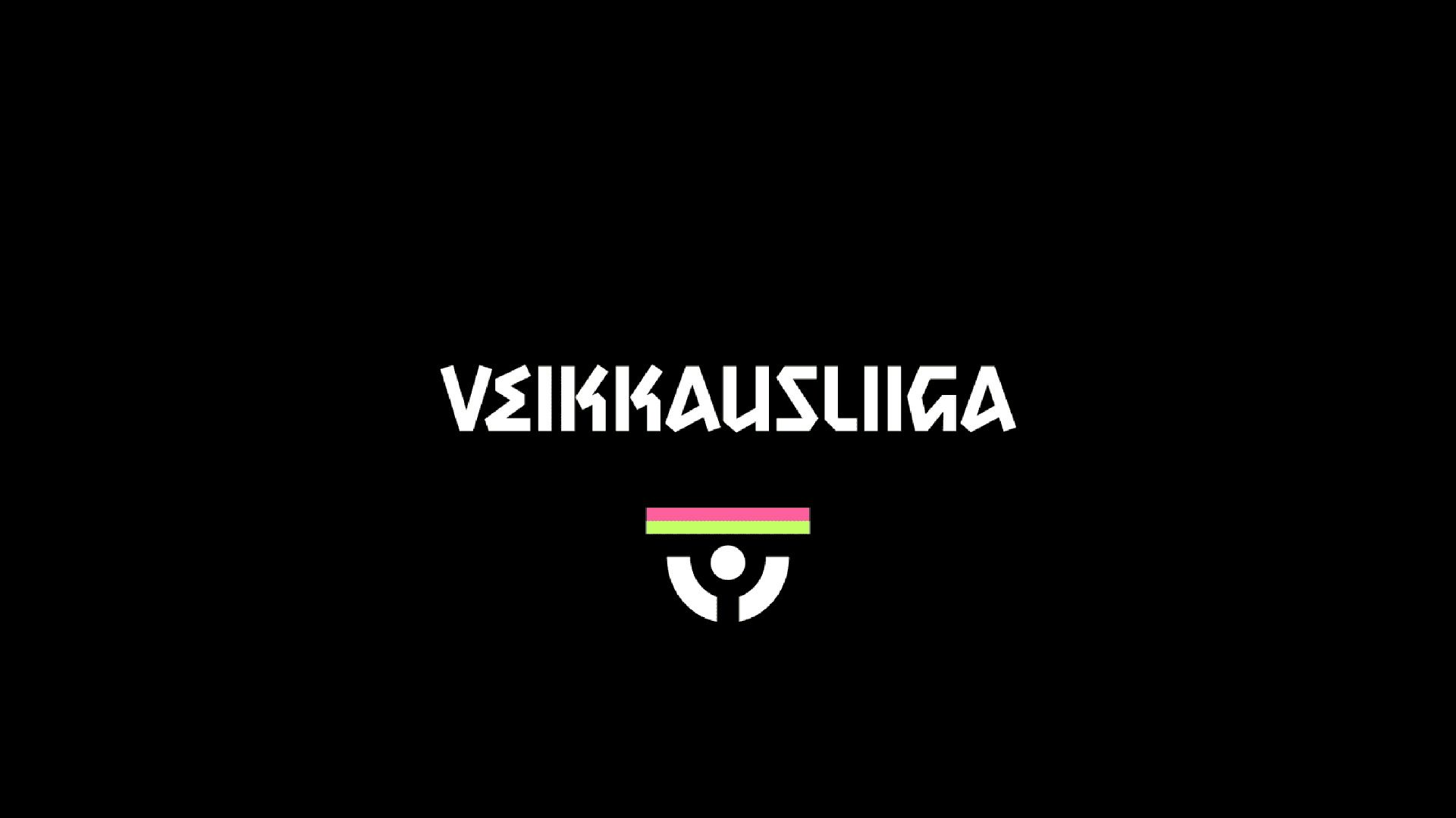
Besides the general link to football fandom, the new typographic identity also connects back to Veikkausliiga’s classic logo of a person holding a scarf aloft. The design has been updated as part of the identity refresh, where it has been translated into a far more minimal graphic composed of a striped horizontal bar representing the scarf above two arcs and a circle representing the head and arms. Like the typeface, the logo can be adapted to different club colours.
The agency also paid attention to motion, developing a suite of animation-ready graphic patterns intended to bring colour and energy to social and digital touchpoints.
“Our goal was to honour the heritage of Veikkausliiga while creating an identity that captures the energy of the game,” says Bond co-founder and chief design officer Jesper Bange. “The scarf is a universal symbol of fandom, and by building the brand around this core idea, we’ve crafted a visual and emotional language that truly embodies what Finnish football feels like.”
The launch of the new identity follows the men’s national team’s appearance at the Euros for the first time back in 2021, and comes after Finland’s star player Pukki returned to the league ahead of the 2025 season, which kicked off at the beginning of April.