Cocktail range Contraband uses cryptic design
The new collection of pre-mixed cocktails rewards curiosity with its packaging design inspired by Prohibition-era secrecy
Stockholm-based creative agency Purple has partnered with 20-gruppen, a local restaurant brand, on the identity for its new range of pre-mixed cocktails – a category that’s having a bit of a design moment. Known for its popular establishments around the city, including Tjoget, Liebling, Paradiso and Positano, 20-gruppen sought to branch into a new category, bringing with it years of experience and success.
Naturally, the cocktail range needed to evoke this expertise, and the team at Purple spent much time developing a fitting look and feel for the products. However, before even considering the aesthetic, they first needed to name the range, and this involved building out a long list of options, illustrating each with potential visual concepts.
The eventual favourite emerged as Contraband – a name inspired by the “clandestine nature of smuggling during the American Prohibition era”, explains Peter Herrmann, Purple co-founder and head designer.
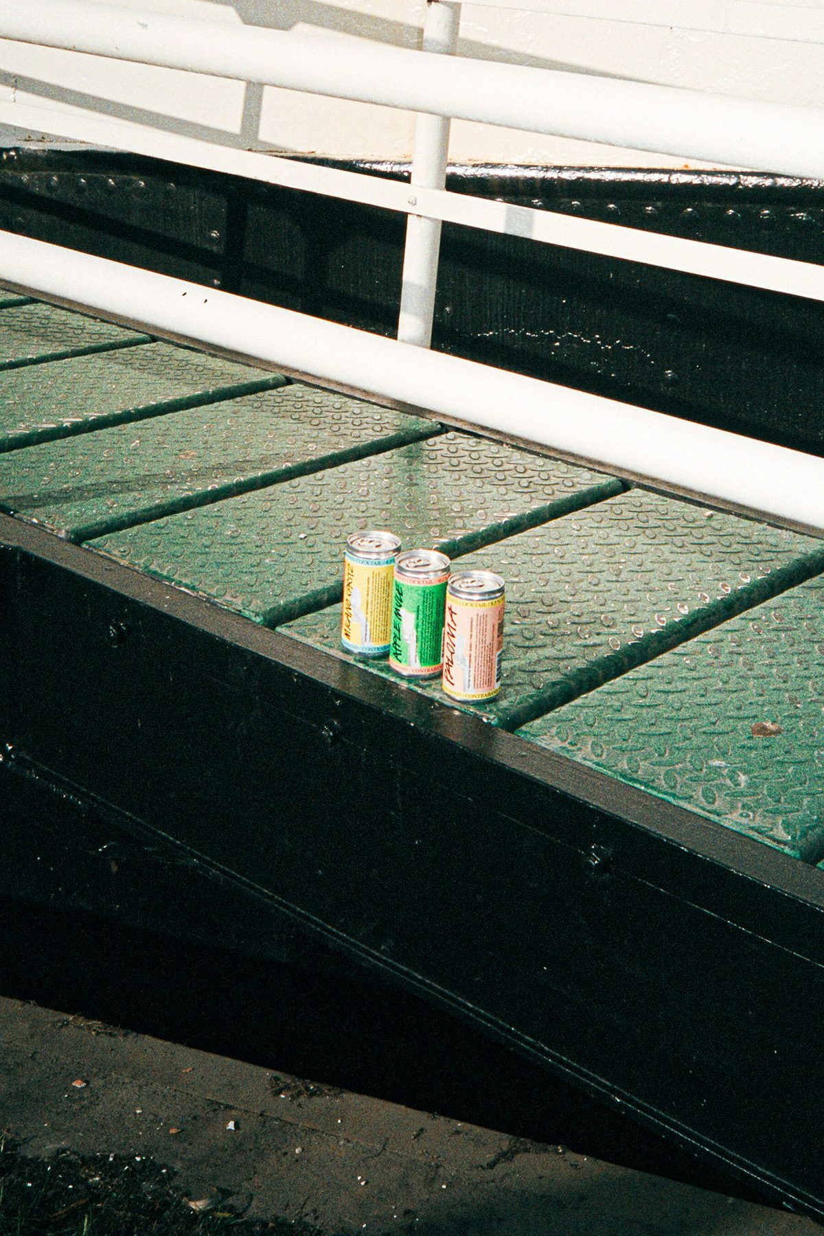
This punchy name informed the visual strategy for the branding, which uses “hidden treasures and concealed secrets” as a conceptual jumping off point for the design of the cans. With five different flavours on offer, Purple needed to develop a unique look for each, whilst retaining a cohesive overall aesthetic.
“The design consists of simple, clear, repeatable, and recognisable elements,” says Herrmann. “This clarity creates a space where each cocktail can stand out and tell its own story without compromising the brand’s identity.”
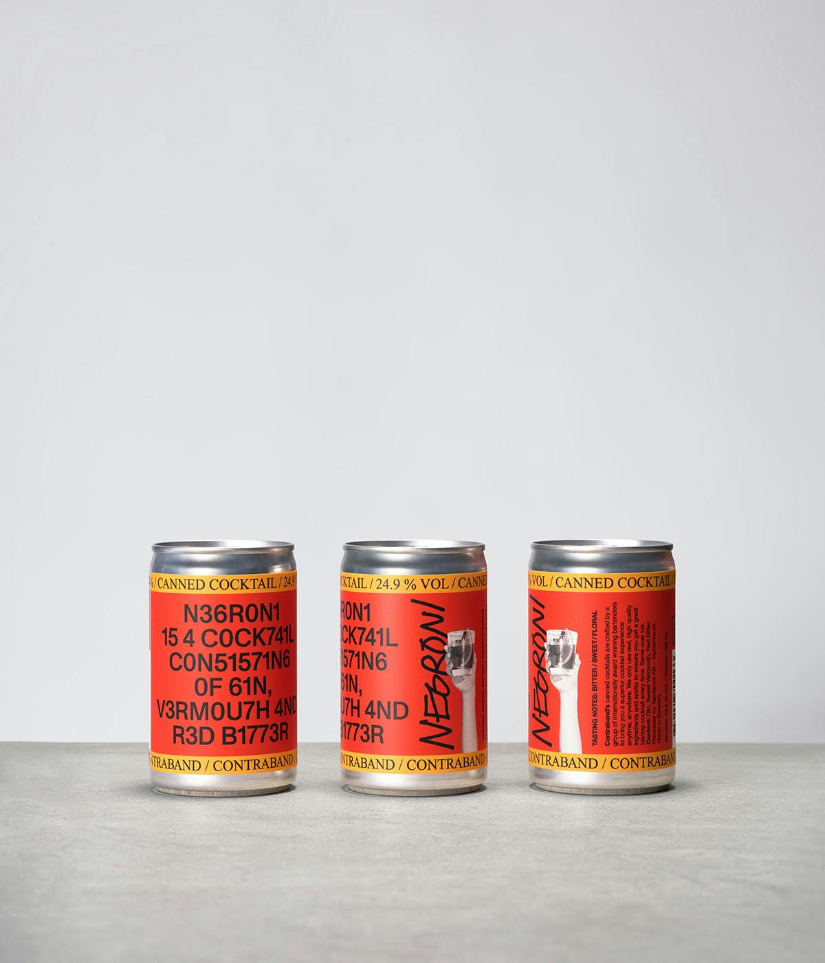
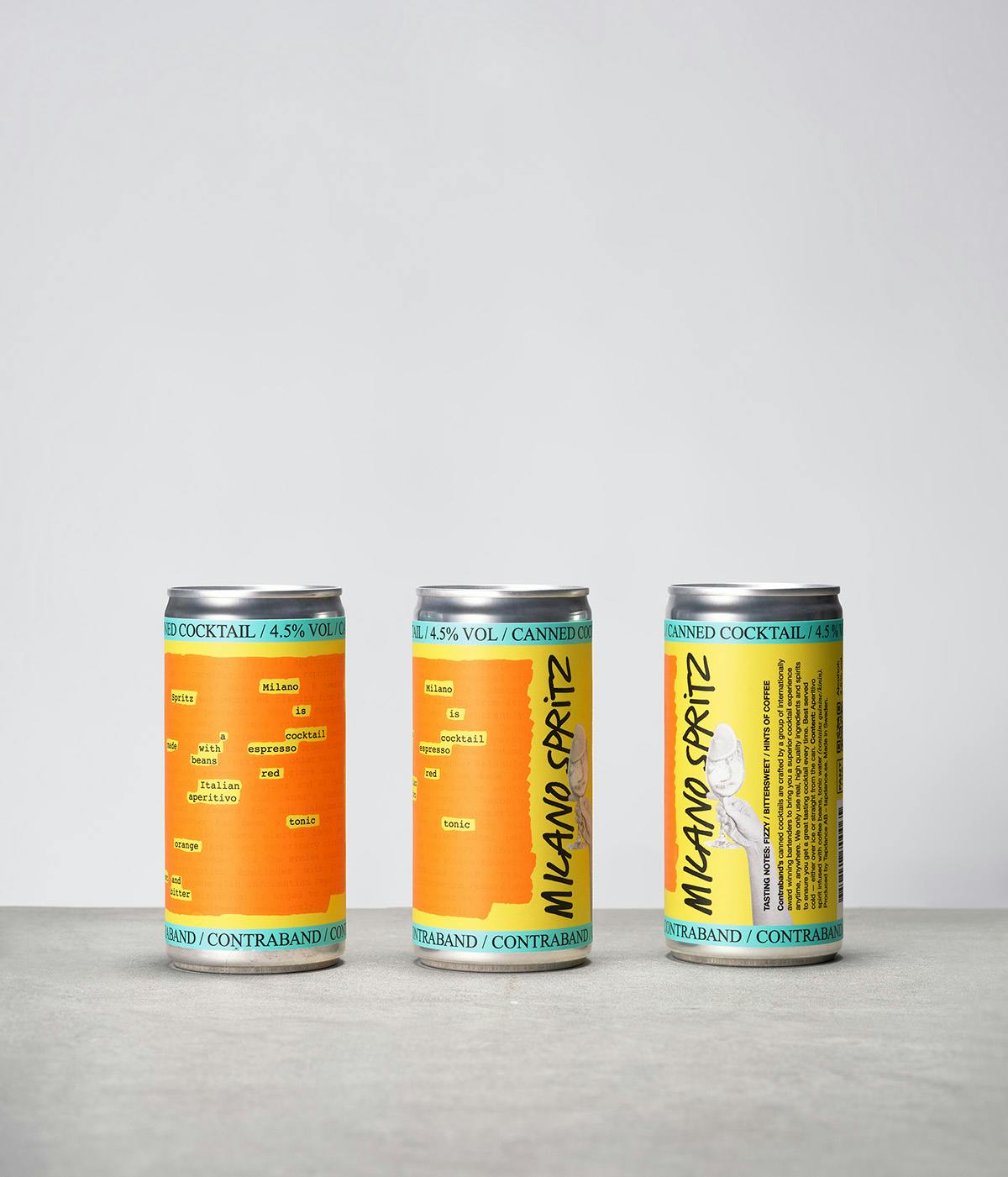
Though seemingly different from afar, each of the cans is united by its visual engagement with the notion of secrecy. For instance, the Milano Spritz is presented as a censored crime report, while the team used 1337, also known as ‘leet’ code (a kind of hacker language comprising a mix of characters and symbols), to encrypt the information on the Negroni can.
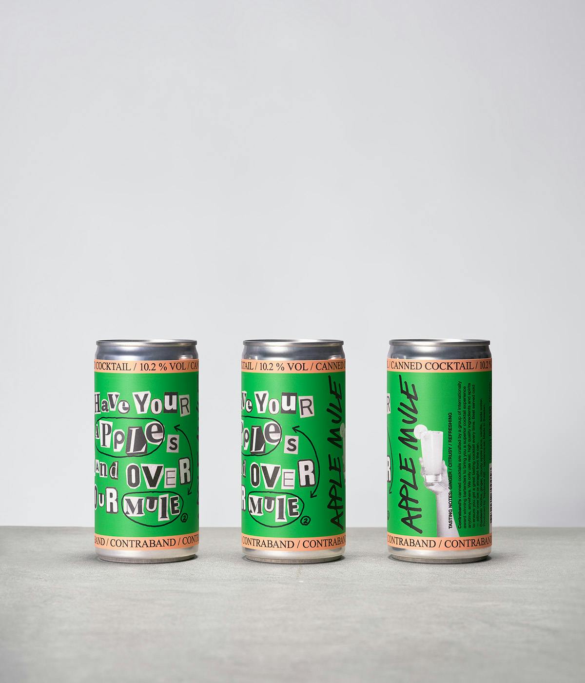
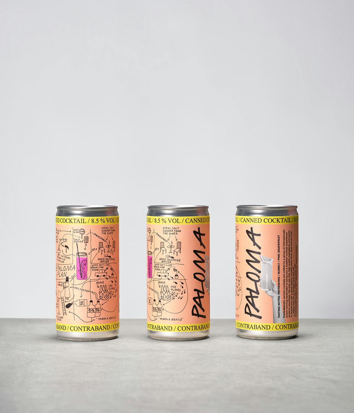
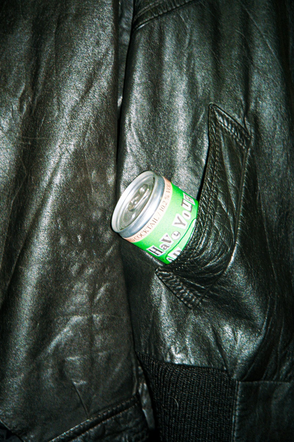
“We’ve put a lot of thought into making the cans visually striking from a distance, but for those who take the time to look closely, there’s a reward – lots of details and a story to immerse yourself in,” explains Herrmann.
As the cherry on the cake, Purple even designed a playful semi-censored flyer hinting at a party being hosted by Contraband in Copenhagen. This addition perfectly encapsulates the spirit of the brand, which is by turns clever and fun.