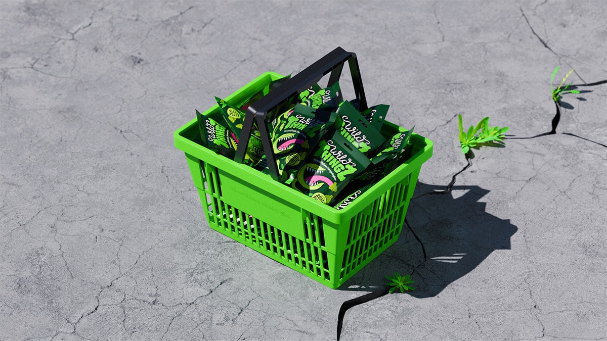
A scary identity for a sweet brand
How and How has designed a characterful identity for Wild Thingz, a new brand positioned as a healthier variety of sweets
In the sweets market, there’s often a trade-off between healthiness and excitement. Brands tend to be fun to look at but bad for you, or better for you but drab to look at.
Wild Thingz hopes to have the best of both worlds with a vibrant brand for its organic, plant-based, artificial additive-free products, which contain significantly less sugar than your average sweets.
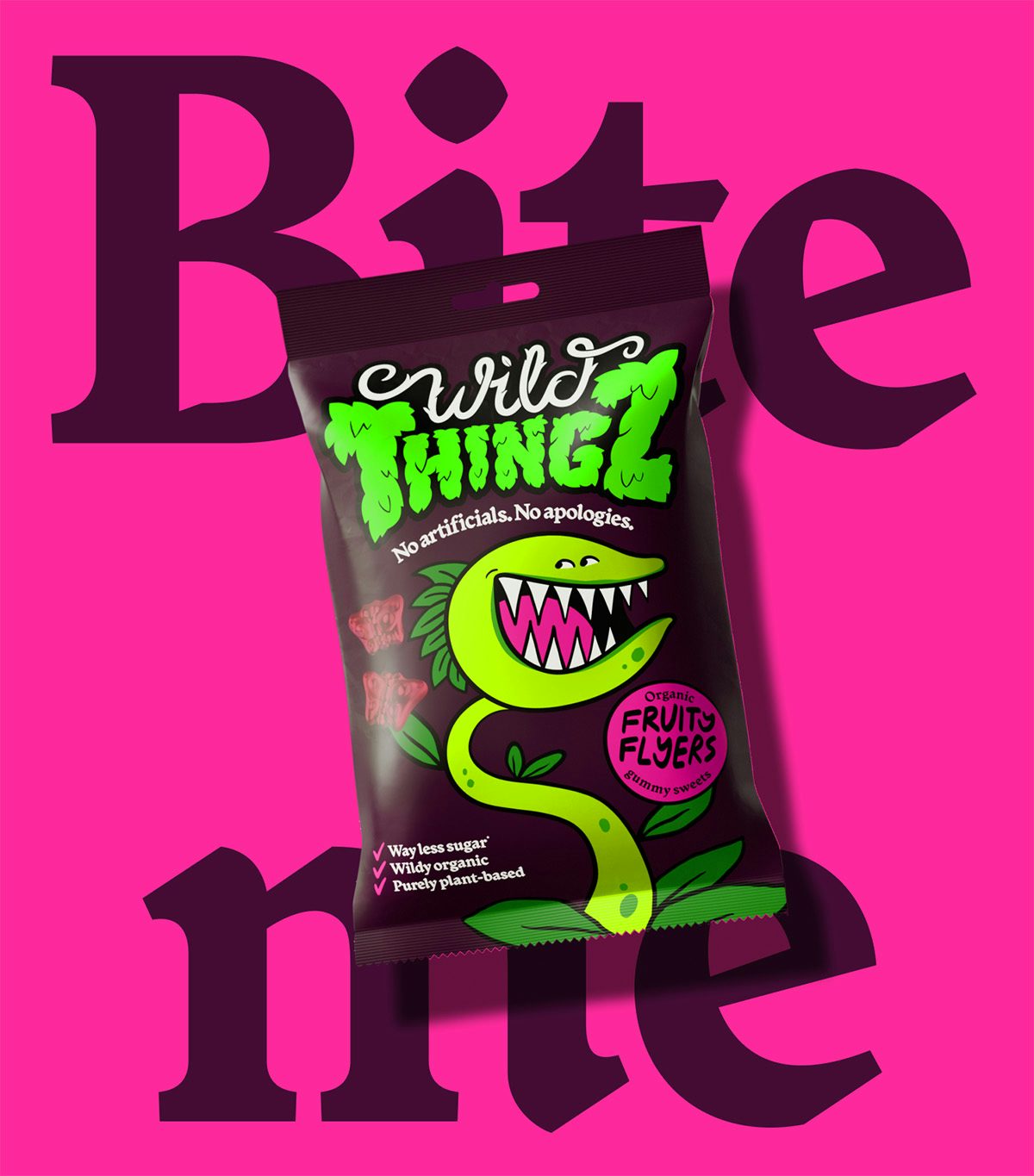
Founder Fliss Newland, who previously worked at Mondelez, insisted on eschewing beige motifs, a philosophy that’s guided branding agency How and How when creating the identity.
As indicated by the name (also developed by the agency), the sweets themselves come in the shape of bugs and the wider branding draws from nature too.
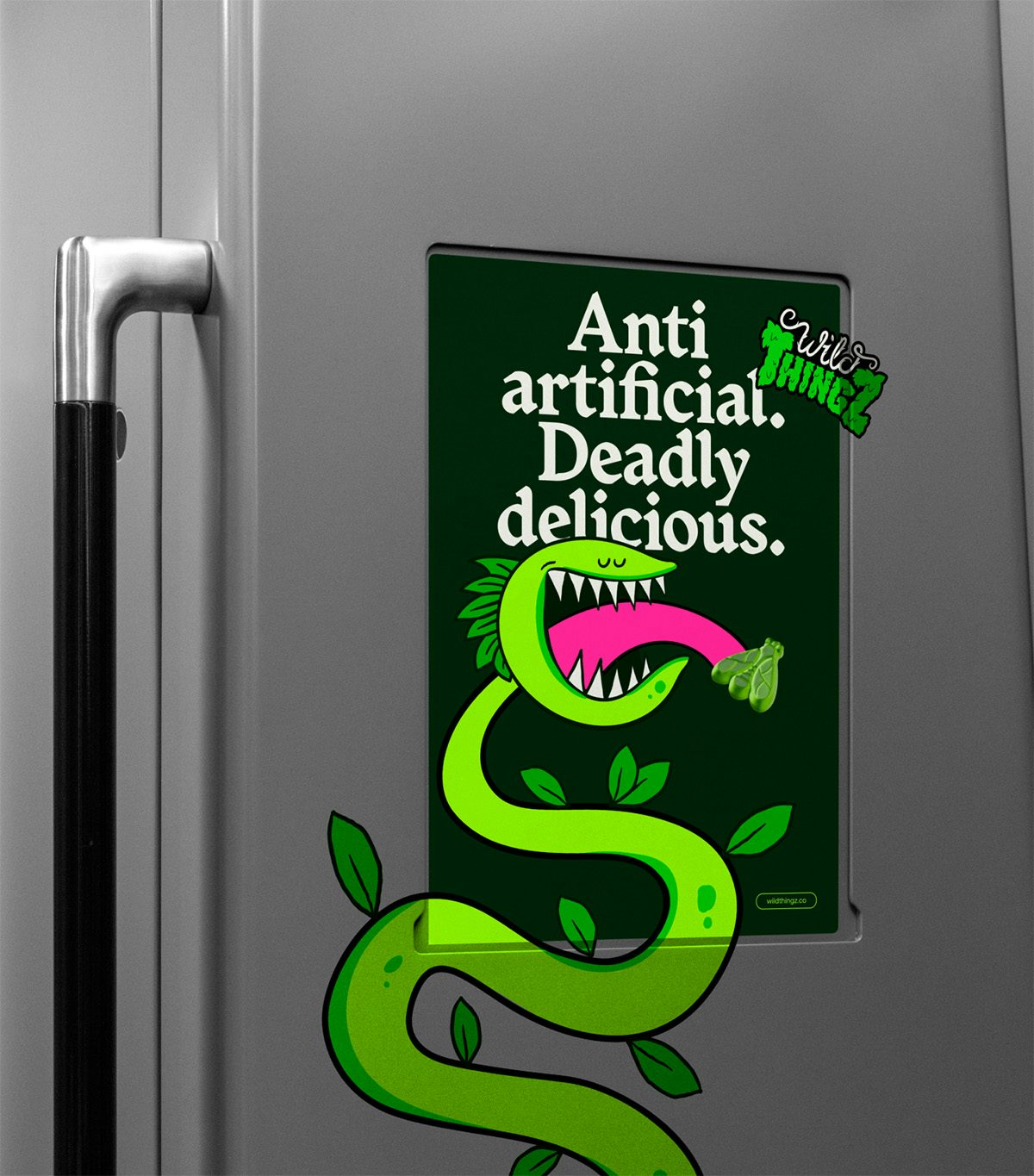
At its heart is an illustrated Venus flytrap mascot that will surely catch as much attention on-pack as it will on advertising displays. This is joined by a wordmark that combines thorny, vining lettering with a textural font that sits somewhere between overgrown trees and furry monsters. The guiding principle for both the visual and verbal identity has been a rebellious spirit that bucks the codes of healthier options.
“We’ve created a whole world of playful plant anarchy,” says design director Priyjah Paramasivam. “It’s not every day that we get to work so closely with a client who is happy to go for it and push our idea to the limit. Honestly, it’s been f-ing fun.”
