A new identity for Dumbo promises ‘a different side of New York’
New York studio DNCO has redesigned the identity for Dumbo, the Brooklyn neighbourhood which sits beneath the Manhattan Bridge in New York
The work aims to reposition the area beyond the familiar images of cobbled streets and brick buildings framing the famous bridge and reassert its reputation as a place of creativity that is “raw, irreverent and proudly different,” says DNCO.
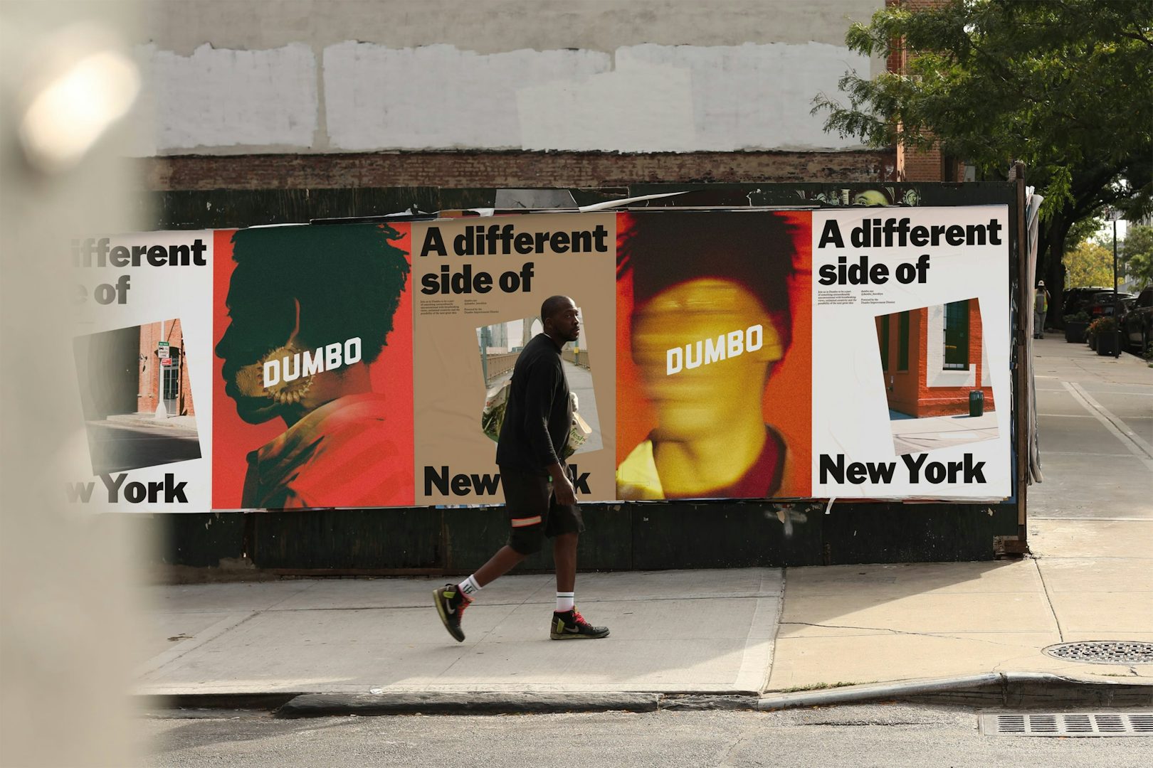
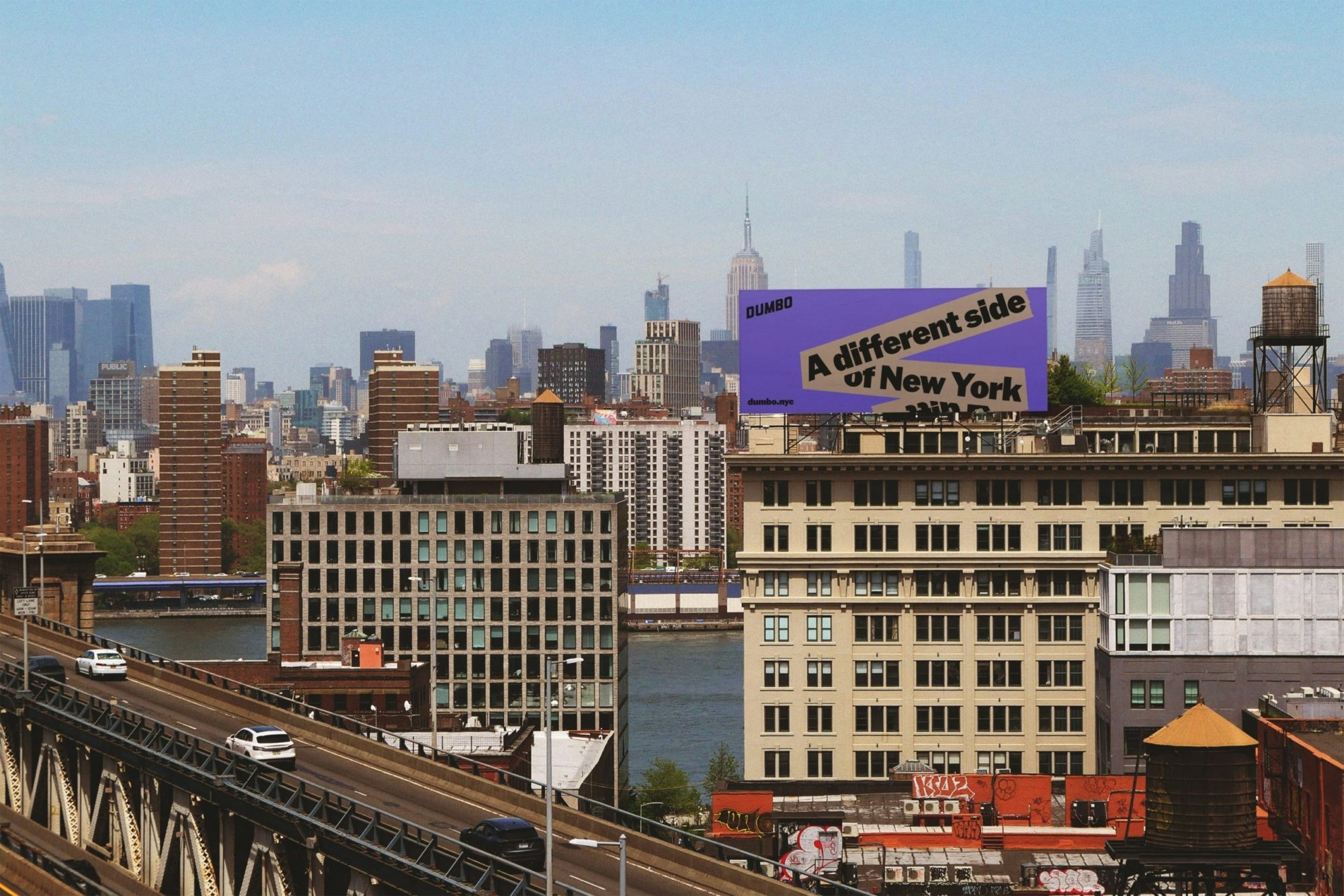
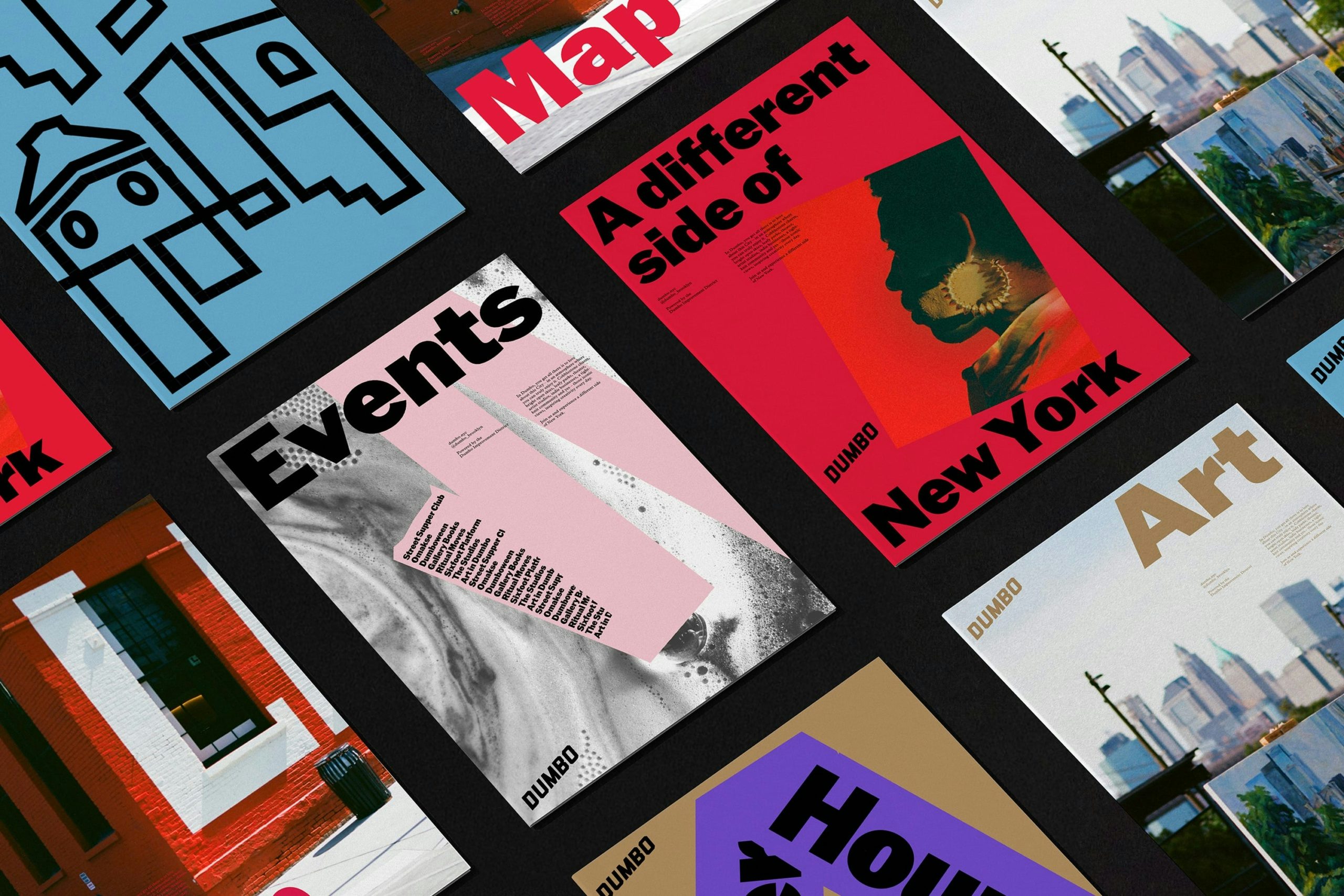
The project makes use of the expression, ‘A different side of New York’, and presents an unfiltered look at this dynamic area of New York City. (The name ‘Dumbo’ – ‘Down Under the Manhattan Bridge Overpass’ – was apparently coined in the late 1970s by artists who believed the name might deter developers.)
Putting the work in context, DNCO say that tourism, residential development and a competitive market for office space were starting to eclipse what Dumbo is all about.
For example, the area is famously a haven for the art community, with more than 100 active artist studios, plus it supports a vibrant food and retail scene and various creative and tech businesses.
DNCO worked with the non-profit Dumbo Business Improvement District on the identity and capturing the expression, ‘a different side of New York’.
As part of the project, the BID, which since 2006 has been active in supporting and promoting Dumbo as a creative area, was renamed as Team Dumbo, “placing people at the heart of the brand”, says the studio, in reflection of a hands-on approach to everything from public art projects to streetscape care.
“We came to DNCO at an inflection point,” says Alexandria Sica, president of Team Dumbo. “Dumbo was no longer a best-kept secret, but it needed a brand that did justice to everything that makes it special. The team gave us both sharp strategy and beautiful design. It felt like a true collaboration – they understood us, challenged us, and ultimately helped us tell our story with confidence and clarity.”
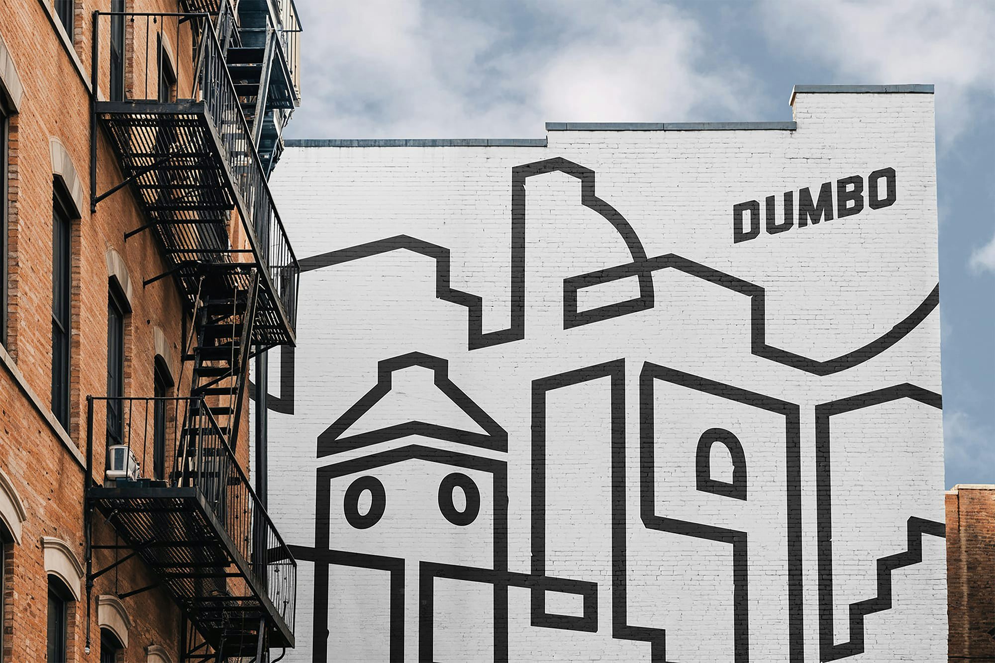
The refreshed system retains the original angled Dumbo logo and was inspired by the humble cardboard box, which was invented in Dumbo in 1879 by Scottish printer Robert Gair.
The new work uses tape as a graphic device that twists and turns in space, connecting the layers of the district and revealing what lies beneath. Dumbo’s industrial foundations are also reflected in the colour palette: steel blue echoing the bridges, while a brick red references the factories.
“When we set up DNCO’s NYC office a couple of years ago, we chose Dumbo for many reasons,” says DNCO managing director North America, Luis Mendoza.
“I walk these streets every day and live nearby, I never tire of them. But Dumbo has given us even more than we anticipated – so it feels only right to give something back. It’s been an honour to work with Team Dumbo to evolve their brand and harness the powerful story that has unfolded here over the years.”