Microsoft’s new identity is a trip down memory lane
Koto created an identity for the tech giant’s 50th anniversary campaign featuring stars such as Clippy and the MSN butterfly
In tech brand terms, celebrating 50 years essentially makes you prehistoric, considering many of the most prevalent companies today were founded this side of the millennium.
So when Microsoft hit this landmark birthday on April 4, the brand understandably wanted to toast the achievement, with celebrations spanning Easter eggs across Microsoft products, a ‘takeover’ of its website, a New York Times Square display, and a brand event.
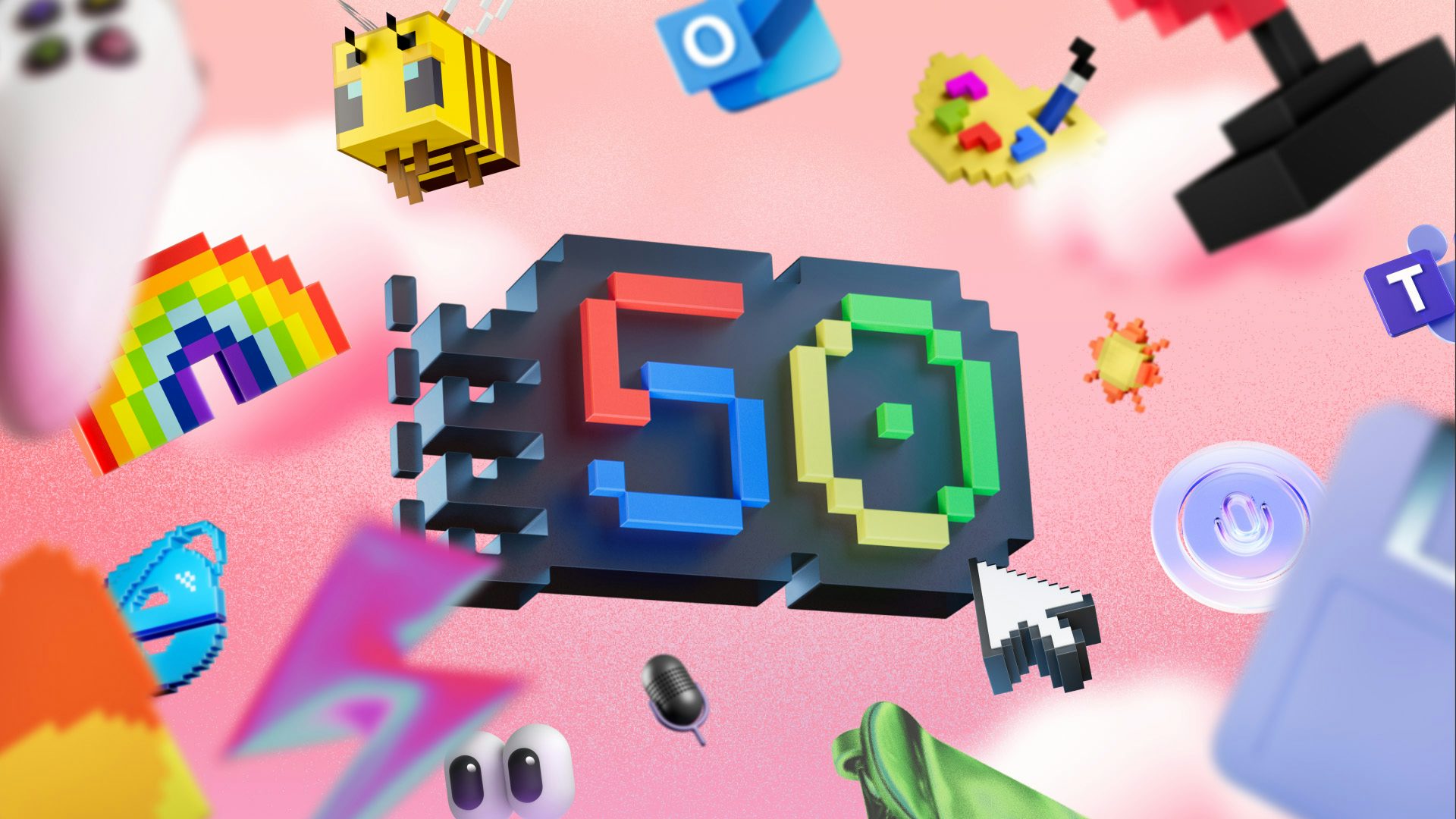
Koto stepped in to design the campaign identity, which nods to some of the hallmarks of Microsoft’s design legacy. At the heart is a ‘50’ icon, with a four-part colour scheme inspired by the classic Windows logo, and jagged edges evoking the low resolution graphics of the past.
The team also drew on Microsoft’s own design system, including using one of its best-known brand fonts, Segoe Sans, as a display typeface.
The identity references various generations of Microsoft’s operating systems and products, which essentially take you on a romp through the different eras of design and most likely of your own life, such is Microsoft’s influence on product design over the last 50 years.
For instance, we see the heavy borders around buttons indicating interactivity, which were later replaced by seamless, streamlined designs as people became more UI literate (not forgetting the influence of a competitor with an appetite for minimalism).
There are also nods to classic motifs like the MSN butterfly and of course Clippy, the smiling virtual assistant that was often the object of people’s frustrations decades ago but with the blessing of time is now the object of rose-tinted nostalgia. Digital pasttimes like Solitaire and Paint also get welcome nods, though other icons, like the PowerPoint logo, fail to ignite the same fond memories for obvious reasons.
These are contrasted with illustrations and design cues reflecting contemporary tastes, like frosted glass backgrounds and 3D emoji-like objects.
Koto’s strategy director, Cassidy Moriarty, pointed out that “this campaign had to honour Microsoft’s legacy without feeling nostalgic for nostalgia’s sake”. It might not all be about evoking memories – the campaign hopes to capture the value of changemakers, past as well as present – but it’s hard not to be reminded of the rich past of computing before our current age of tech megalomaniacs.


