
The best book cover designs of the year 2024
Writer and editor Mark Sinclair chooses his favourite cover designs of 2024 and reflects on the year in books
One of my favourite book covers of this year doesn’t make my top ten, but I think it’s a great example of what can be achieved with the most fundamental elements of book cover construction – type and image. In this case the visual element is a portrait photograph. Admittedly, it’s one of a very famous person, but amid a sea of faces that look out from the array of covers of biographies and autobiographies published over the last few years, only a few ever really stand out.
Sadly, celebrity-penned books tend to feature a fairly familiar image of the author; if not a headshot then they’re likely shown in a trademark pose befitting their career/personality/reputation etc. Sports biographies, for example, seem to follow their own simple, unbending rule: an intense close up, warts and all.
But look at the cover of Sonny Boy, Al Pacino’s long-awaited memoir (published by Century (Penguin) and designed by Darren Haggar) and it features a remarkable image of the actor: a black-and-white shot, inauspicious but nonetheless compelling, of Pacino in reflective mood. To me it’s a refreshingly simple break from the norm. The actor’s arm frames the top of the picture, while the type is nothing fancy, quite traditional even, but understated like the image.
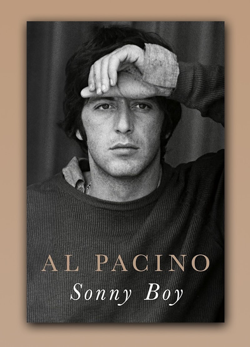
These kinds of books rarely feature in posts about good book covers, presumably as they’re so often formulaic – a large portrait does most of the work and, being a picture of a famous person, it’s likely an image that the audience is familiar with. But back to Al, of whom there are a legion of great images out there (even discounting movie stills) and this choice of image struck me as a stand-out in a riot of shouting colour, because of its quiet subtlety.
As I mentioned, covers like these rarely feature in the round-ups published online over the course of the year. And in my list, there are just two titles that use a photographic image – one is up front, giving us a window into the past; the other is used more as a backdrop for some interesting type. Art, illustration, graphic type and lettering are abundant on new books, which help to emphasise texture and the haptic qualities of printing and paper.
Of course, book designers still make use of photographic images, but for some years a more hand-made, hand-crafted creativity has edged into this ever-evolving area of design. I’ve picked the below ten covers based on what I’ve taken to be great examples of the latter; perhaps if more biographies took the route that Century have with Mr Pacino, there’d be more of them within lists like these.

In addition to the featured covers, I’d also like to mention the recent series design that Granta created for Nobel-winning author, Han Kang (photos daubed with bright paint and pen), and also Jaya Miceli’s reissues of some Stephen King classics. Faber’s 70th anniversary edition of Lord of the Flies (designed by Pete Adlington) gave a fresh take on a book which has had a range of covers over the seven decades it’s been in print.
Another Faber book rose to the occasion of having the literary spotlight cast upon it – and Sally Rooney’s Intermezzo has a visual presence that such a book inevitably commands. Another favourite, which appeared on the Booker Prize shortlist, was Ami Smithson’s cover for James by Percival Everett (Doubleday). And I’m looking forward to how Tom Etherington’s work across Simon Garfield’s ambitious ABC of Fonts series develops, where each book offers a biography of a typeface. We’ve had Albertus, Baskerville and Comic Sans to date, and with presumably another 23 to go, the process should keep both author and designer busy over the coming year.
So as 2024 draws to a close, here are some of my favourite covers from this year:
The Rising Down: Lives in a Sussex Landscape by Alexandra Harris; Publisher: Faber; Designer: Pete Adlington
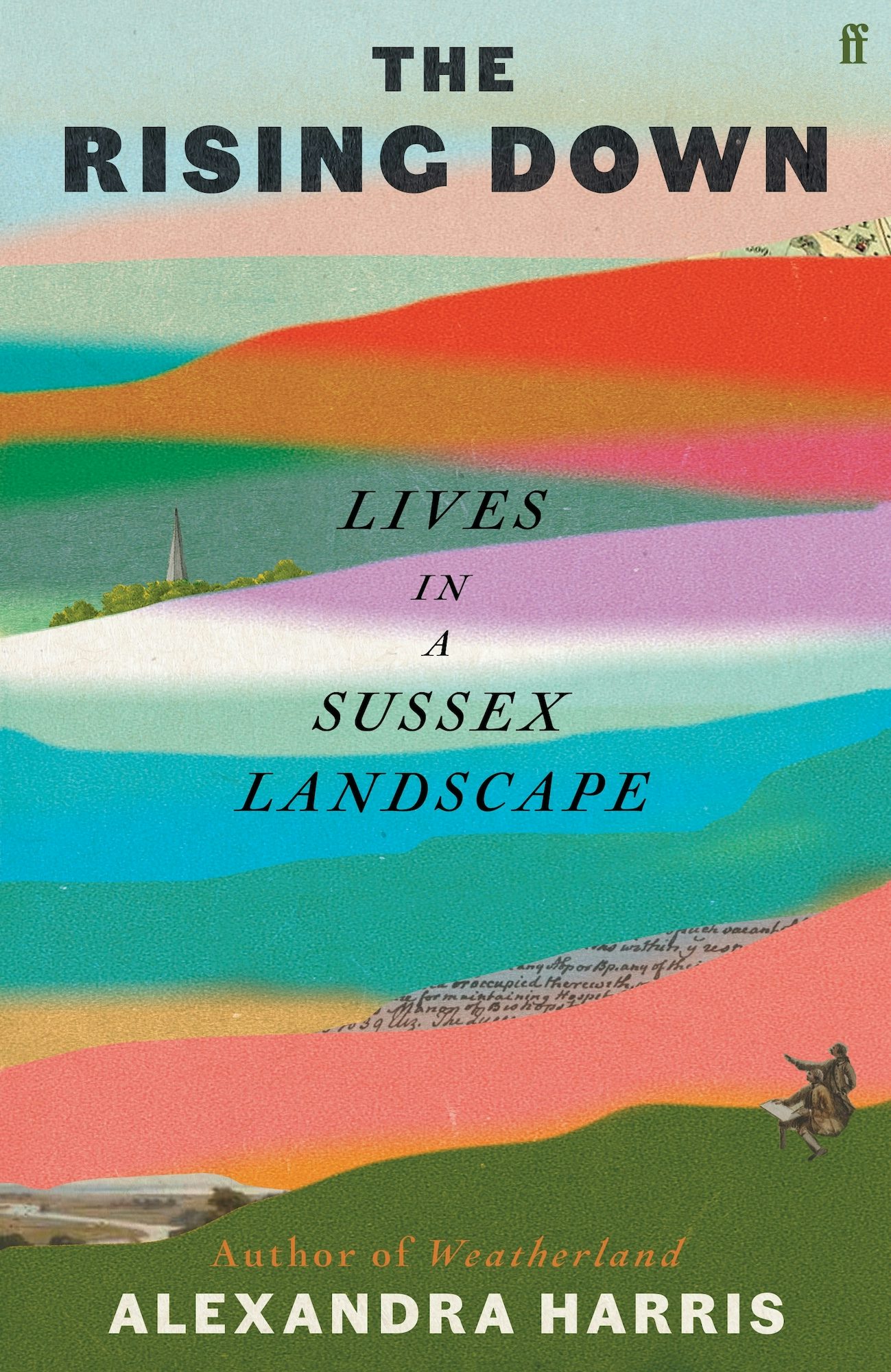
This striking cover is eye-catching from a distance while a closer inspection reveals hidden details – a steeple, a river bend … and some gentlemen? The dominant element is the sheer range of colours, banded like strata of sands.
An Earthquake is a Shaking of the Surface of the Earth by Anna Moschovakis; Publisher: Soft Skull; Designer: Gregg Kulick; Art Director: Nicole Caputo
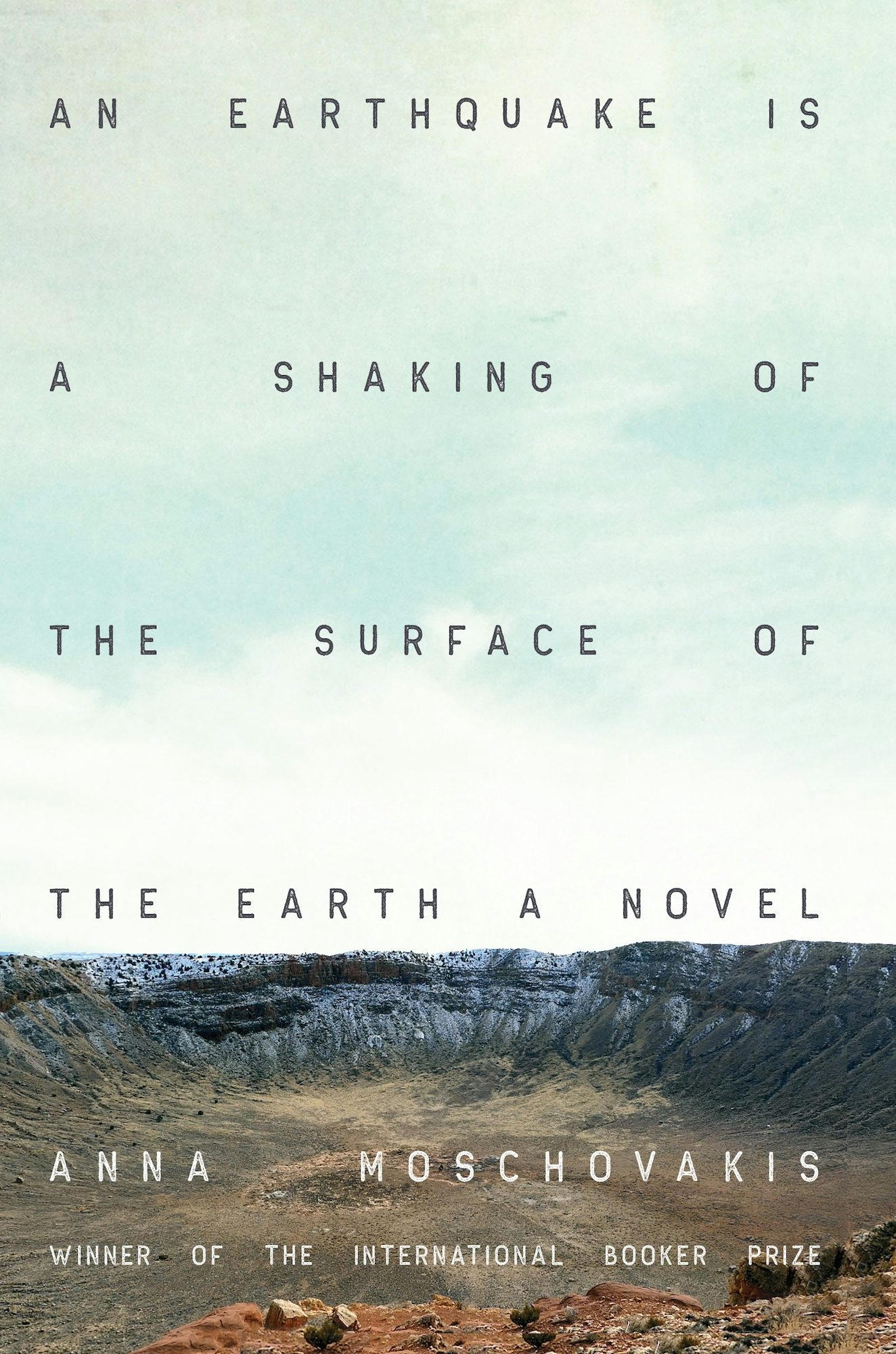
The type treatment on this is so good you almost miss the background image of a massive crater. A huge title is rendered with an almost rhythmic sensibility – its smaller words pushed to the edges of the cover, while the longer ones follow the largest, ‘earthquake’, down the centre as if in aftershock.
The Body Farm by Abby Geni; Publisher: Counterpoint; Designer: Jaya Miceli; Art Director: Nicole Caputo
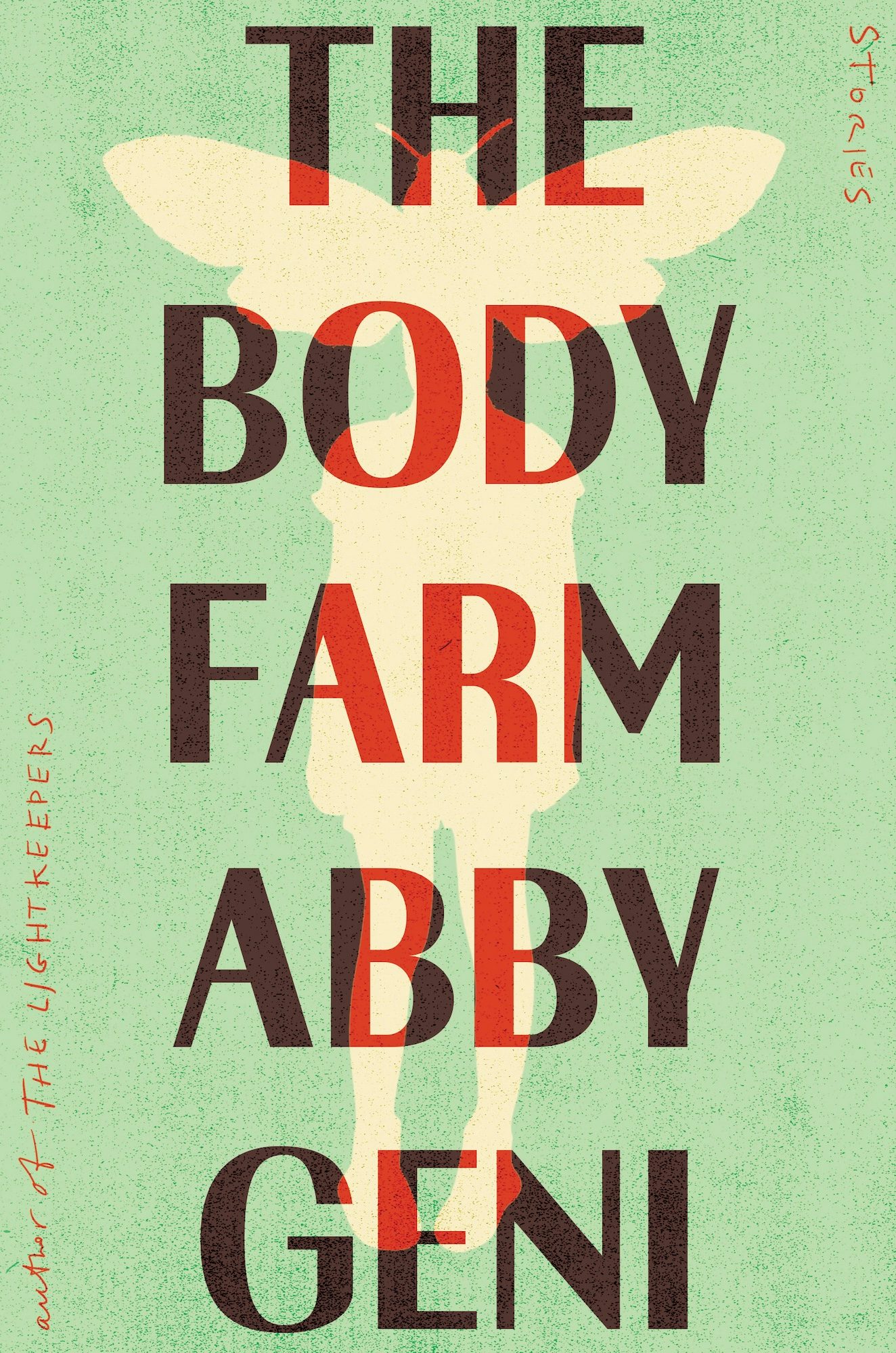
This is a hardworking design in that it manages to be both tasteful (colour palette) and uneasy (almost overbearing type, image of a strange human/moth creature). It all suits the creepy title – and the stacked-up words really stand out.
Butter by Asako Yuzuki; Publisher: 4th Estate; Designer: Emma Pidsley; Art Director: Julian Humphries

I love everything about this strange concoction of type, colour, vertical cow illustration and disturbing finger daubs. Are we in the world of blood, or ketchup, or both? Who knows (I think it’s both), but the cover conveys a kind of austere and formal oddness brilliantly.
Dogs and Monsters by Mark Haddon; Publisher: Chatto & Windus; Designer: Suzanne Dean

This simple-seeming blend of cut-out shapes conveying both the title creatures relies on two colours, with black – unusually – as the dominant hue. The hit of pink at left and right works really well, ensuring the cover pops out of the shelves. (An added charm is the dog’s ears doubling up as monster teeth.)
36 Ways of Writing a Vietnamese Poem by Nam Le; Publisher: Knopf; Designer: Janet Hansen; Art Director: John Gall
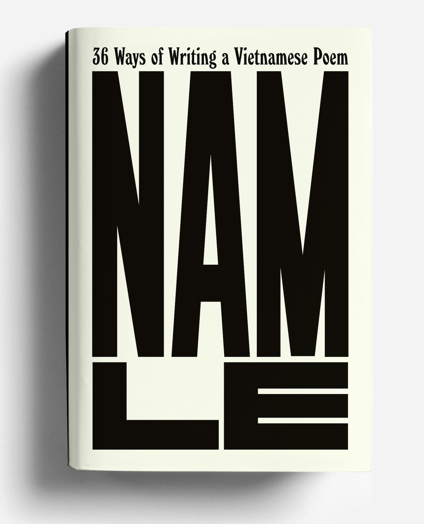
With a short author name and long book title, there’s plenty of opportunity for playing with the relationship between the two here. The boxy ‘L’ and ‘E’ are jammed in below the angle-ridden ‘NAM’ ensuring you can’t miss it, while the whole thing references the 1981 cover of Nam by Mark Baker. Using typeface Windsor and a custom font, the book’s UK publishers Canongate went with the same design.
Munichs by David Peace; Publisher: Faber; Designer: Luke Bird; Art Director: Pete Adlington

This sensitively handled cover works really well for David Peace’s dramatisation of the Munich air disaster of February 1958, where eight of the Manchester United team, alongside several journalists and club officials, were killed when their plane crashed on take-off. The poignant photograph, taken sometime after the tragic event, shows Bobby Charlton with some young footballers in a back lane in Ashington, Northumberland where he lived.
The Road to the Salt Sea by Samuel Kọláwọlé; Publisher: Amistad; Designer: Alicia Tatone; Art Director: Stephen Brayda
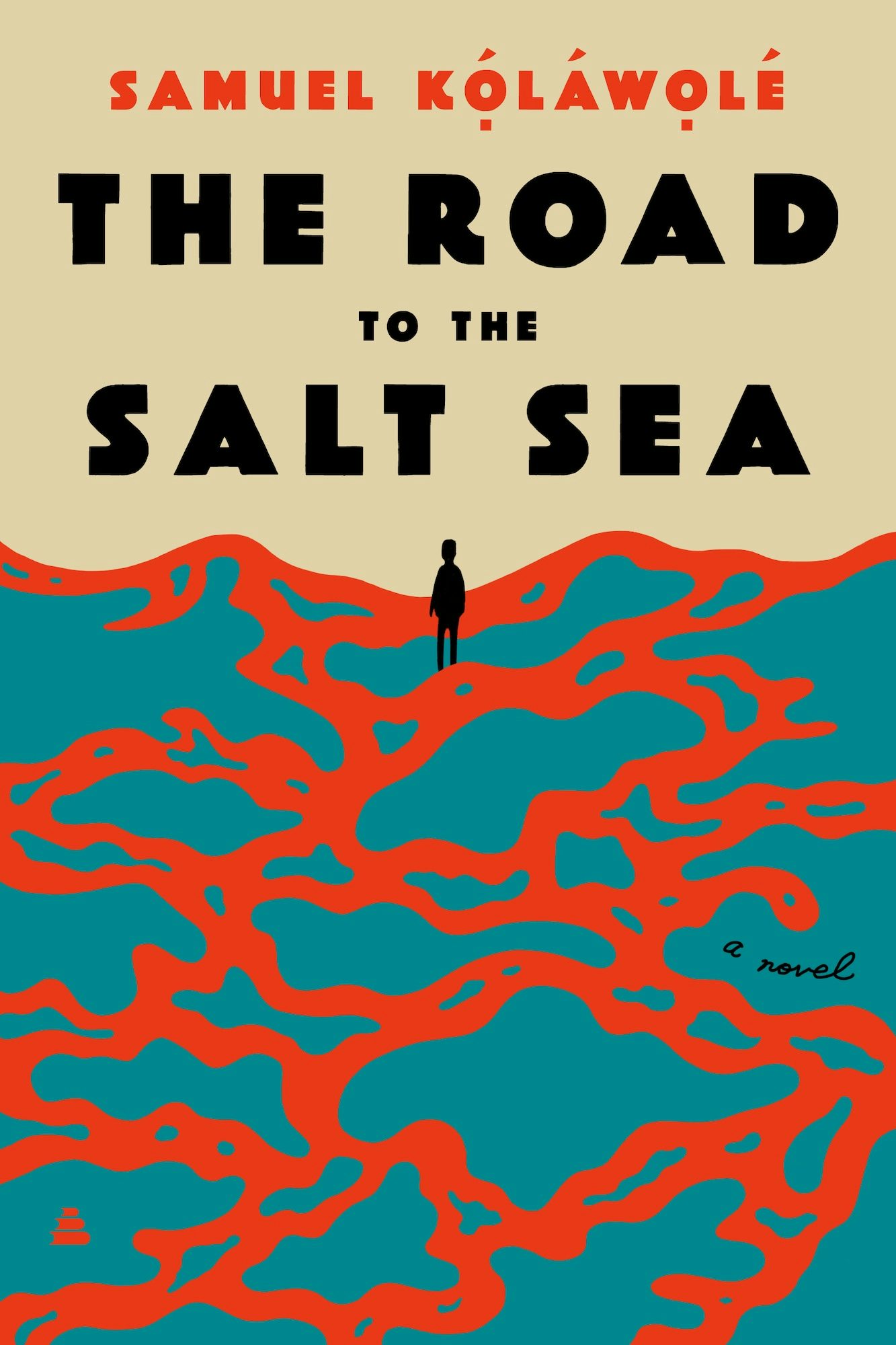
What I like about this cover the most is the setting of all the constituent parts: the bold, clashing colours of red and blue, alongside a great type choice, working together to generate a great composition overall.
All Fours by Miranda July; Publisher: Riverhead; Designer: Helen Yentus

Daubed around the edges of an epic oil painting by Albert Bierstadt (1866), with a sunset at its centre, the hand-painted type literally frames the picture on this cover for Miranda July’s latest. As a composition it feels expertly balanced, but also weird enough to be off-kilter at the same time.
Ghostroots by ’Pemi Aguda; Publisher: WW Norton & Co; Designer: Sarahmay Wilkinson

Using a beguiling artwork by Day Brièrre (note the red at the deer’s neck!), this cover makes use of a compelling type treatment composed from hand-cut lettering. Great border, too – again, everything ties together really well.


