Mubi’s debut book is an ode to lettering in film
The global streaming, distribution and production company is adding to its growing offering with a new publishing arm, starting with an intricately designed book on type and lettering on screen
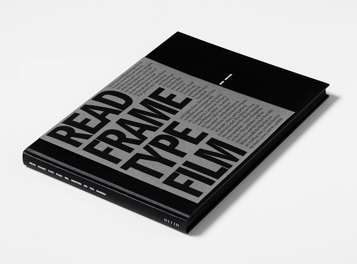
Four years after launching its biannual magazine Notebook, Mubi is expanding its publishing agenda with a new imprint called Mubi Editions. The imprint will encompass explorations of film culture and history, collaborations with filmmakers and artists, rare or newly translated texts, and books dedicated to Mubi’s own programming.
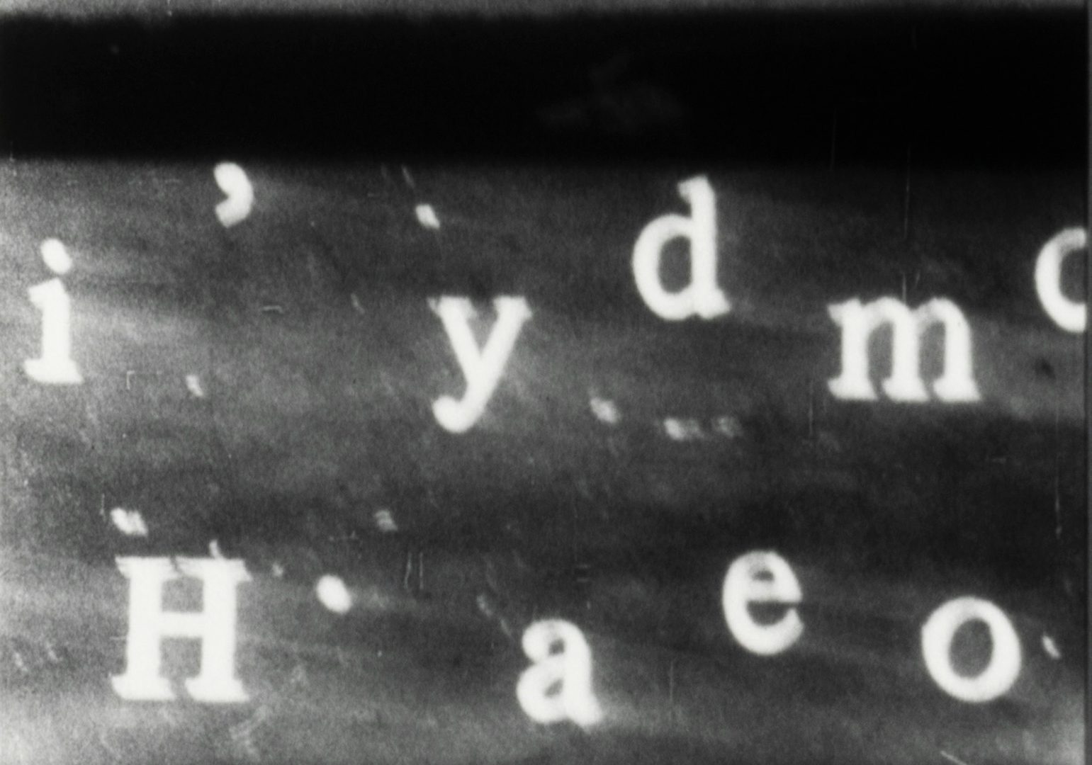
Mubi Editions kicks off with Read Frame Type Film, edited by Enrico Camporesi, Catherine de Smet, and Philippe Millot. Building on a research project called TypoFilm, which launched in conjunction with the Centre Pompidou in Paris back in 2020, the book examines the dialogue between typography and film during the 20th century. It does this through the lens of 24 films drawn from the Pompidou’s collection, the number a reference to the standard frame rate of analogue filmmaking.
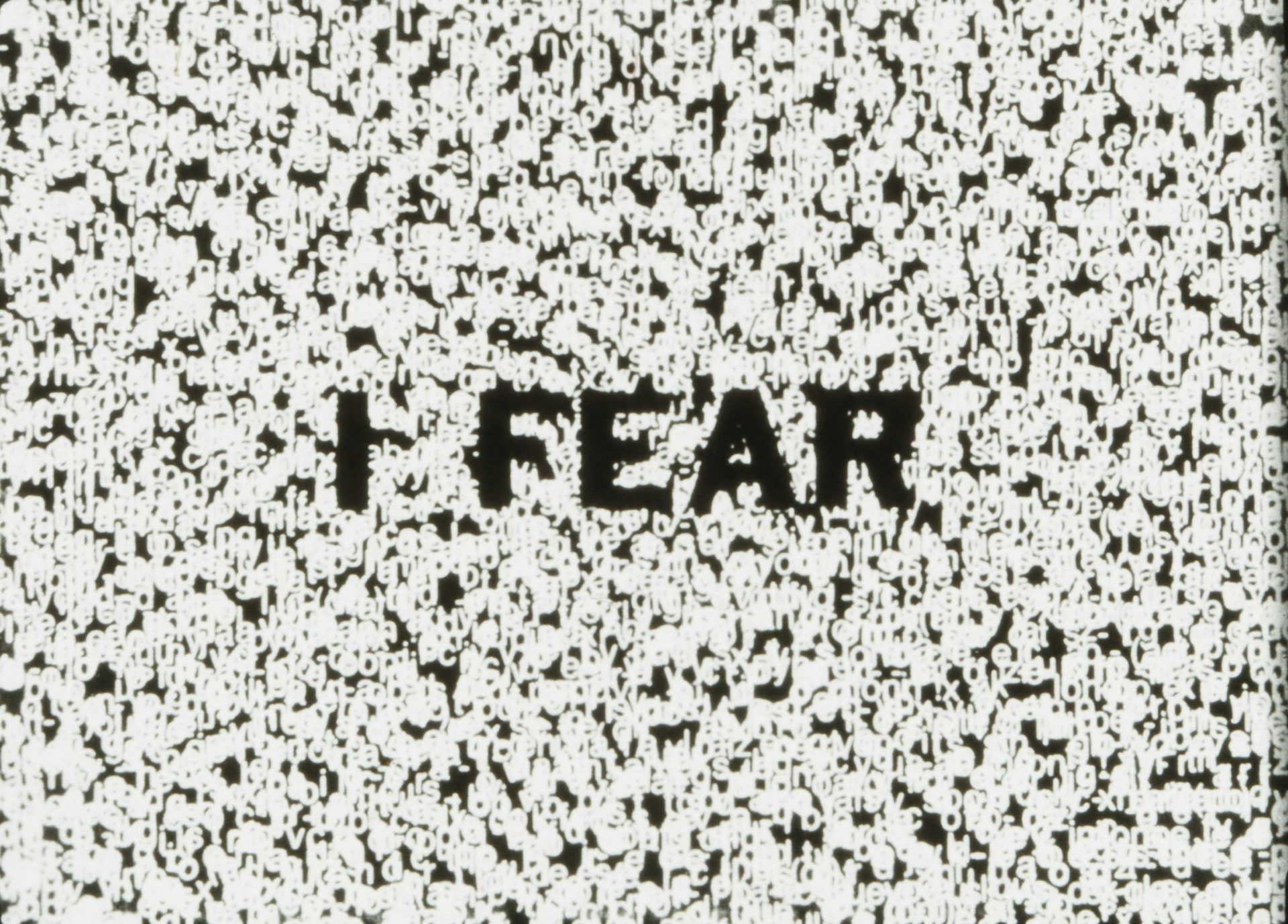
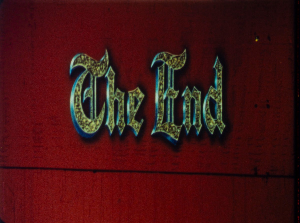
Among the artists and directors featured in the book are Marcel Duchamp, Man Ray and László Moholy-Nagy, which should signal that the editors have clearly scoured archives for unconventional expressions of typography and lettering. Think concrete poetry, instructional signs, and optical illusions.
This experimental attitude runs throughout the book’s editorial design, which references a theatrical screening environment. The editors were first interested in the concept of a velvet curtain concealing a cinema screen, according to Millot, who is also the book’s designer and runs a design practice under the name SpMillot. This idea manifests in a dark paper flap covering the book which, when lifted, reveals the book cover: a thick, dark perimeter with rectangular white space at the centre, symbolising a screen at the back of the room.
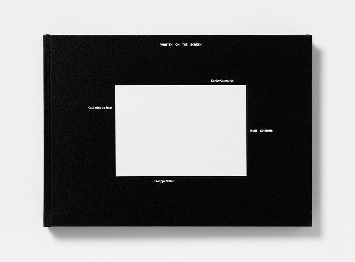
This rectangular framing device recurs in the foreword and in the introduction to each film discussed in the book. It’s both visually striking and toys with the reader’s focus, making it an active experience.
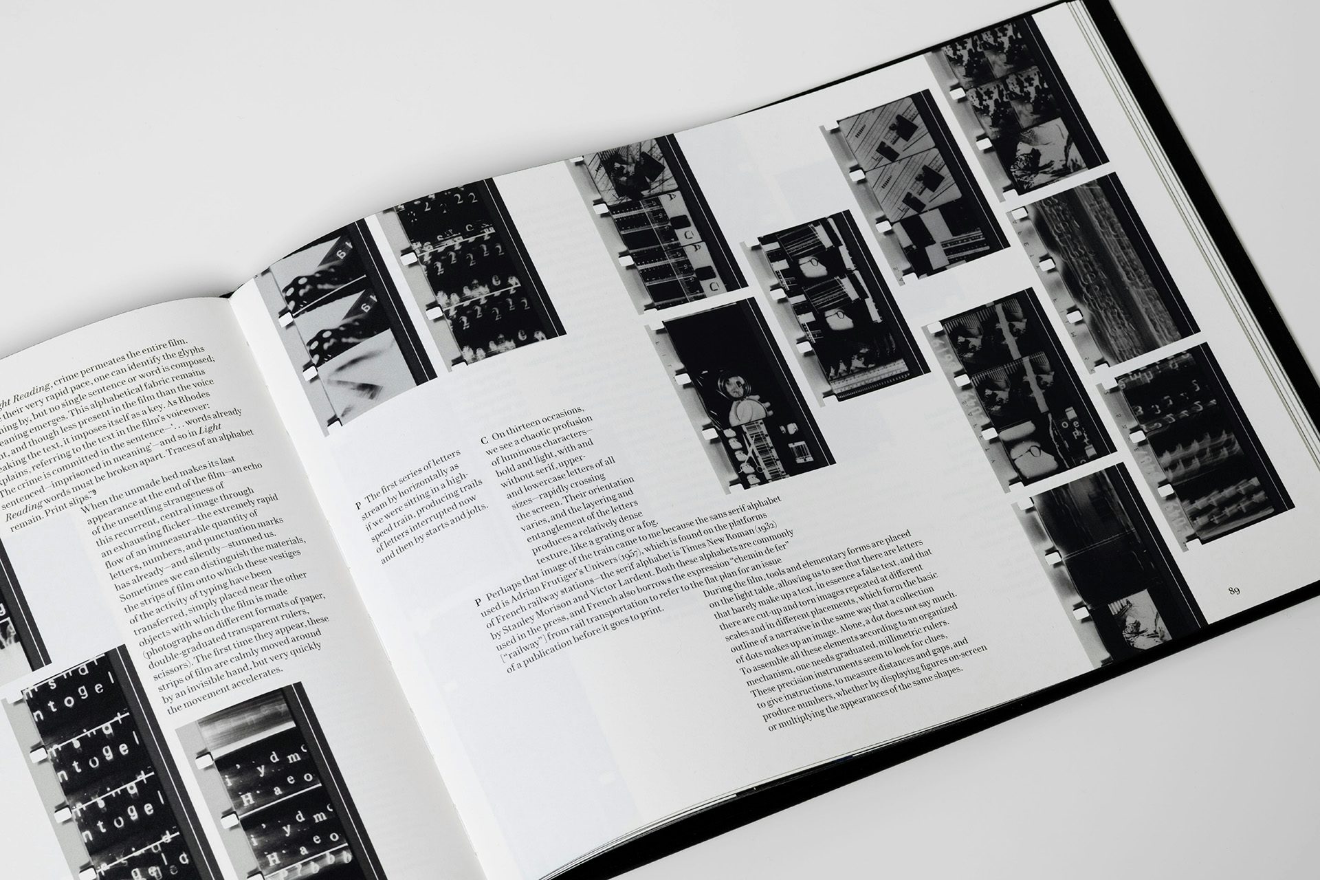
All of the films covered in the book were shot on celluloid, which the team wanted to embed in the design. “We wanted the book to reflect this materiality by showing the material quality of the films themselves, but also by working on the materiality of the book itself, which creates a tactile atmosphere for the reader,” Millot explains. This is apparent in an early spread featuring film strips, which was printed on acetate to illustrate the tactility and translucency of the celluloid.
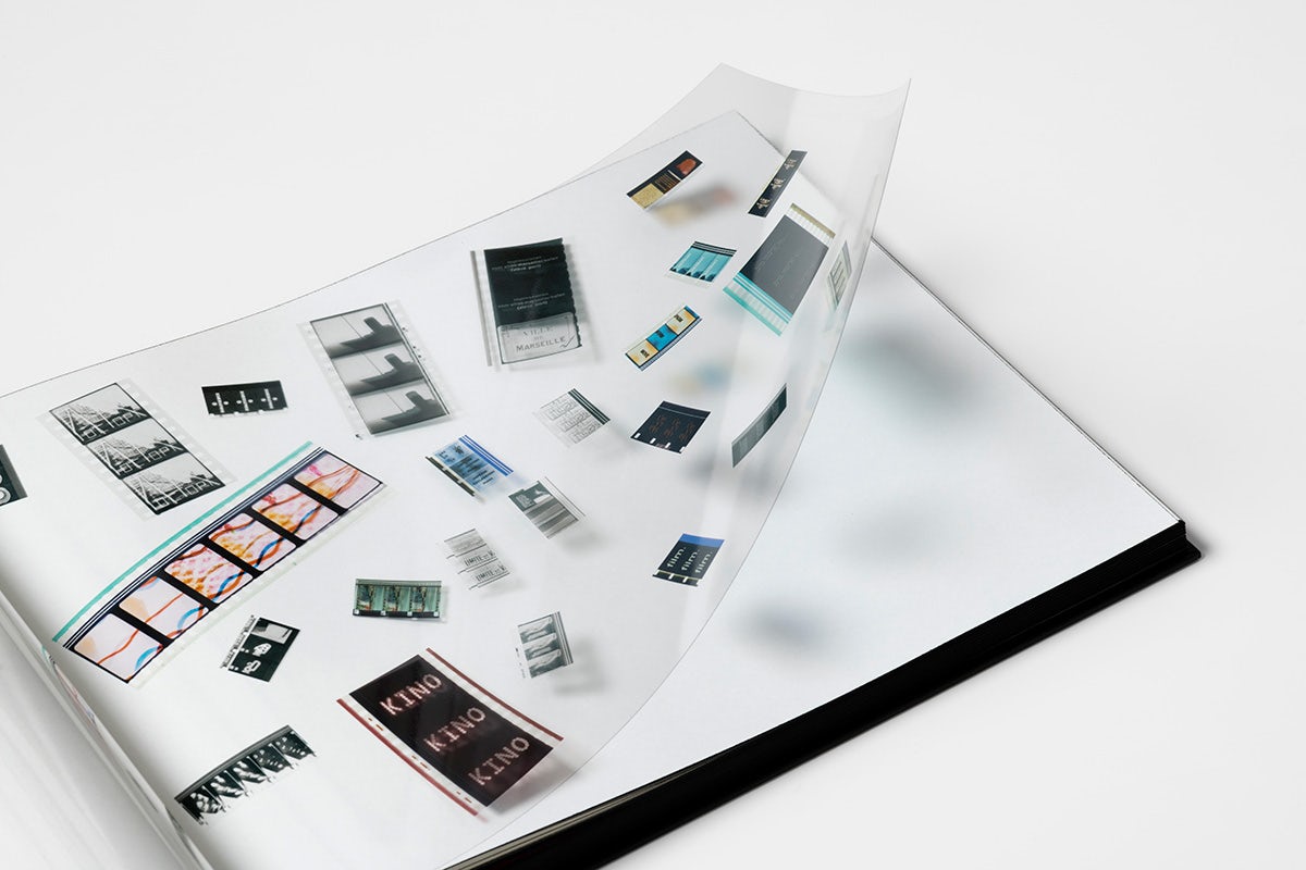
The new photographs of the film strips throughout the book offer a wider aspect than viewers would see in a screening, showing surplus detail that would usually be there for a production team or projectionist, Millot explains. The film strips were carefully unravelled to shoot the photographs, a process mirrored in the reading experience. “The first time you open the book, the paint, which has glued the pages together very lightly, gradually peels away, and you can hear a slight, rhythmic sound, like a film reel unrolling.”
Millot likens the entire process not to design, writing or editing, but to drawing. “That’s why at the end of each book there’s our signature, ce livre est dessiné par. It’s a way of hearing Robert Bresson say: ‘I dreamt of my film gradually taking shape before our eyes, like a painter’s canvas eternally fresh’. A book gradually taking shape before our eyes.”
Read Frame Type Film is published by Mubi Editions; mubieditions.com
