Mustafa’s poetry publication is designed with symbolism in mind
Artist and poet Mustafa’s new project explores different forms of ceremony through poetry and photography, a theme that’s echoed in the editorial design by Jordan-based studio Turbo
Until a few years ago, Canadian-Sudanese music artist and poet Mustafa went by the name Mustafa the Poet. Although he has shed his title from his alias, poetry is still very much coursing through his veins – and through his new publication, Nour, which explores the idea of ceremony in all its forms.
“Nour means light, and so much of what I know about light comes from the poetry I’ve been gifted in my life. A lot of that poetry came from my faith, and there’s no better way of understanding ceremony than through poetry,” Mustafa says.
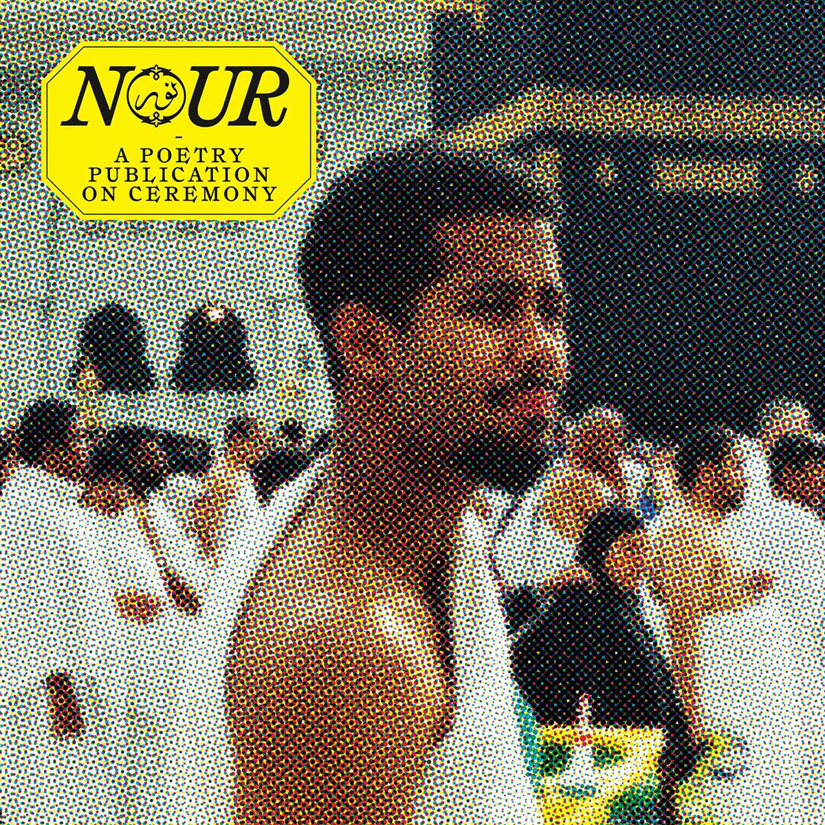
Created in partnership with WePresent, WeTransfer’s arts platform, the publication features a “collage” of perspectives reflecting on what ceremony means to them, whether religious devotion or other expressions of faith and spirituality, which may range from everyday rituals to once-in-a-lifetime experiences. Celebrated writers such as Hanif Abdurraqib and Max Porter appear in Nour alongside some decidedly unexpected names, such as Pedro Pascal and Channing Tatum, who have both contributed poems to the project.
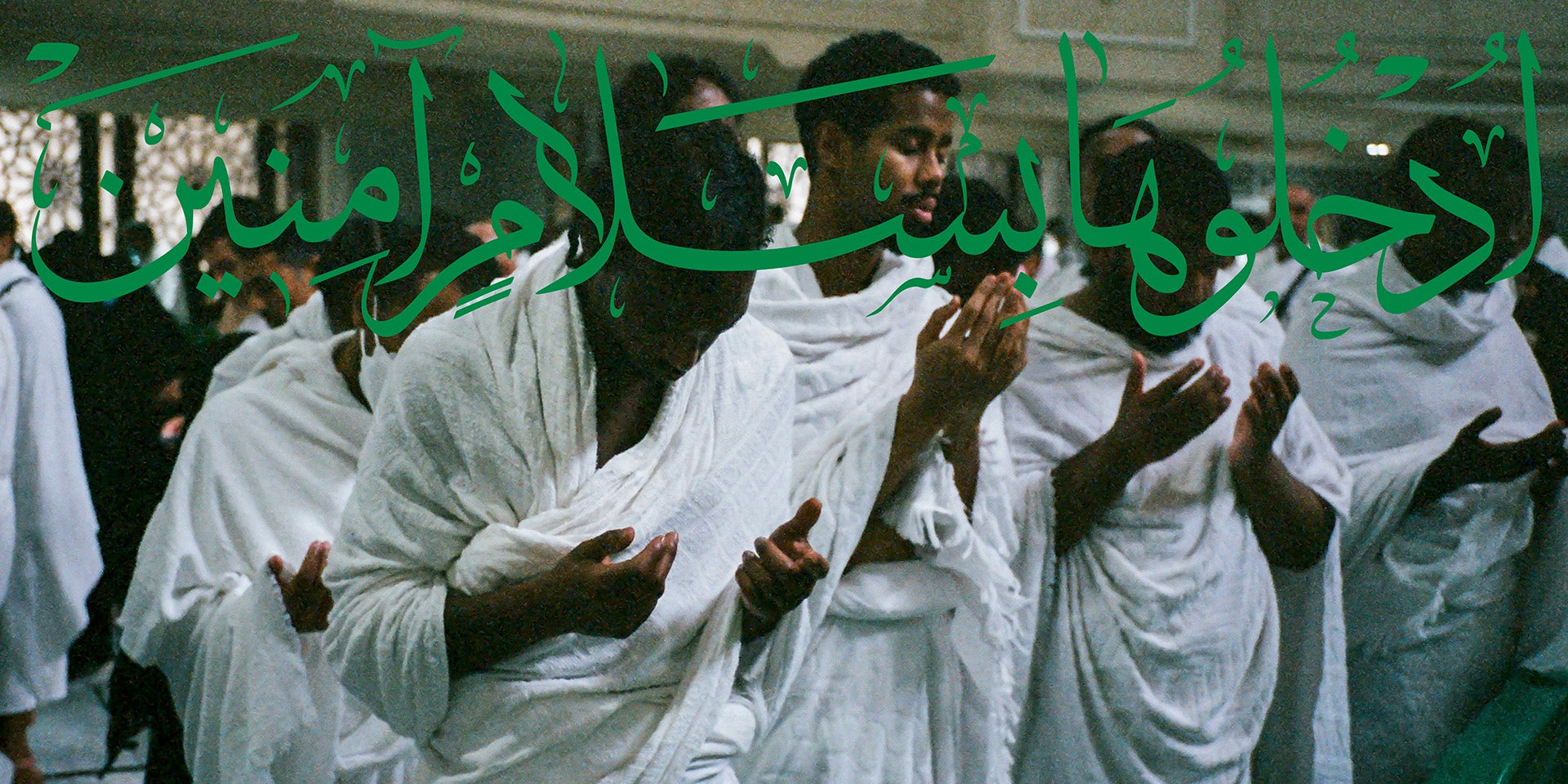
To accompany the texts, the publication features Magnum photographer Sabiha Çimen’s joyful photographs of girlhood in Turkey; Yasin Osman’s intimate documentation of Mustafa’s pilgrimage to Mecca; and a typically eye-catching photograph by Mous Lamrabat on the back cover.
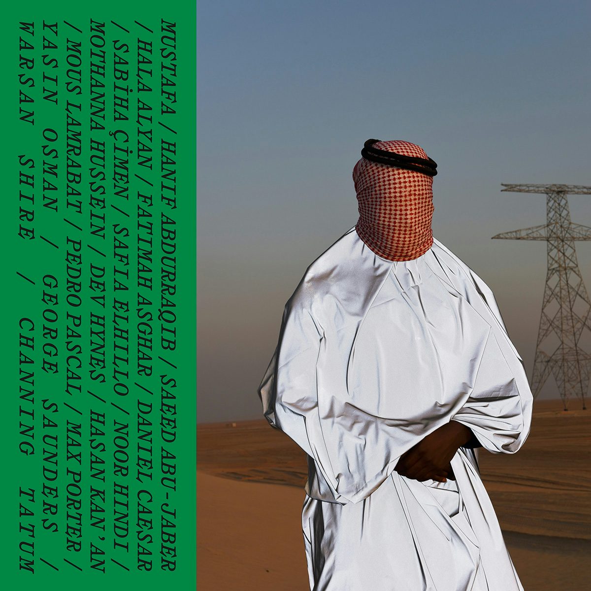
The publication was designed by Jordan-based studio Turbo, which was approached for its “slightly rebellious, very no nonsense” approach, according to WePresent’s senior editor Liv Siddall. “They have the excellent and crucial quality of understanding the importance of beauty and space, while not being afraid to go big and take mischievous risks.”
The studio is led by Mothanna Hussein and Saeed Abu-Jaber, who besides running their graphic design practice are also two of the co-founders of the influential online radio station Radio Alhara, based in Palestine and Jordan.
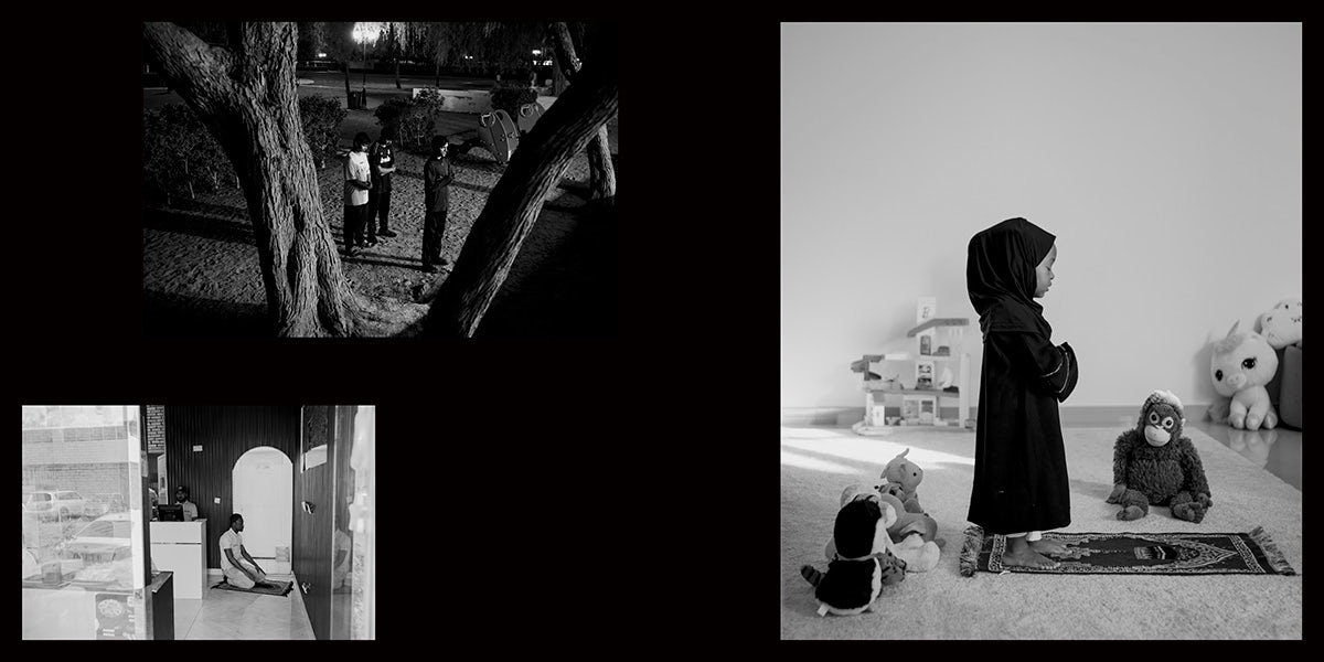
The concept of ceremony was central to their design of Nour. “That started from the outer sleeve; the black colour makes it visually quiet but the process of opening it up slowly reveals a very colourful publication inside,” the designers explain. “This same thought was given to both the subtle and not so subtle references to the Quran used throughout the book, whether in calligraphic form, verses or icons and shapes.”
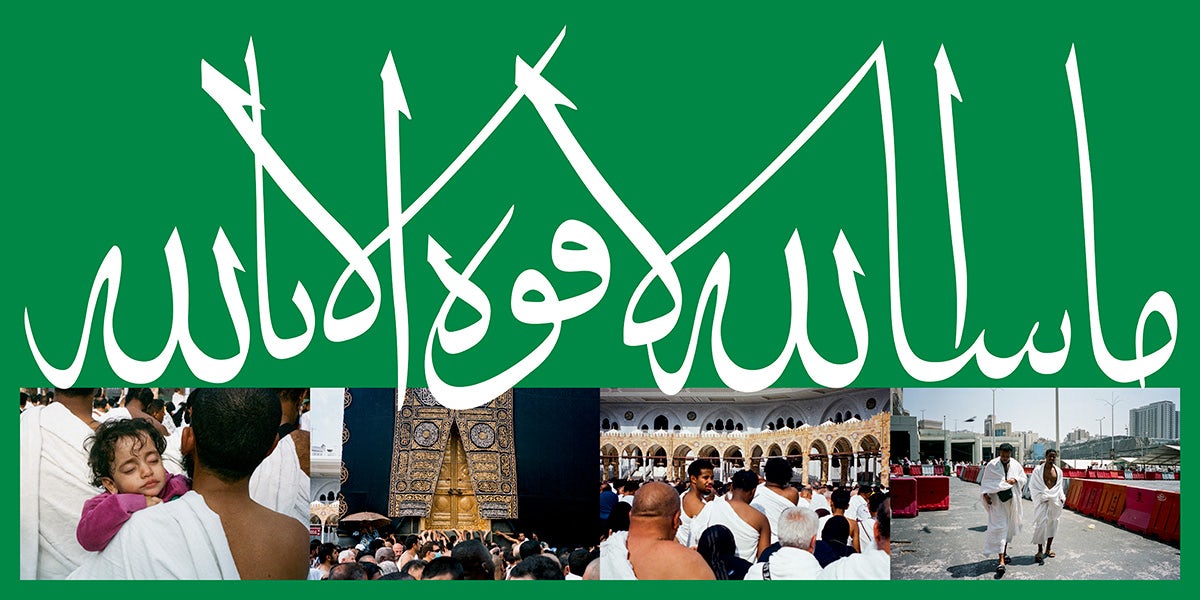
Symbolism associated with the Quran and Islamic culture more broadly is a recurring thread throughout the design, from the colour green, which conjures images of paradise, to the presence of traditional hand-drawn calligraphy by Hasan Kan’an, who Turbo has been working with for more than ten years. “He is a master calligrapher and we love his work – there was no one else that we thought would bring such authenticity,” Hussein and Abu-Jaber explain.
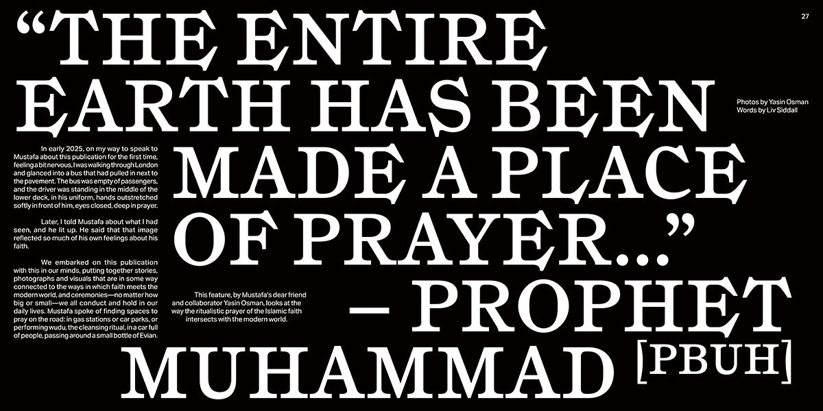
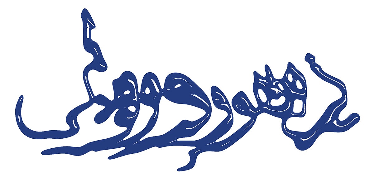
Kan’an’s calligraphy appears alongside “more experimental treatments of Arabic type in general, which we felt created a more modern feel so that we weren’t leaning too much on traditional depictions of Arabic design,” the designers say. This exchange between the traditional and the contemporary was a constant consideration. Age-old rituals are expressed in modern imagery, and tactile, traditional methods interact with digital processes. (Appropriately, Nour is available as both a free digital download and a limited run of physical publications from Climax Books.)
Hussein and Abu-Jaber explored different ways of incorporating the Basmala (the name designating one the most significant Islamic phrases) and other verses from the Quran into the design. “There are also more subtle references to the Quran throughout the book, including the opening spread with the shot of the sky, for example, and the seven horizontal lines referencing the seven heavens. The circles found in the interviews are usually used in the Quran with numbers inside them noting the beginning of verses,” the designers explain.
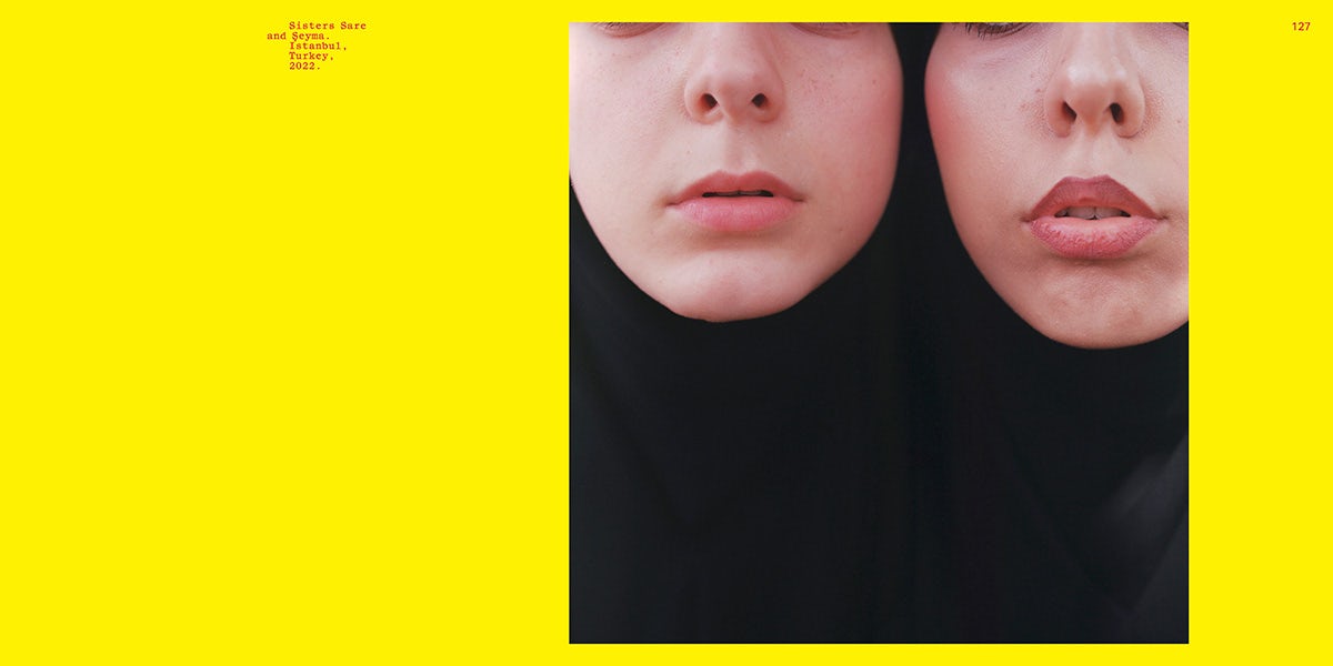
The design choices are in dialogue with the artworks and commissions. Yellow was used in the spread of Çimen’s photographs to elevate the vibrant, youthful energy of the images. “For the poetry section, we wanted it to feel airy and light so we kept the pages white, but then combined scanned calligraphy in blue ink by Hasan to add more beauty to the section while still retaining a peaceful reader experience.”
Although the design was turned around in a short timeframe, it feels spacious and thoughtful; almost meditative. “We had to understand and channel an artist’s vision quickly, find ways of marrying tradition and modernity, and commission the hand drawn elements alongside feedback rounds and print deadlines,” Hussein and Abu-Jaber explain. “Doing that in a matter of weeks was a challenge, but we’re proud of the finished product.”
Nour by Mustafa and WePresent is available to download here; turrrbo.com
