
The best album art and design of the year 2024
Our favourite album artworks and designs for 2024 involve introspection, illusion, and bucketloads of green
There has been plenty to feast on in the world of music this year, including some long-awaited returning acts. Jamie xx released his first album since his widely acclaimed debut, 2015’s In Colour, and with it an abstract black and white visual language in keeping with the new album’s title, In Waves. The length of the wait for new music was trumped by The Cure, who reflected on the state of the world in their first new album in 16 years.
Meanwhile, those who have an appetite for gossip and feuds will have been reaching for the popcorn. There has been lyrical sparring between Drake and Kendrick Lamar, the latter dropping a surprise album in November. The machinations of the industry have also been leveraged to take out the competition, with suspicions that Taylor Swift released multiple successive versions – six in all – of The Tortured Poets Department to quash chart rivals Billie Eilish and Charli XCX (whose album incidentally saw her repair a relationship with a fellow musician). The latter released a remix album of her own, with a deadpan, garbled name that seems to acknowledge Swift’s apparently cynical move.
Another big release came in the form of Beyoncé’s Cowboy Carter, which was also a takedown of sorts, responding to the rejection she and other Black artists have felt from the country music genre. The album cover reprises the artwork for 2022’s Renaissance and gives it an Americana rework. It prompted much debate over whether pride can still be attached to the American flag, and whether that’s even what she intended to evoke.
Throughout all of this, there has been plenty to indulge in visually. Perhaps it is simply a case of musicians recognising the need to deliver something unique for loyal, cash-strapped fans, or evidence of the anticipated embrace of craft in the face of AI, but it has felt like a particularly strong and varied year for album art and design.
We’ve whittled down a strong pool of contenders to ten of our favourite artworks and designs that came out in 2024, listed below in order of release.
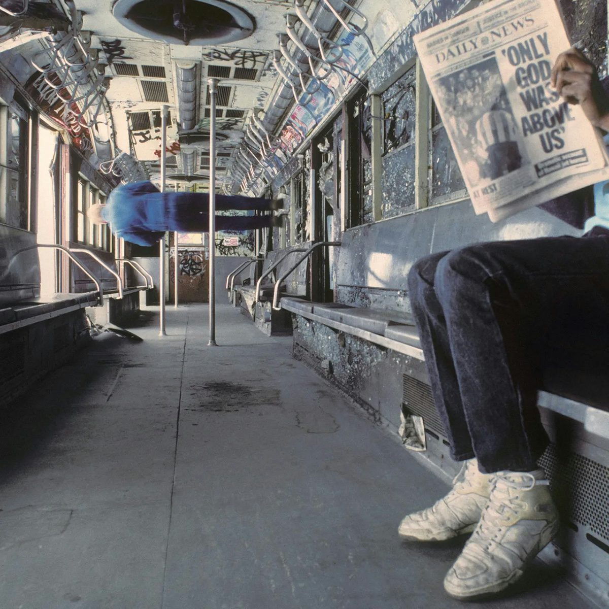
Vampire Weekend, Only God Was Above Us; Label: Columbia Records
Most album art is dictated by the record itself, but for Vampire Weekend’s latest LP, the inspiration went in the other direction. A headline on the newspaper in the photograph used on the cover actually informed the album name: Only God Was Above Us.
The image was taken in the late 1980s by photographer Steven Siegel as part of an entertaining series shot in a ‘subway graveyard’ in New York City. Many of the train carriages were tipped over, lending all of the images an eerie, gravity-defying perspective.
For the special edition, the record sleeve features reactive inks that reveal graffiti when a UV light shines over it – a nod to the clandestine graffiti artists who transformed the abandoned subways.

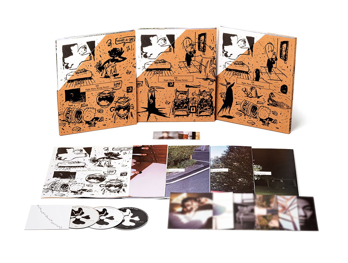
RM, Right Place, Wrong Person; Label: Big Hit Music
This year, RM – leader of the Korean sensation BTS – released his second solo album, Right Place, Wrong Person. As the title indicates, the album finds him in an existential state, as he considers the path he’s strapped into as a music megastar and the life he would have led had he not found fame.
BTS is known for its ‘army’ of dedicated fans, and RM’s album design by Seoul studio Kontaakt certainly caters to that. Housed in a folder illustrated by Martin Groch is a lyric book. It comes with a poster booklet of photographs by Rosie Marks (who also shot the digital cover) which seem to show an uncanny version of the life that could have been: marriage, a simple nine-to-five, time for family get-togethers. Other photos by Wing Shya and Takahiro Mizushima appear across the album package in standalone photo cards showing RM taking on these different personas, plus an extensive photo book of beautifully shot naturalistic images.
It might be a superfan’s dream, but there is depth to the album visuals, which explore these dualities between what is and what could have been.
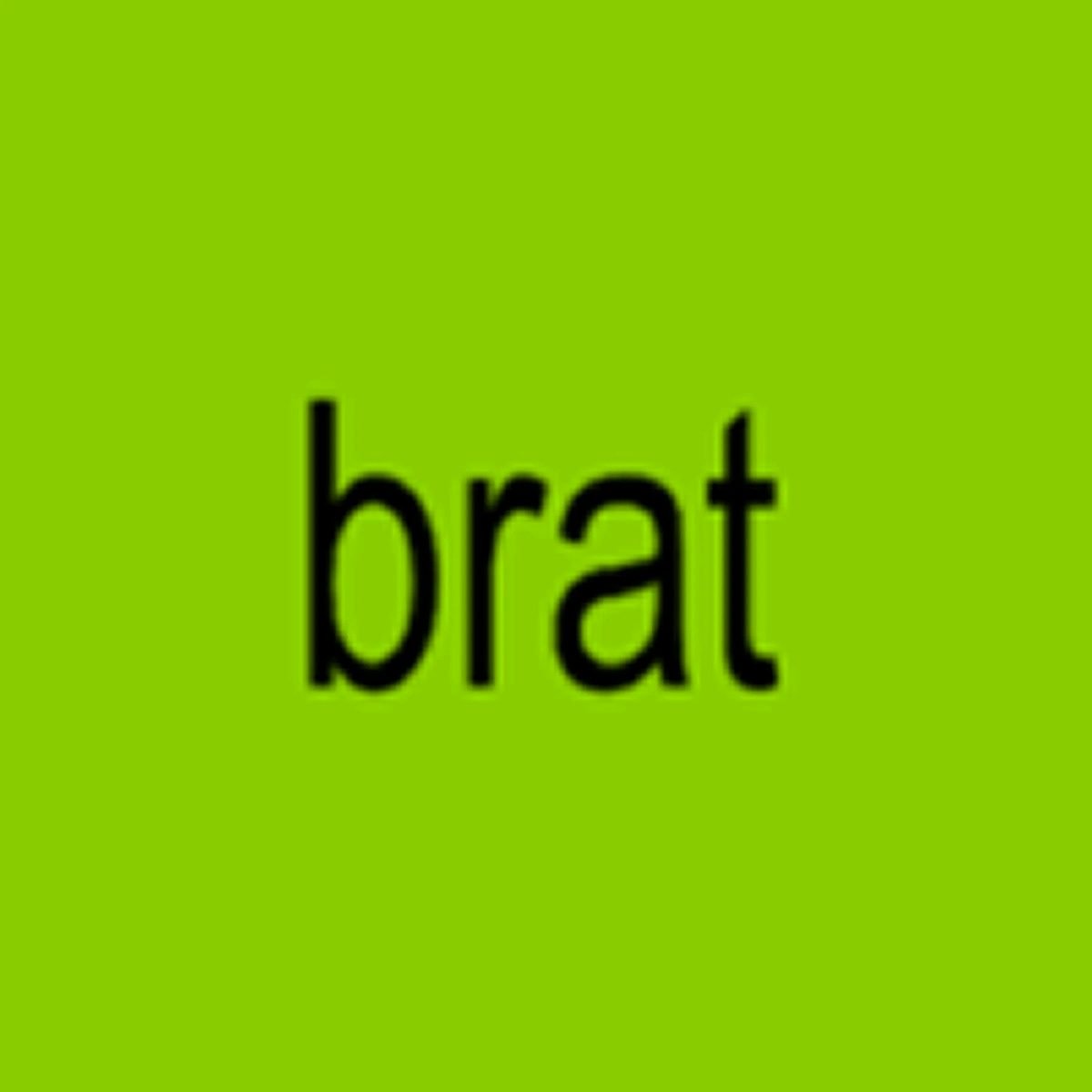
Charli XCX, Brat; Label: Atlantic Records
Charli XCX’s Brat almost needs no introduction, and that’s in large part thanks to the cover art. Spearheaded art director Brent David Freaney, Charli XCX’s creative partner Imogen Strauss, and the musician herself, the album artwork is a rare example of a cover design not only crossing over into culture, but being ingested and regurgitated by it too.
It has spawned thousands of memes, clunky brand copycats, and even a presidential campaign strategy. Years of unrealistically pixel-perfect ‘content’ from brands, influencers and the music industry were all pointing to this moment, and it came out in a sickly shade of slime green and low res, lowercase lettering – a stretched version of Arial. It screams ‘I can’t be bothered’, because, seriously, who can?
Except everything was meticulously planned and executed. As with most cases of ‘anti’ or ‘ugly’ design, a surprising amount of work goes into it. “We designed the album at 150px/72dpi then resized for whichever format we needed it for in the earlier days of the campaign,” Freaney told Berlin type foundry ABC Dinamo, which designed the album’s secondary typeface. “It then became a daily task for someone at the studio to have to communicate to a printer that the low res was intentional.”
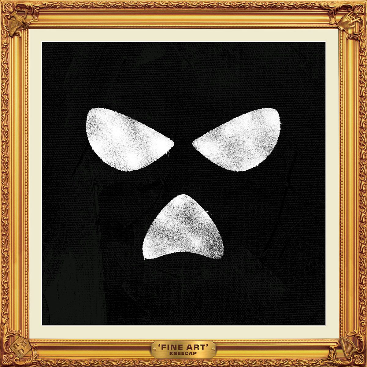
Kneecap, Fine Art; Label: Heavenly Recordings
Irish trio Kneecap’s debut album, Fine Art, presents a kind of heady rap opera staged in The Rutz, a fictional pub in their home district of West Belfast.
The album artwork nods to the balaclava typically worn by group member DJ Próvaí (though his is usually in the Irish tricolour), which has also become the band’s de facto logo. Here, the balaclava is enshrined in an ornate frame embellished with some carefully chosen motifs, including an Irish harp and a hand holding a joint. The reverse side is even more detailed, with both practical information and irreverent messages seemingly stamped on the back cover, along with a fake bit of hanging wire.
The album release was followed up by a semi-autobiographical film which, ironically considering their stance on the British establishment, won at the British Independent Film Awards among others.
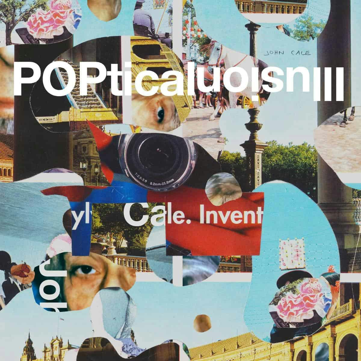
John Cale, Poptical Illusion; Label: Domino
John Cale’s latest album, Poptical Illusion, sees him go to optimistic, dreamlike places, which is reflected in the album design.
Designed by Rob Carmichael at LA studio Seen, the record features abstract collages by Bjorn Copeland throughout, including a cover artwork that maintains the tactility of hand-cut photographs, which is welcome in an age of digital precision and seamlessness. The album title is partly upside down, bringing just the right amount of disorientation while still being broadly readable and balanced.
But the real delight of the entire package is the intricate paper pop-out object by paper artist and designer Kelli Anderson, which takes the already layered cover artwork and transforms it into an illusory construction deserving of the album title.

Fontaines DC, Romance; Label: XL Recordings
Fontaines DC’s first studio album since signing with XL Recordings saw the Irish group push their palette of sounds to new, unpredictable places, purposefully subverting presumptions around the album title, Romance.
This is expressed on the cover, which features the album title rendered in an acid green gothic typeface that pushed the album’s concept to the fore. “Felt like a word scary enough to try to avoid but it was simply impossible to do so in that colour. The rest came from that neon green word,” guitarist Carlos O’Connell told CR in a conversation about the album visuals and the band’s desire to evolve the aesthetics of rock music.
The album cover features an illustration by Lulu Lin of a heart-shaped head, the shiny texture of elastic pulled taut, quietly weeping. XL Recordings art director Texas Maragh explained that the album’s illustration and overall design needed to match the scale of the music: “We wanted to create a sense of the artwork bursting out of the packaging, like it was too big to be contained.”
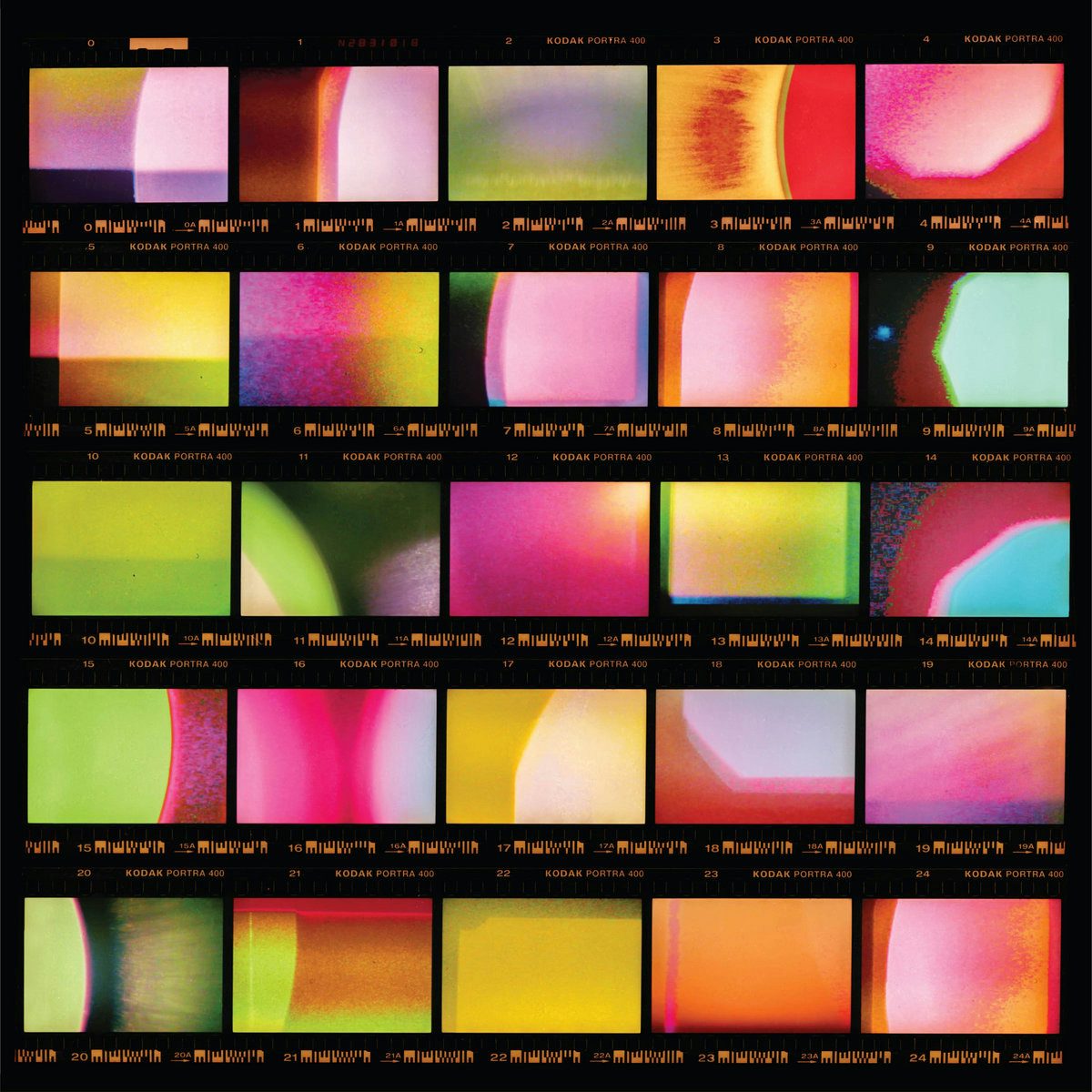
Wendy Eisenberg, Viewfinder; Label: American Dreams
The jazz artist’s experimental album Viewfinder explores “what happens when you reach clarity and it throws you off-balance, and what it means to love something without understanding why you love it”, according to the label.
That sense of clarity underpinning the record operates on several levels – in the emotional sense, but also in a literal sense, in that it’s Eisenberg’s first album since having laser eye surgery.
This is channelled into the striking album cover conceptualised by Richard Lanz, which takes the simple form of a contact sheet and turns it into an abstract evocation of Eisenberg’s experience during the surgery. “You have to stay awake for a surgery and see the visual effects the laser going into your eye has on you,” Eisenberg said. “And because cameras are modelled after the fashion of our own eyes, the way that the light is shifting when the laser is doing its job … you kind of see something as experimental as a camera process happening in your eye.”
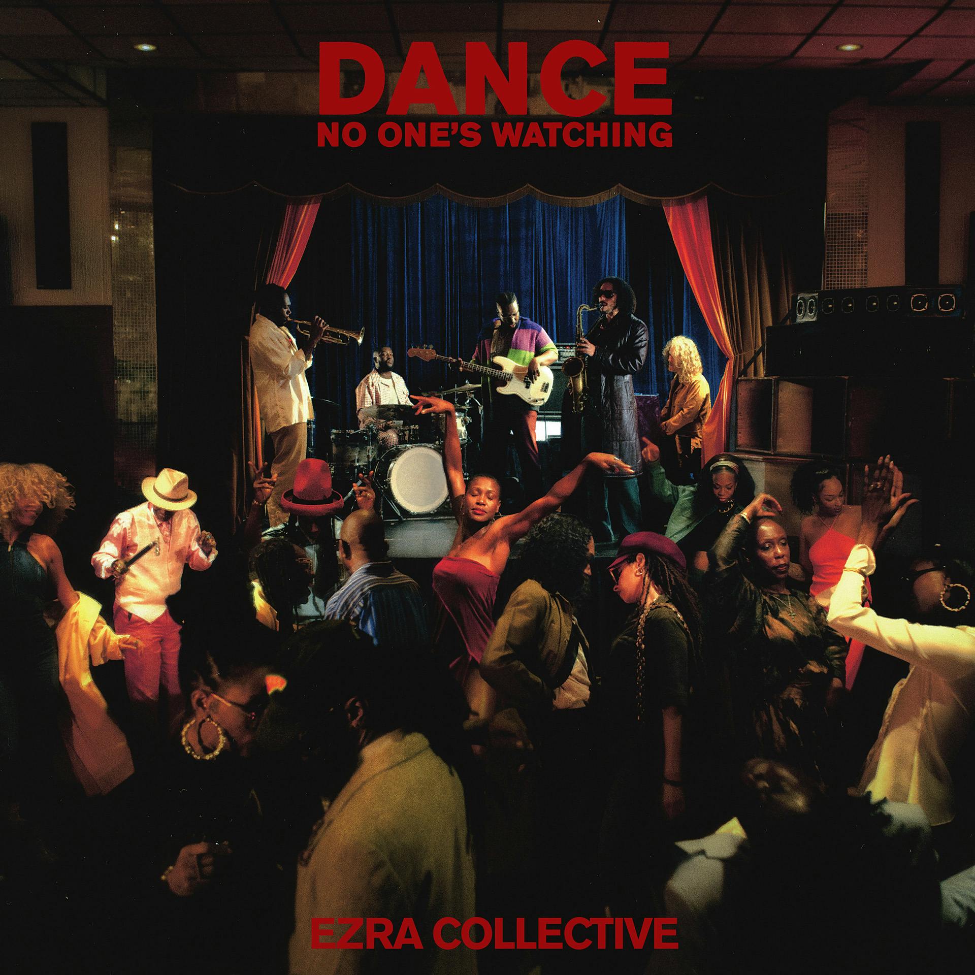
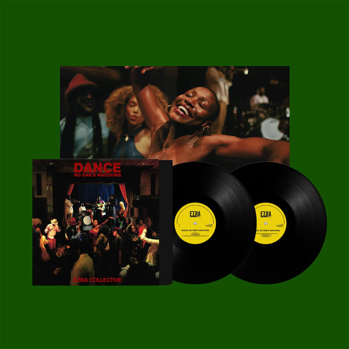
Ezra Collective, Dance, No One’s Watching; Label: Partisan Records
Mercury prize-winning Ezra Collective’s latest album, Dance, No One’s Watching, is a love letter to the dancefloor and the power of collective music experiences.
Photographed by Marco Grey, who worked with his colleague Jeremy Ngatho Cole at Yout across the entire album creative, the cover art presents a densely filled dancefloor that sits somewhere between a collage and tableau photography, where every individual is the star and yet they come together as a whole. The vinyl packaging features another beautifully shot image across the gatefold.
The CD version comes with a zine booklet designed by Shea McChrystal that houses the disc, offering a nice attention to detail for an often-overlooked format.
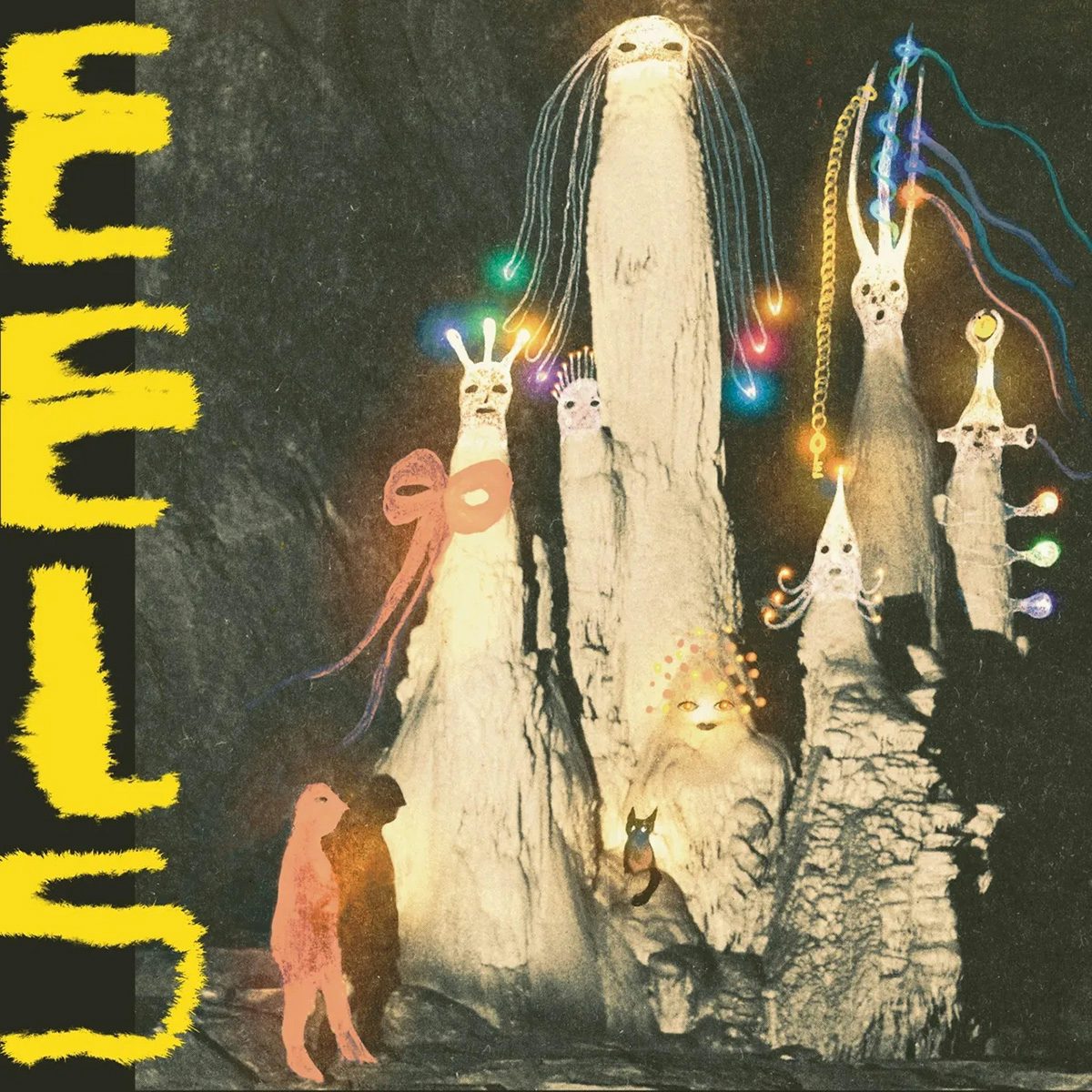
Being Dead, Eels; Label: Bayonet
Being Dead’s sophomore album Eels is described by their label as a “darker record” than their last. “Like its animal namesake suggests, the songs on Eels are malleable, the record like slithering through murky waters or strange half dreams, mysterious and beautiful in how it moves, reflective in a wavering sheen.”
The scene is set by the haunting cover artwork by Julia Soboleva, whose murky, obscure vision is a solid match for this strange underworld conjured by the music. On the cover, Soboleva has created a range of “spectral” beings that seem to be a blend of stalagmites, deep sea creatures, and 70s children’s TV characters.
The special bundle comes with a magnet, an illustrated eel bookmark, and marbles contained in a bag of their own – just so you don’t lose them.
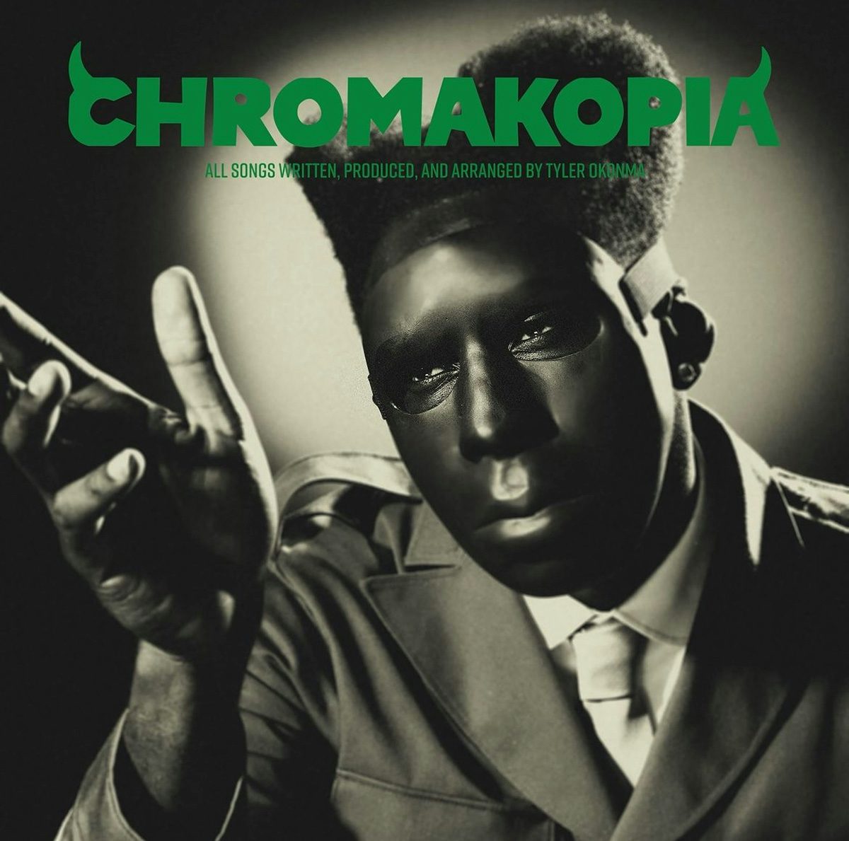
Tyler, The Creator, Chromakopia; Label: Columbia
After having told fans that there would be no new music from him this year, Tyler, The Creator (real name Tyler Okonma) surprised people with a teaser for a new album, Chromakopia. It introduced fans to his latest conceptual universe, which was cemented in a sepia-toned, Ayo Edebiri-fronted music video that came soon after.
The album’s aesthetic has the trappings of a horror – green fanged lettering, plus a custom ceramic mask that gives Friday the 13th vibes – which was fitting for its release around Halloween. However, the visuals mainly nod back to slightly older references, including studio portraits from 1930s and 1940s Hollywood and an Alfred Hitchcock screentest. “He wanted the cover to feel like it came from a film of that era,” explained photographer Luis Perez, who is part of Okonma’s trusted creative and production team.
And yet, these are more than just stylistic choices; the mask acts as a layer of protection allowing Okonma to go to deeply personal places in the lyrics. The result takes noirish tropes and refracts them through Tyler, The Creator’s (masked) vision.


