The beautiful and brutal world of title design
Title design is in decline, though remains a powerful way of engaging audiences in film and TV. We talk to designer and filmmaker Filipe Carvalho about how the industry has evolved in the past two decades
There are certain design opportunities that remain the holy grail for those entering the creative industries. While vinyl records may have become a niche purchase, the opportunity to create a striking sleeve remains desirable to graphic designers, who are eager to enter a pantheon that includes the likes of Peter Saville, Vaughan Oliver and Jonathan Barnbrook.
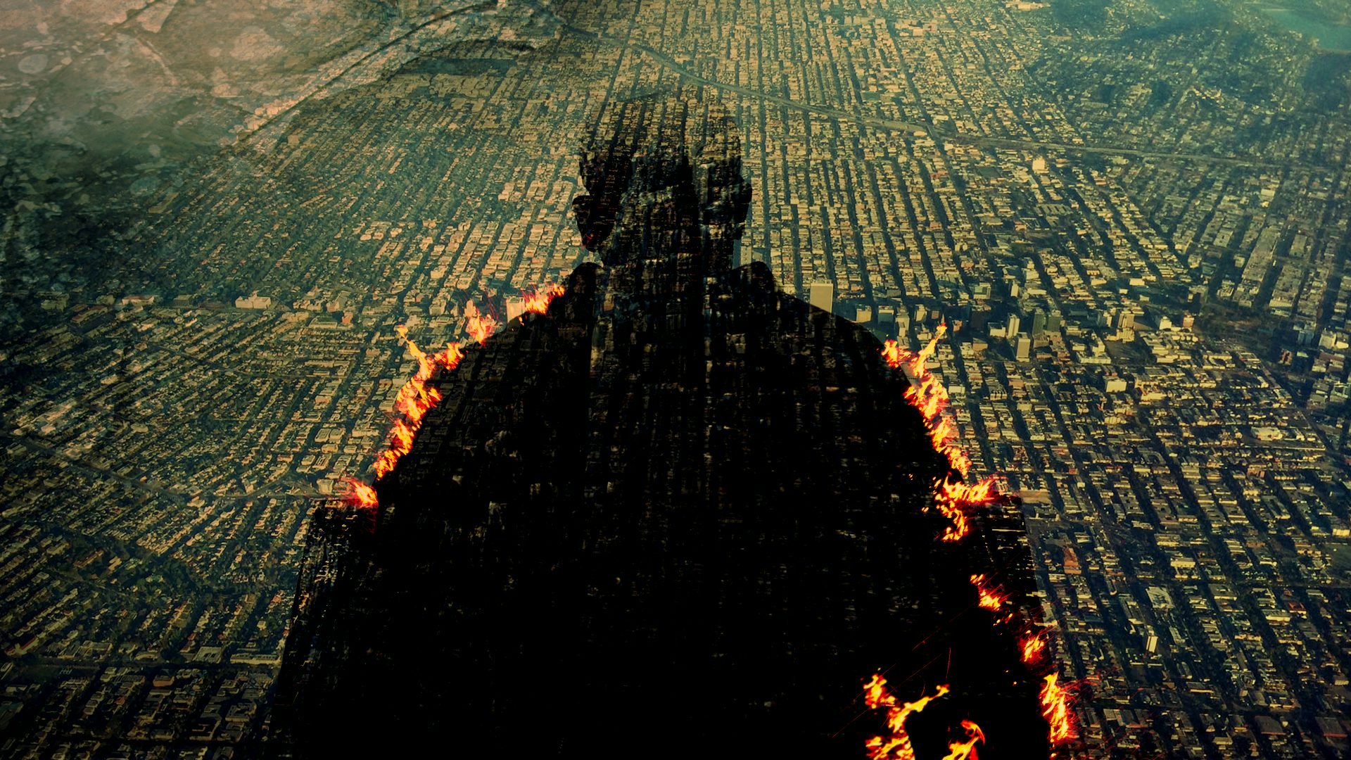
Creating titles for film and TV inspires equal passion. Titles set the scene of a story and draw audiences in, and the most effective ones feel an integral part of the success of the work: think Mad Men’s falling man, Seven’s gritty title sequence or The White Lotus’ indulgent opening credits (which caused a furore in the latest series when the showrunners decided to change the music).
But despite the love they can generate, titles are going through a tough period, according to director Filipe Carvalho, who spoke to me after his appearance at the recent Offf festival in Barcelona. “Film has been losing main titles for a long time,” he says. “There’s virtually no opening titles anymore in films … that’s been happening for quite a while.”