The Monthly Interview: Chris Ashworth
The designer’s new book spans everything from his formative period at Ray Gun magazine through to his corporate life at Microsoft. Here, he reflects on a career of two halves and his recent move back to the UK after 15 years away
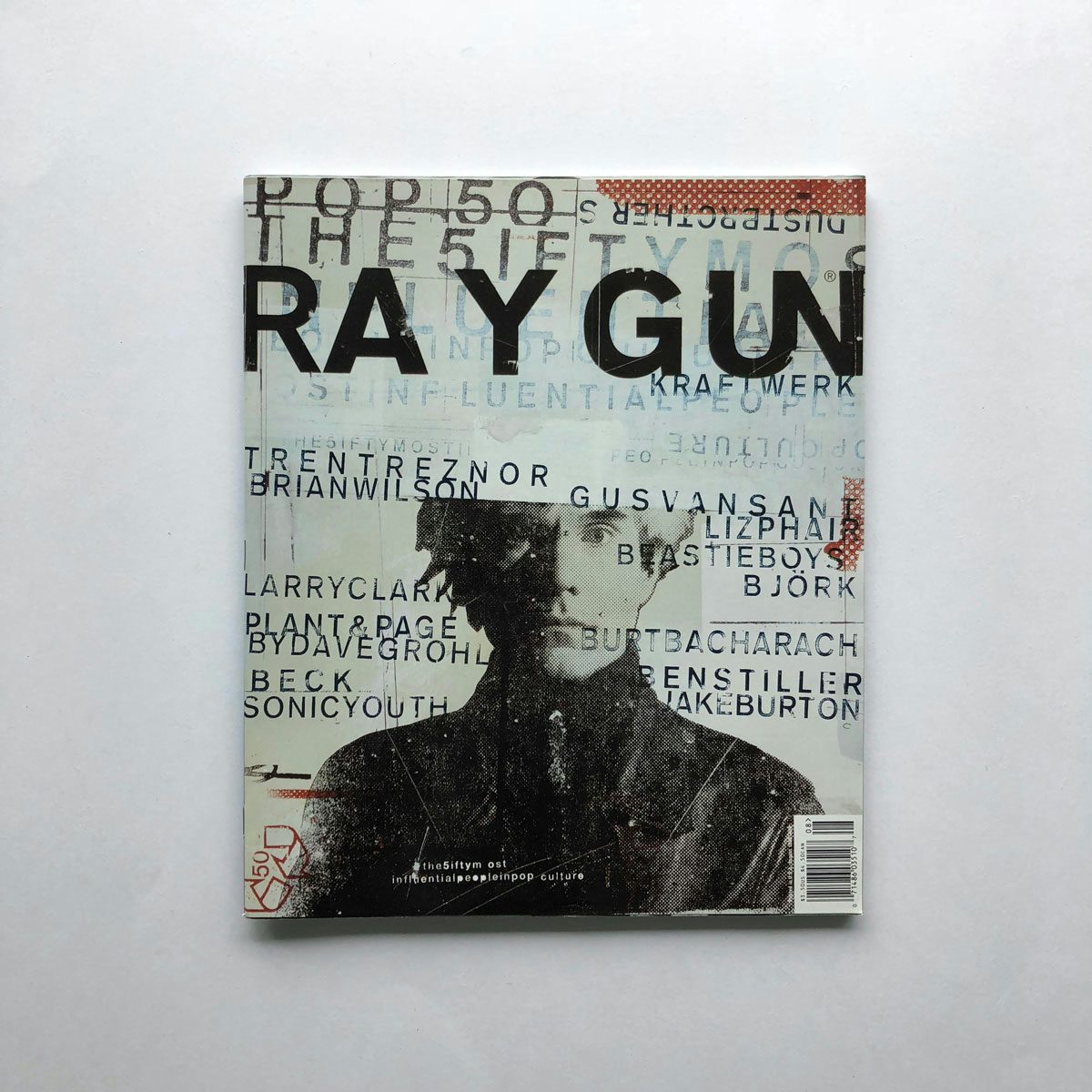
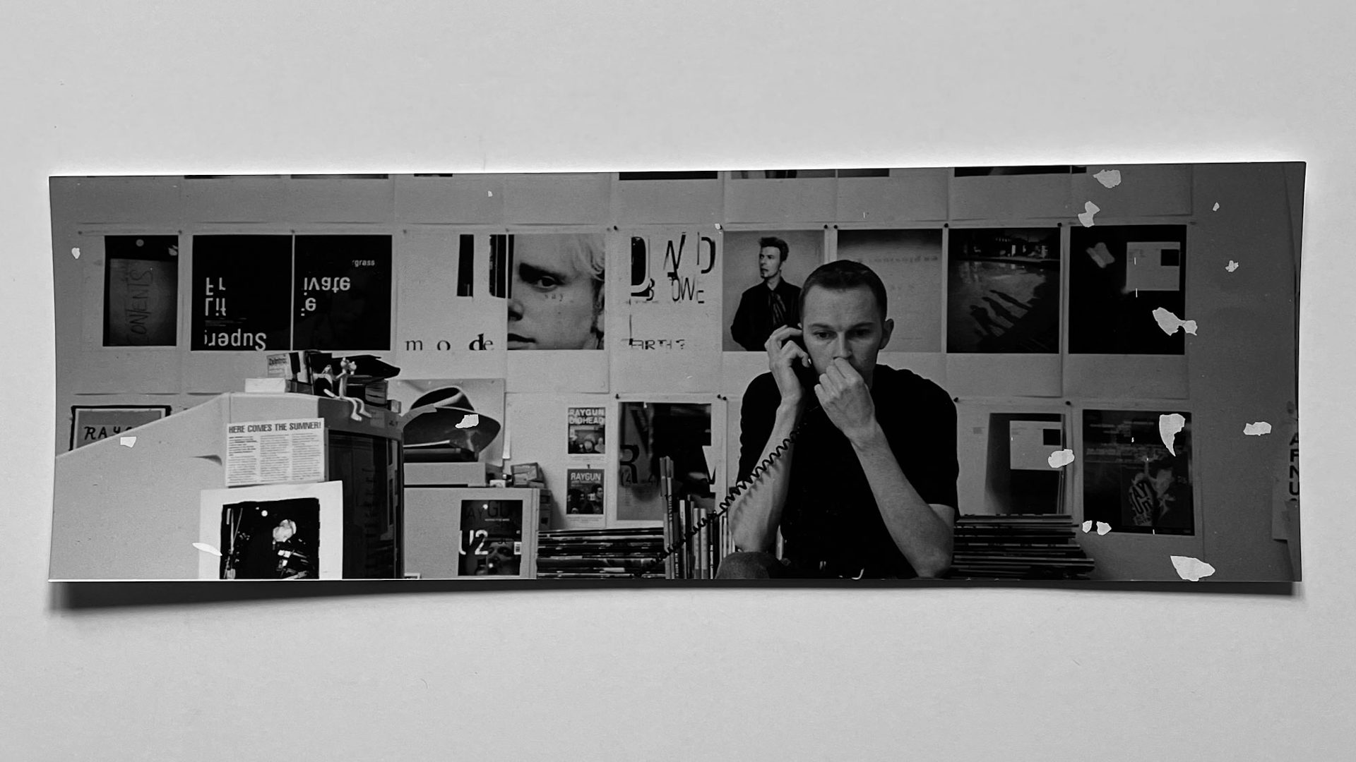
At a quick glance, Chris Ashworth’s CV reads like something out of the TV series Severance. Over the three decades he’s spent in the industry, he’s inhabited both extremes of the design spectrum; firstly, making his mark on two classics of 90s music magazine culture, Blah Blah Blah in the UK and Ray Gun in the US, at a time when wildly experimental typography was all the rage. And secondly, as a creative director in corporations such as Nokia and Microsoft, where he headed up global brand projects and managed a team of 25 people.
Designed and authored by Ashworth himself, his new book Disorder is his attempt to rationalise his double life in design. Drawn from his expansive personal archive, which has been back and forth with him in cardboard boxes during four relocations between the UK and the US over the years, the book’s subtitle – Swiss Grit – is a term that has come to encapsulate his design approach over the years.
Ashworth was originally taught by a Swiss designer in the late 80s while studying at York School of Art, so was well versed in the rigours and principles of Swiss typography and design. Then in the early 90s, when he was spending most of his time designing flyers for clubs, he was exposed to David Carson and Why Not Associates, whose work moved him in the same way the Swiss masters did. “Swiss Grit then,” he says, “is essentially Swiss graphic design with some soul. With some serendipity and chance shaken up alongside some rigour and sans.”