
Celebrating Penguin Books at 90
We reflect on Penguin Books’ formidable design history on its 90th birthday, and reveal the winners of its annual Cover Design Award
This year, Penguin Books turns 90. Founded on the simple premise of making books more accessible to more people, from the outset the company was helped in its mission through its application of design. With the belief that quality literature should cost no more than “a ten-pack of cigarettes”, as founder Allen Lane had it, within a year of the first Penguin paperback’s appearance in July 1935, three million of them had made their way into readers’ hands.
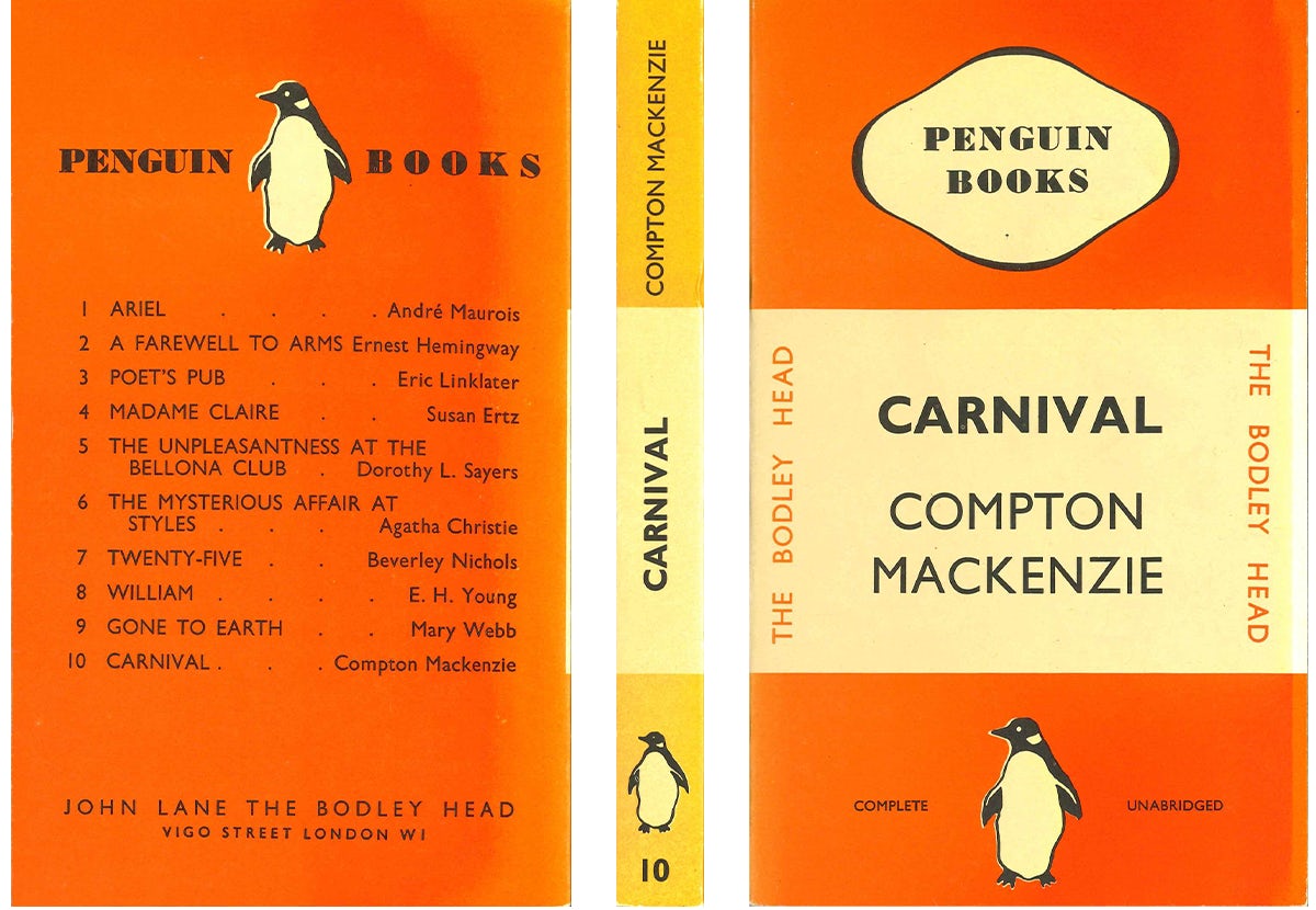
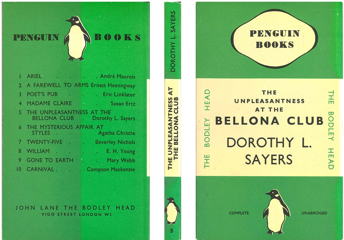
Design has remained central to the Penguin story since its first logo and horizontal grid ‘tri-band’ cover were devised by a 21-year-old named Edward Young. By the late 1940s, Jan Tschichold’s modernist approach saw him refine Young’s inaugural system, while the role of designers Hans Schmoller, who established the look of Penguin Classics and Penguin Modern Classics, and Germano Facetti, who innovated and brought in Romek Marber’s famous grid (a template that defined Penguin once again in the mid-20th century), continued the evolution of a brand where more individualistic approaches to specific covers became more commonplace as time went on.
Today, Penguin balances a range of approaches to individual titles while retaining the requisite ability to create unified series designs, an approach that remains key to its success. In this, the company also manages to acknowledge its past while wearing its heritage lightly as it moves towards its centenary.
“It’s fundamental for all designers to understand their brand’s heritage, but progress must always be about the future, not looking backwards,” says Penguin Press art director Jim Stoddart. “Penguin today is a publisher of incredibly diverse authors and writing, so there is plenty of room for template-driven series and unique standalone projects to work side by side.”
Since 2001, Stoddart and his art department have been responsible for the design of an array of imprints – from Penguin Classics and Modern Classics and the relaunch of Pelican Books, to much-loved series such as Great Ideas, Clothbound Classics and Pocket Penguins.
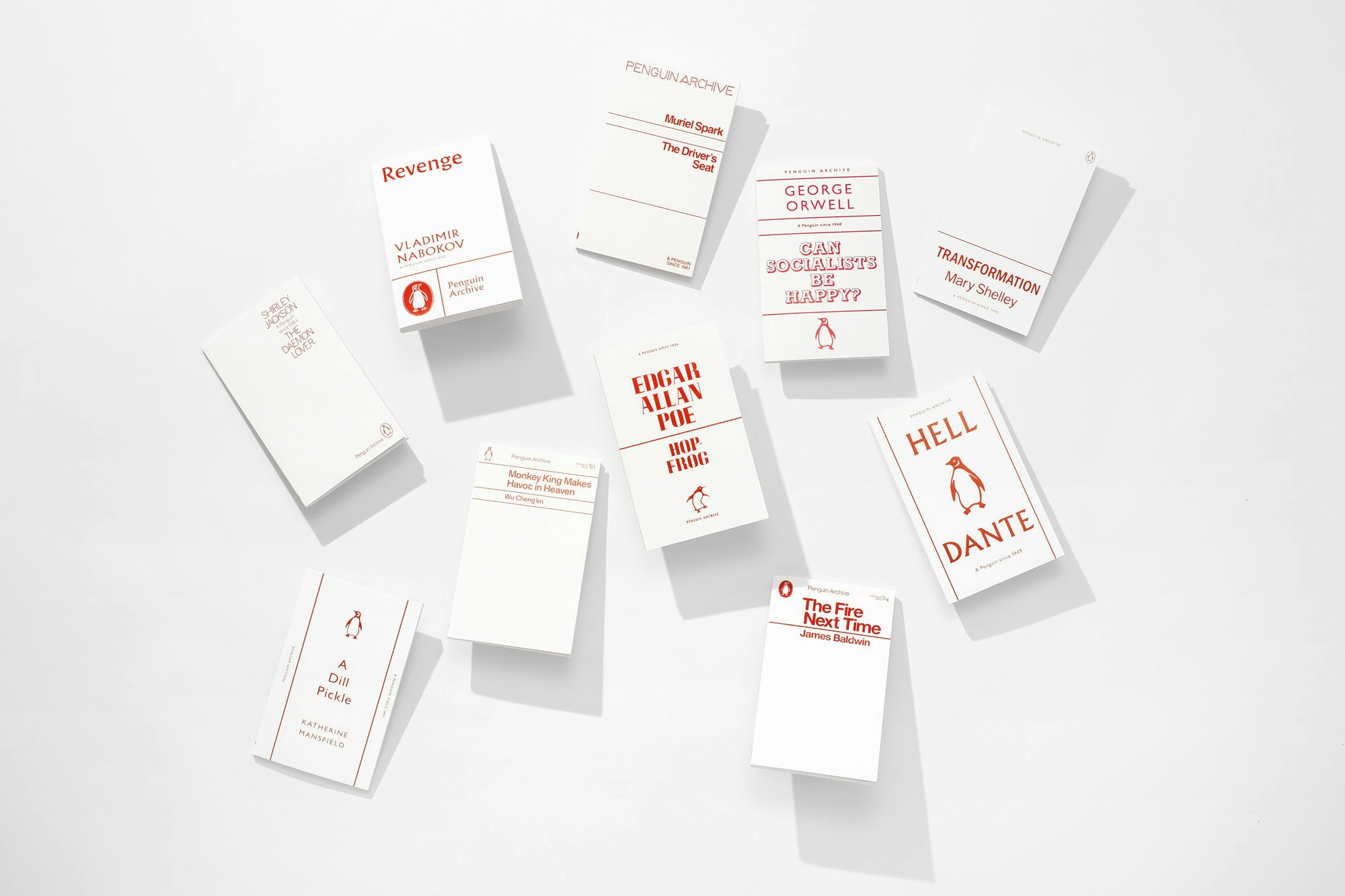
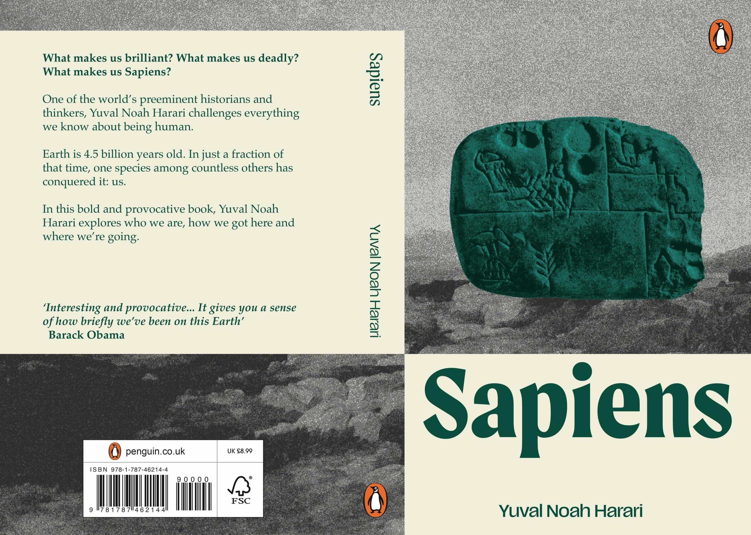
Marking Penguin’s 90th anniversary, Stoddart has been working on Penguin Archive, a new 90-book series celebrating Penguin authors from every period, with covers “inspired by memorable Penguin designs from each era”. The results honour everything from the tri-band style that “brought a revolutionary modernism to British publishing”, to the emergence of more image-led covers in the 1950s and 60s, the type deconstruction of the 90s and beyond. “I’ve never had more fun creating 90 book covers,” says Stoddart.
It’s this precedent for series design that suggested the theme for this year’s Penguin Cover Design Award, which saw an impressive range of entries from aspiring students and designers with less than one year’s experience in a creative role. Launched in 2007, the award aims to nurture new talent in the publishing industry via real cover design briefs written by Penguin art directors.
This year, entrants were invited to respond to a special one-off brief: rather than redesign an individual book cover, they were tasked with creating a new design system for paperbacks that would encapsulate the spirit of Penguin’s founding design principles: “bold, distinctive and mass market.”
It’s fundamental for all designers to understand their brand’s heritage, but progress must always be about the future, not looking backwards
“We thought it would be a good opportunity to devise a brief that made us look at what made Penguin special in 1935,” says Zainab Juma, Penguin’s head of brand, who was also one of the judges of the awards this year, “and boil down the product of those first ten paperbacks. What if you were to back-engineer that brief for Edward Young in 1935 and give that to someone today? What would that result in?”
Stoddart admits that it was a challenging brief. “Not only were designers required to represent a multiplicity of authors and titles within one design system, many have also then added illustrative elements to represent each book,” he says.
For one of the judges of the award, Penguin General’s art director Richard Bravery, the task was about considering “what is a relevant, unique and innovative design system within today’s way of consuming books”. Bravery adds that he wasn’t necessarily looking for “the most complete design system, but how [someone] could articulate visually commonalities between things”.
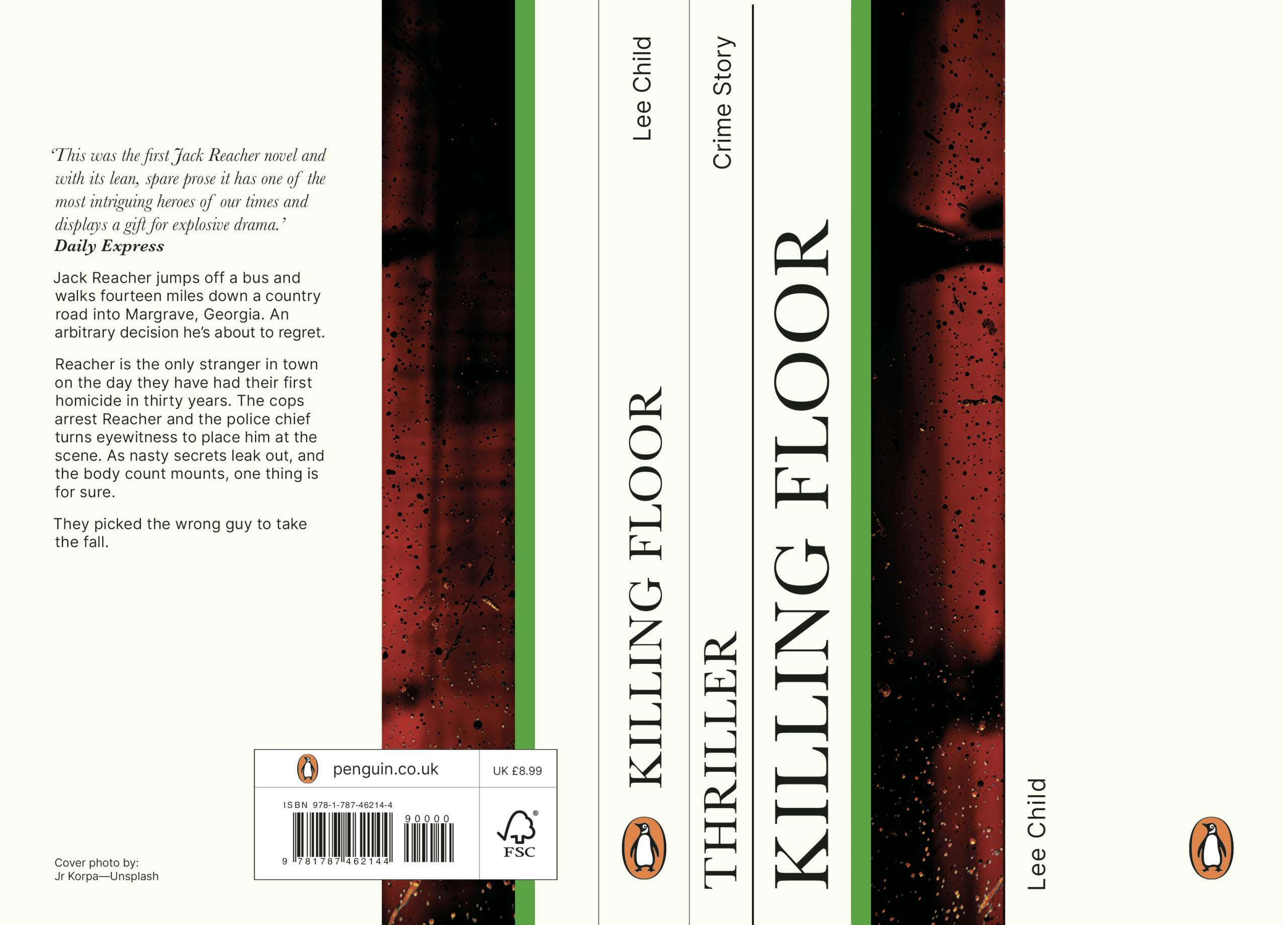
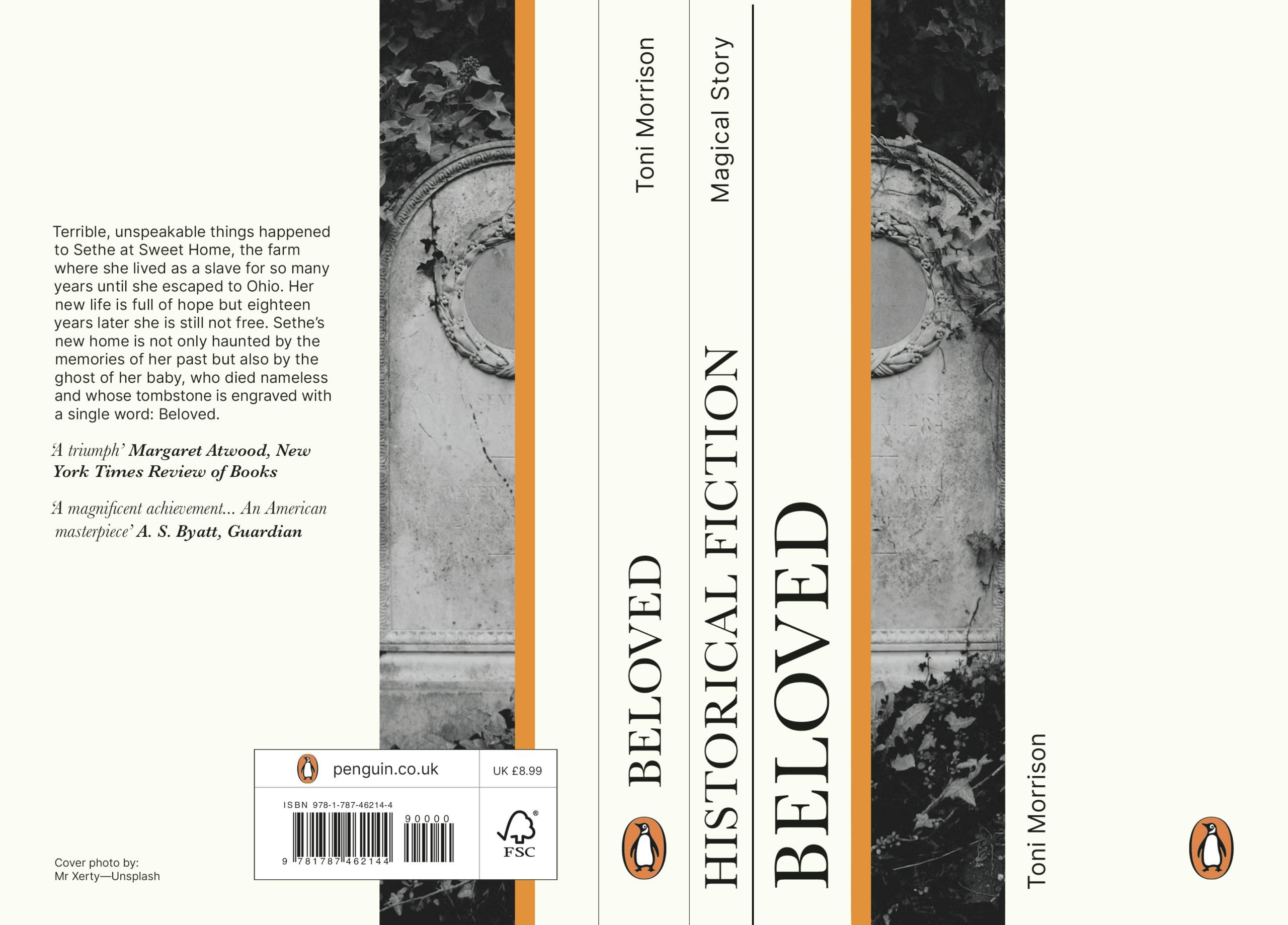
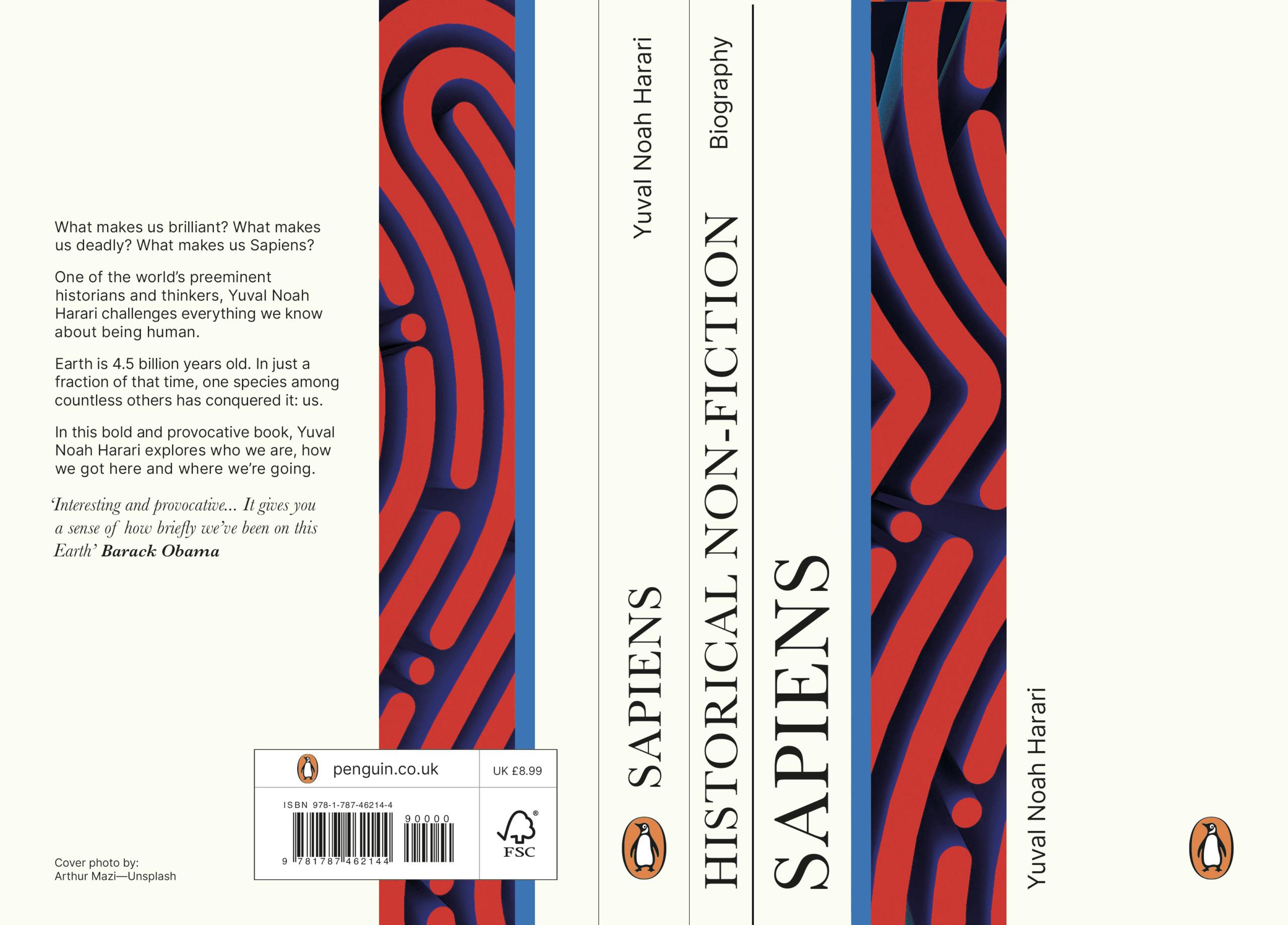
First place in this year’s competition went to Ella Dorrington, a graphics student at Leeds Beckett University. Her winning work stood out for a number of reasons. “I really appreciated the way that [the design] looked at how we consume content rather than this very structured way that we maybe see books,” says Bravery. “It was influenced by website design, or library categorisation; this idea of how we organise content … this instantly appealed to me in that it felt like it was speaking to the way we consume content in a modern way.”
“The coloured stripes in my design reference Penguin’s 1985 colour-coding system, updated to a contemporary palette that works for both print and digital marketing,” says Dorrington. “To create visual intrigue, photography is abstract, subtly hinting at the book’s theme. Challenging traditional cover conventions, I chose to incorporate the genre onto the cover, ensuring readers can instantly identify the book’s subject, no matter where they see it.”
Abby Muir, a graphics student at Nottingham Trent University, took second place, while Daniel Bossons, a graduate mechatronics engineer, took third among a shortlist of particularly strong work. Bravery says he liked the fact that in Muir’s work “we can see design systems in a pictorial way, as opposed to something which is a more formal grid”, and that Bossons’ designs stood out because of “the playfulness with the brand”. “They’ve created a ‘stamp of quality’, as opposed to a strict, structured grid or raster system.”
“After considering Penguin’s design principles, I decided to create covers that emulate the texture and colours of riso printing – while working around my lack of access to one,” says Muir. “I created halftone textures in Photoshop and used transparency settings to layer over colours. I used paintings, tapestries and artefacts from the Metropolitan Museum of Modern Art’s digital archive to achieve a distinctive look that references the content of the books.”
Of his designs, Bossons says: “My concept introduces a graphical border which roughly evokes the shape of a penguin bird. My aim was to create a simple, appealing graphic that leaves plenty of room for an illustration or photo and typography. Having gone with such an untraditional border graphic, I felt sticking with Helvetica would help to keep the design grounded and reminiscent of historic Penguin covers.”
As ever, the winning work has made the Penguin judges excited for the future. For Juma, many of the shortlisted projects gave her a chance to think about how a long-established and familiar brand is considered from an outsider’s perspective, one that might even suggest “the parameters within which we can play, given the really different context in which we run the brand today”.
With the Penguin Archive series recently hitting the shelves as part of the 90th celebrations, the brand has nodded respectfully to its past and offered a contemporary take on its own place within the history of publishing design, just as its Cover Design Award offers a glimpse of the talent of the future.
“There were very few submissions that answered the brief in a superficial way,” adds Bravery. “The brief demanded a greater degree of thought and ideas behind it. It’s really refreshing to see that ideas are still really celebrated.”


