Brimm’s identity eschews eco tropes
HarrimanSteel has created a vibrant brand for the new journal and shop that references playfulness rather than compromise
When James Haycock launched his own collective, journal and store this year, he wanted it to have sustainable principles baked in. But that didn’t mean the brand would have to show up in the world in a conventional way.
Instead of framing climate action in terms of compromises and sacrifices – which although reasonable steps in addressing climate change are hardly an easy sell – the idea is to show that life can still be full of pleasure while caring for the planet at the same time.
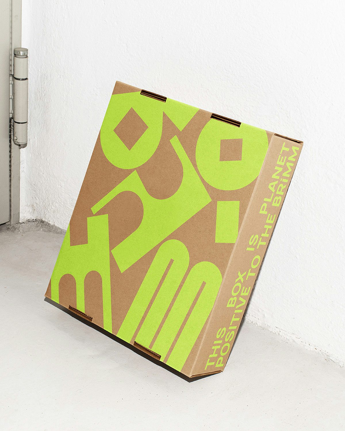
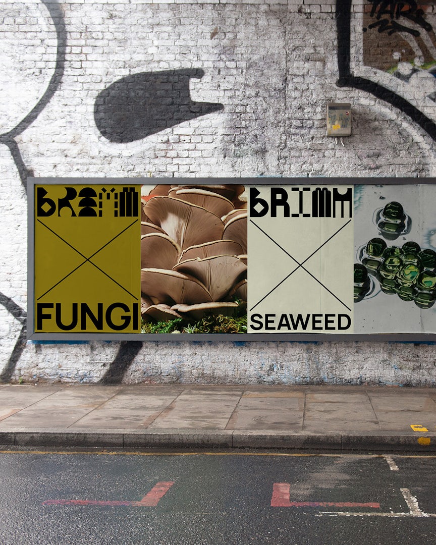
This is encapsulated in the brand name, Brimm, which refers to the notion that life is full enough without overproduction and overconsumption. The brand name is stylised as BRiMM, with a lowercase ‘i’ designed to draw attention back to the individual role in climate action.
To align with the brand’s “climate-conscious mission”, the team at HarrimanSteel – the agency behind the branding – aimed to embed sustainable practices into the branding and implementation, after learning about “how even the smallest visual decisions might impact the environment,” says Nick Steel, co-founder of HarrimanSteel.
This is most apparent in the animated modular wordmark, which features constantly transforming abstract letterforms, creating the sense that it is ‘living’. The animations use a file type that is substantially smaller than most gifs or videos, making it less energy-intensive, too.
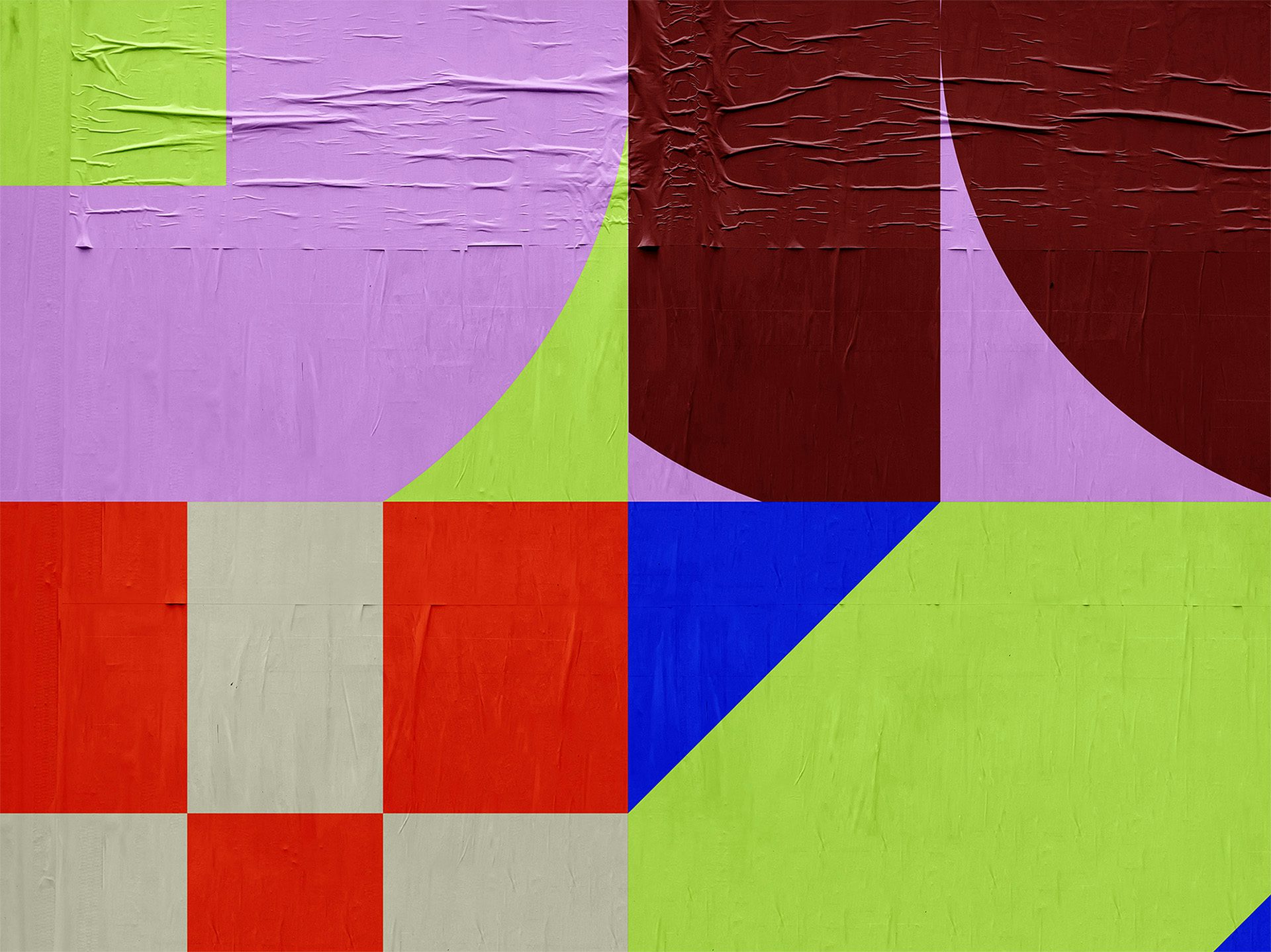
This sense of vitality forms the backbone of the identity. Rather than rely on tired leafy motifs and “guilt-driven slogans”, the team aimed to reinvigorate the visual and verbal language of climate action.
“We deliberately avoided the usual green palette and natural iconography. Instead, we leaned into colour and joy, positioning sustainability as something vibrant and inviting, not austere or limiting,” explains Steel.