AmplifyChange’s identity symbolises freedom
Studio Sana has redesigned the branding for the sexual and reproductive health organisation, using butterflies as a key motif
AmplifyChange was established ten years ago as a fund for grassroots sexual and reproductive health organisations. Since then, it has evolved to become a fully fledged non-profit of its own that provides vital support.
Over time, its identity struggled to reflect the scale of the work it was doing, so the organisation turned to Studio Sana to bring its branding up to speed and address issues around flexibility and accessibility.

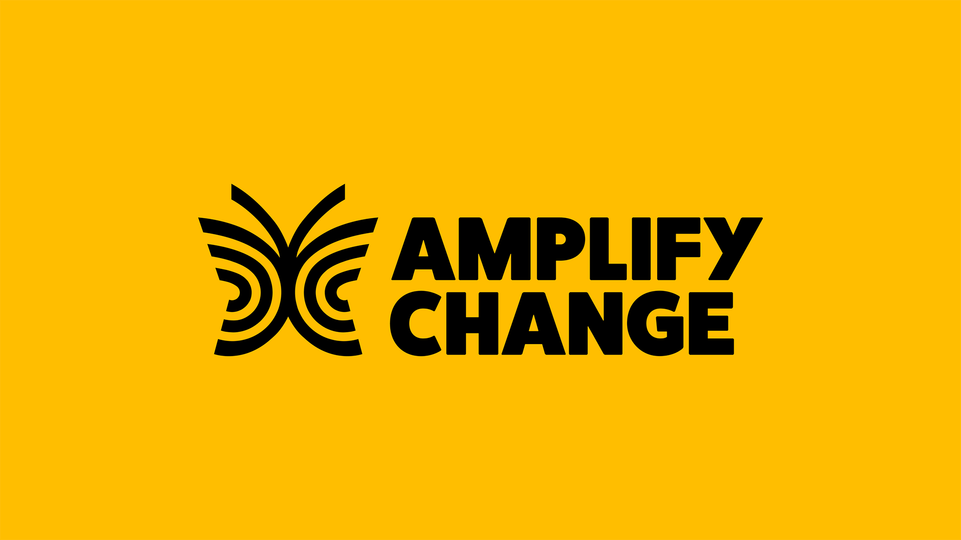
The redesign is centred around the symbol of a butterfly, chosen because in many cultures it symbolises metamorphosis, freedom and renewal. It serves as a poignant motif in a time where reproductive rights and bodily autonomy are being rolled back in many countries, including the devastating overturn of Roe v Wade in the US.
The line-based design used in the main logo has been extended to a new icon set for the organisation, helping to create consistency across the identity.

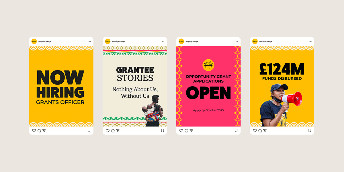
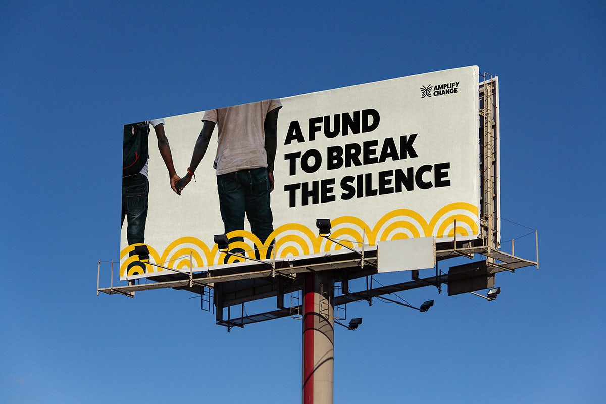
The new colour palette and suite of patterns are drawn from South Asian and African textile design, reflecting the regions in which most of AmplifyChange’s partners are based. The graphics can be used in assets to bring fresh energy and vitality to photography.
According to Studio Sana, “The visual identity places AmplifyChange’s vision at the heart, that they’re more than a fund but a movement builder driven to attain SRHR for all.”
