JKR creates data-driven identity for Centersquare
The branding for the US data centre hopes to buck category conventions with a bright colour palette and adaptable data-based patterns
Centersquare, the largest data centre in the US, has worked with branding agency Jones Knowles Ritchie on the development of a new identity for the company, which was founded earlier this year through the merging of Cyxtera and Evoque.
Specialising in colocation and data centre services, Centersquare hopes to transcend category norms with its new name and brand system. “The challenge isn’t just making something bold – it’s making something bold and unique while still feeling trustworthy and relevant,” says Scott Fogel, group strategy director at JKR.
For the agency, the project’s success was dependent on its ability to create an accessible, inviting and lasting brand. Whereas many competitors in the sector fall prey to tired tech clichés – from unpronounceable brand names to stock images – Centersquare wanted to break the mould.
The design team first looked to the world of luxury and premium products for inspiration on how to do this, focusing on car, watch and hospitality brands as models for success. “These are masters at creating immersive, aspirational experiences,” explains David Balsamello, creative director at JKR. “They’re purposeful, with a sense of pride and badge factor, where the name itself carries weight. We wanted that same timeless confidence.”
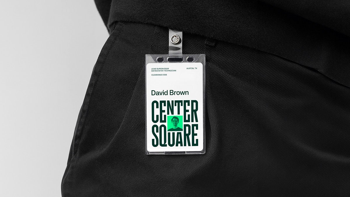
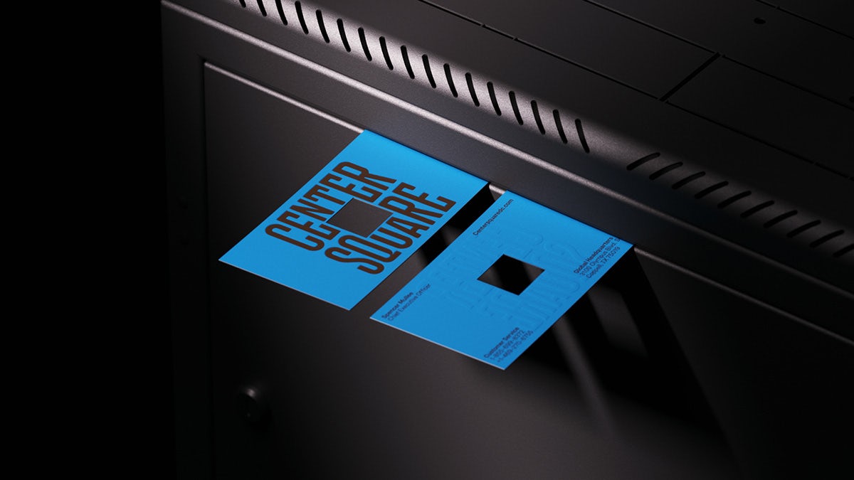
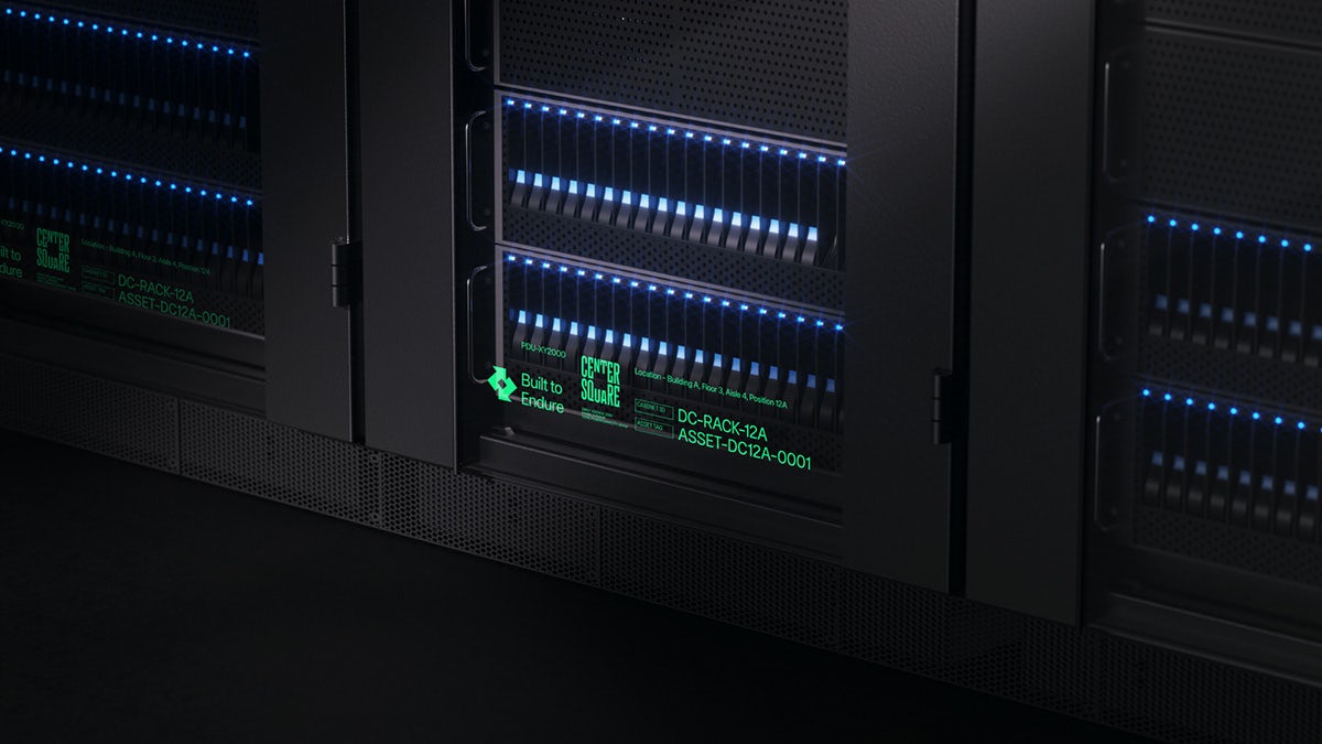
The team developed an eye-catching wordmark built around a playful interpretation of the brand name. Using custom letterforms, the words ‘center’ and ‘square’ are positioned around a blank, square space in the middle of the design, alluding to the name but also cleverly creating an opening for a range of graphics and imagery. The letterforms were created by typographer Simon Walker to “symbolise stability within a dynamic structure”, according to the agency. There is also a secondary wordmark for “versatile application”.
Looking to stand out even further, the team at JKR also created a warm, vibrant colour palette to contrast with what the agency calls the “cold corporate aesthetic often associated with tech”. Bright pops of blue, green, yellow and pink balance out other more minimalist aspects of the branding, and position Centersquare as a dynamic, future-facing company.
Other key elements of the identity include custom iconography based on square grids; an isometric illustration style to bring clarity to complex information; and a new UI system and website that create an engaging and reassuring user experience for those wishing to explore the company’s offerings.
Adaptability has played a central role in the branding in keeping with Centersquare’s tagline: ‘Infinite Flexibility. Absolute Certainty.’ The brand’s primary typeface, Systemia by Peregrin Studio, was chosen to flex from small spaces to large headlines. JKR also collaborated with Variable.io on a custom data visualisation tool that transforms real raw data into dynamic, adaptable patterns that form the centrepieces of the logo.
Jason Little, executive creative director at JKR says: “The data-driven design highlights what Centersquare’s clients care about most – flexibility – constantly adapting to make the brand as dynamic as the business itself. Centersquare is disrupting the codes of the sector by elevating what makes it unique, rather than focusing on the norms of the category.”
It is another case of a company in a less glamorous sector embracing design. “Branding for ‘dry’ sectors is more freeing than challenging,” says Fogel. “The bar is generally lower – after all, there’s no Coke or Nike to outshine. But doing it well is harder than it looks.”