Vietnam’s leading sneaker brand launches a new identity
Biti’s Hunter, one of Vietnam’s most popular sneaker brands, marks a new chapter with fresh, dynamic branding by M-N Associates
It’s been nearly a decade since footwear company Biti’s – which was founded in 1982 – released its first Hunter sneaker. Now a brand in its own right, Biti’s Hunter has become one of Vietnam’s most recognisable sneaker brands, selling millions of pairs globally and making up the majority of Biti’s overall revenue.
“However, as the brand expanded, it faced difficulties in maintaining its uniqueness,” explains the team at Ho Chi Minh City-based studio M-N Associates, which recently overhauled the branding and packaging for the company.


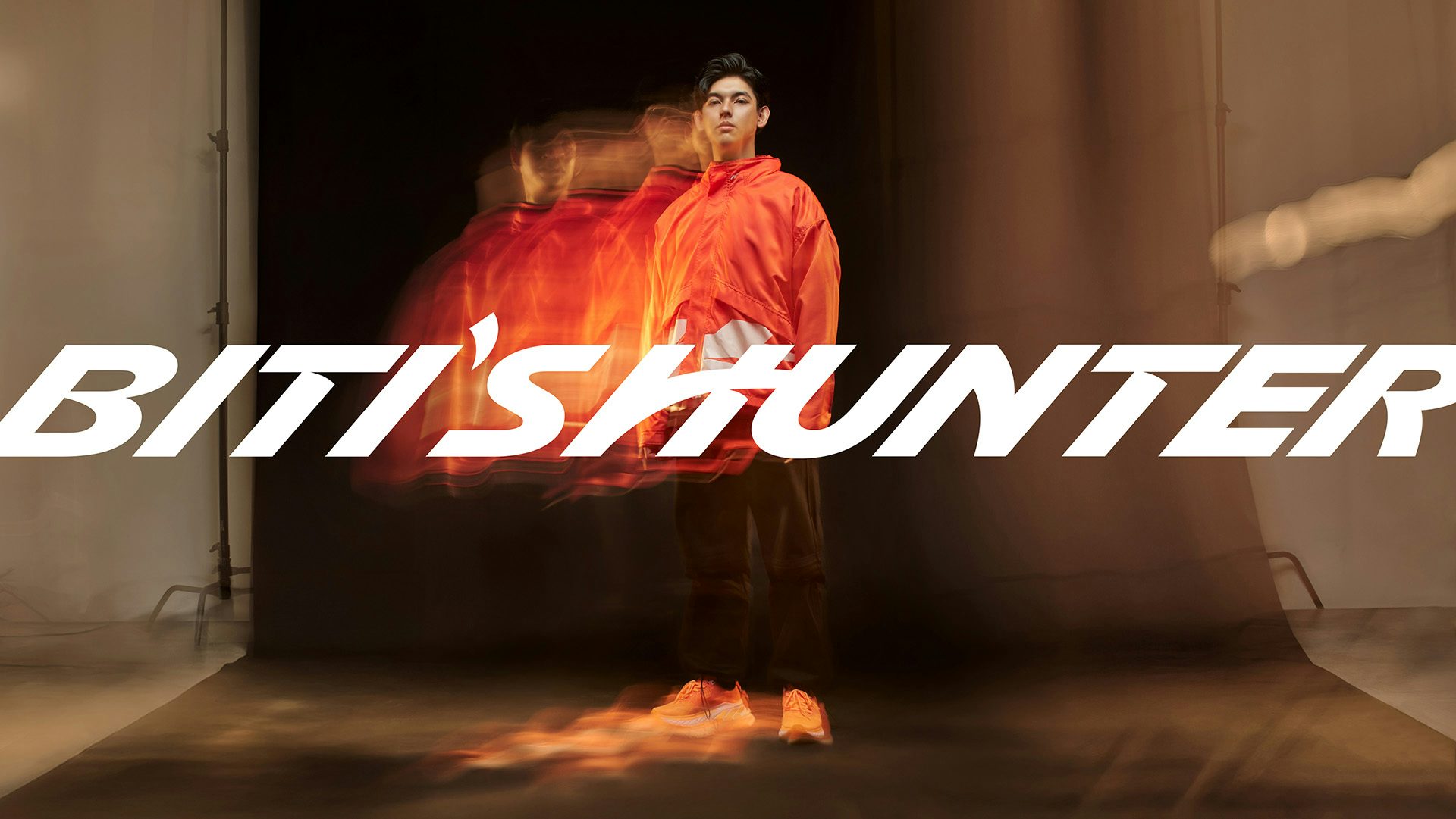
At the heart of the branding update is the new logo, which draws on the original Biti’s Hunter wordmark and elevates it into a more contemporary and forward-facing design. Notably, the logo incorporates an abstract bird mark through the ‘H’ in ‘Hunter’. This new, dynamic letterform symbolises “freedom and expression”, but also the start of a new chapter for the brand.
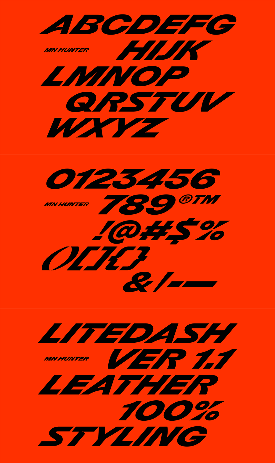
Elsewhere, the MN Hunter custom display typeface features tilted, forward-leaning characters evoking progression, while “sharp cuts and edges evoke boldness and resilience”, according to the design studio. However, the typeface also nods to Vietnamese cultural heritage, including curvatures inspired by the conical headwear known as nón lá. As a result, the new branding looks to history while feeling energised and ready to take on the saturated global sneaker market.

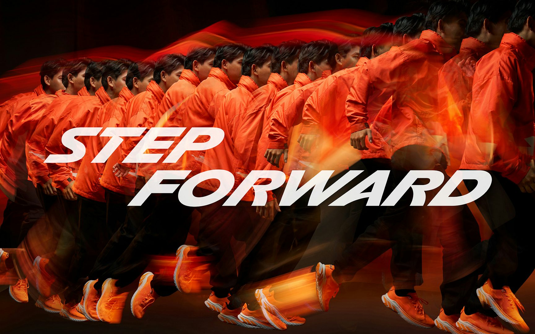
These updates play out not only within branding materials and a redesigned website, but also across the product itself and packaging, where the brand had previously been struggling to assert a unique identity. The new Biti’s Hunter sneakers feature the tilted ‘H’ letterform, which speaks to ideas of movement, pace and progress, while the sneaker boxes showcase the wordmark in full, as well as the brand’s new tagline: ‘Step Forward’.
“Rooted in Vietnam’s heritage and fuelled by modern aspirations, the rebrand introduces bold, innovative designs that honour tradition while embracing forward-thinking innovation,” according to the team at M—N Associates. “At the heart of the rebrand is a call to action: step forward – into new experiences, into self-expression, and into a global stage.”


