
A decade of posters for theatre company Soho Rep
NYC-based designer Naomi Usher talks about the intimate creative process involved in designing posters for experimental theatre
Avant-garde theatre company Soho Rep has been based in New York’s Walkerspace theatre for the past 30 years. Coinciding with the closure of that space, the theatre company (which is moving to a new location) recently opened its doors to the public to hold a three-day ‘wake’ celebrating the many artists that have made it what it is today. This included showcasing and selling off the extensive collection of posters from its plays over the years.
Eye-catching and deeply conceptual, these posters have all been designed by local branding agency Studio Usher. Run by the eponymous designer Naomi Usher, the studio’s team have worked closely over the last decade with Soho Rep to create posters that push the boundaries of the art and do justice to the pioneering spirit of this off-Broadway theatre company.
“Soho Rep is constantly experimenting with form and storytelling. This challenges me to create designs that are as original and as thought-provoking as the theatrical productions,” Usher says of their ongoing collaboration.
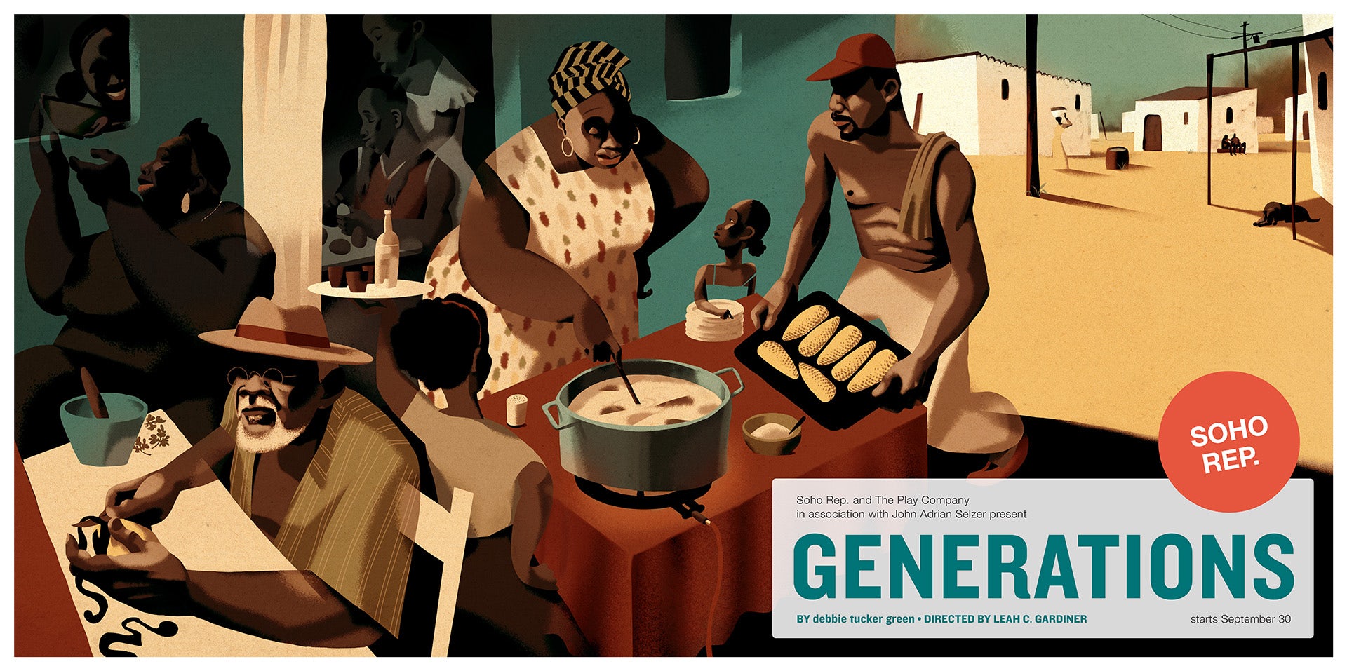
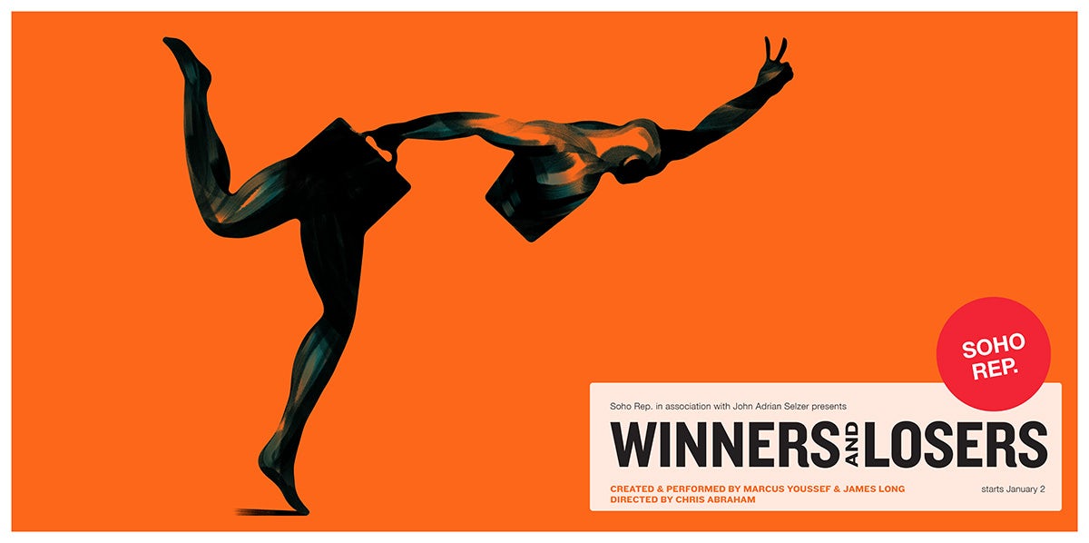
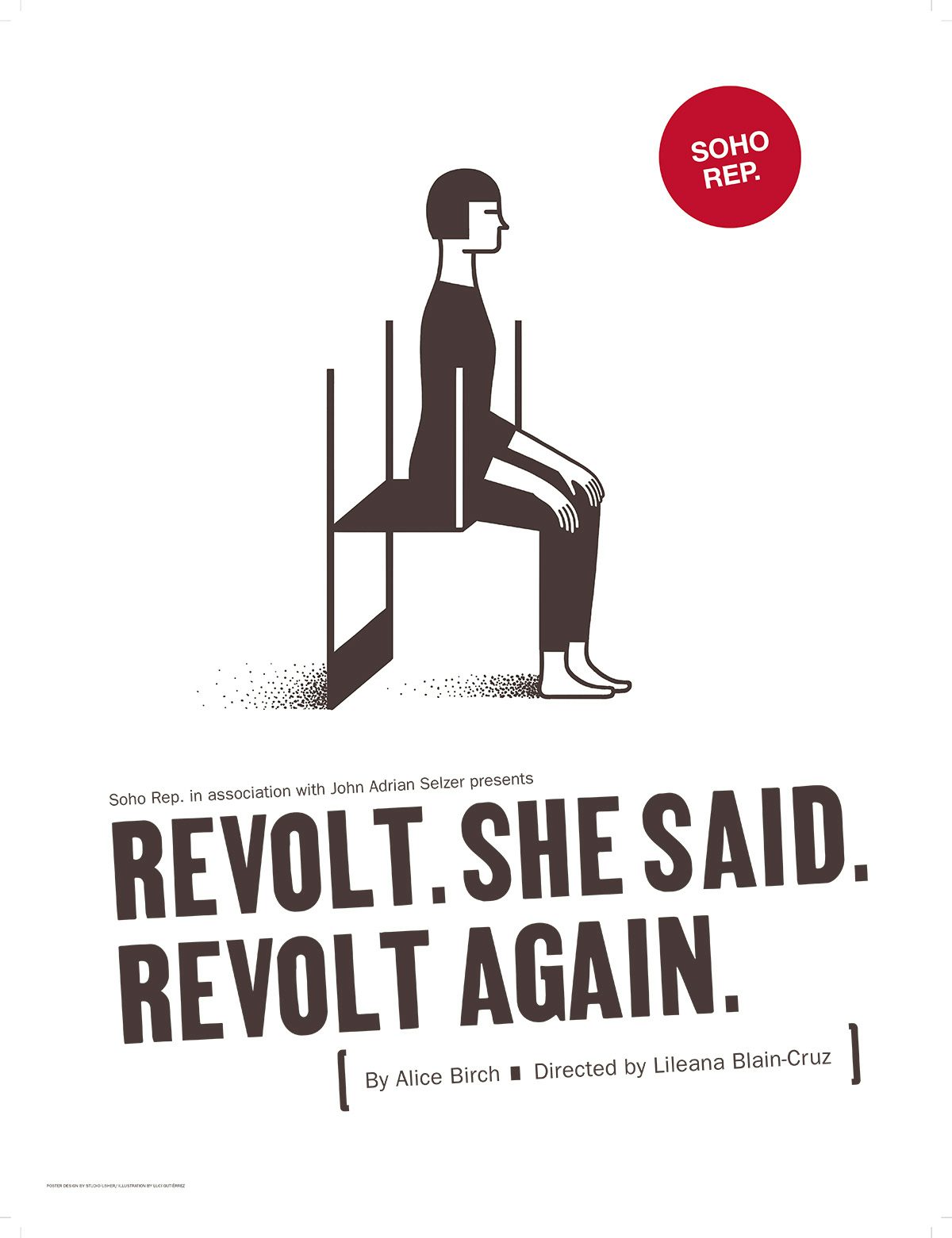
Featured within the collection are posters for stand-out plays such as the Pulitzer prize-winning Fairview by Jackie Sibblies Drury; Is God Is by Aleshea Harris, which is currently being made into a feature film; and David Adjmi’s Marie Antionette. Strikingly experimental, these productions are complemented by equally imaginative poster designs, which span mediums such as illustration, photography, and collage.
“Reading the script is essential, but a script and a live performance are entirely different experiences,” Usher says of how concepts take shape. “So I always meet multiple times with the playwright, director, and Soho Rep’s artistic leadership to get a full understanding of the production.”
However, Usher is not the only driving force behind the posters – her team often includes illustrators, photographers, designers and other visual artists, each chosen based on their connection with the play in question.
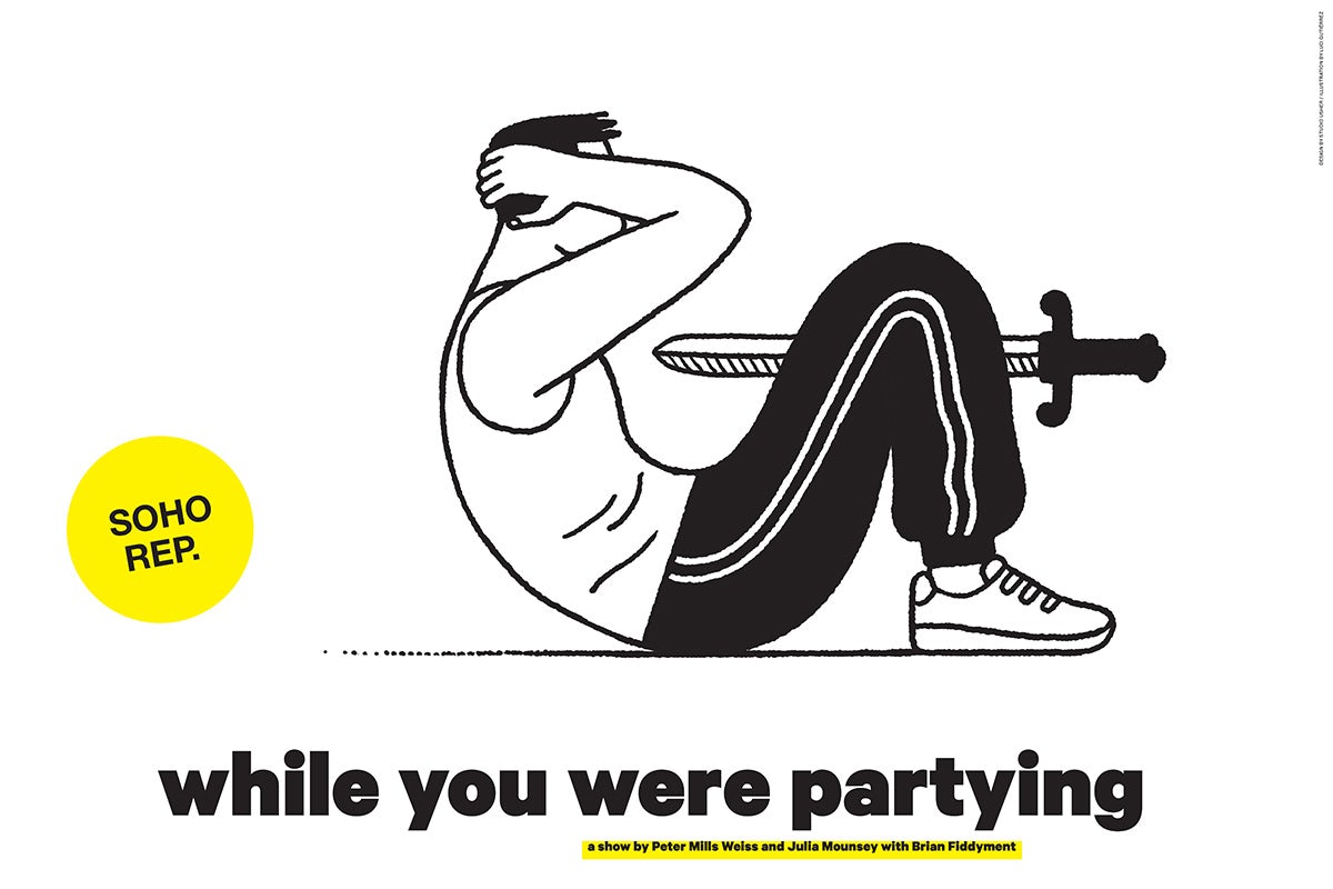
Usher highlights Luci Gutiérrez’s work on Julia Mounsey and Peter Mills Weiss’ production While You Were Partying as a prime example. Gutiérrez’s first language is Spanish, and she has previously reflected on language in her illustrated book called English is not Easy. “Her illustrations explore the nuances of the [play’s] language, which allows her to deliver ideas that surpassed the parameters of our brief,” Usher explains.
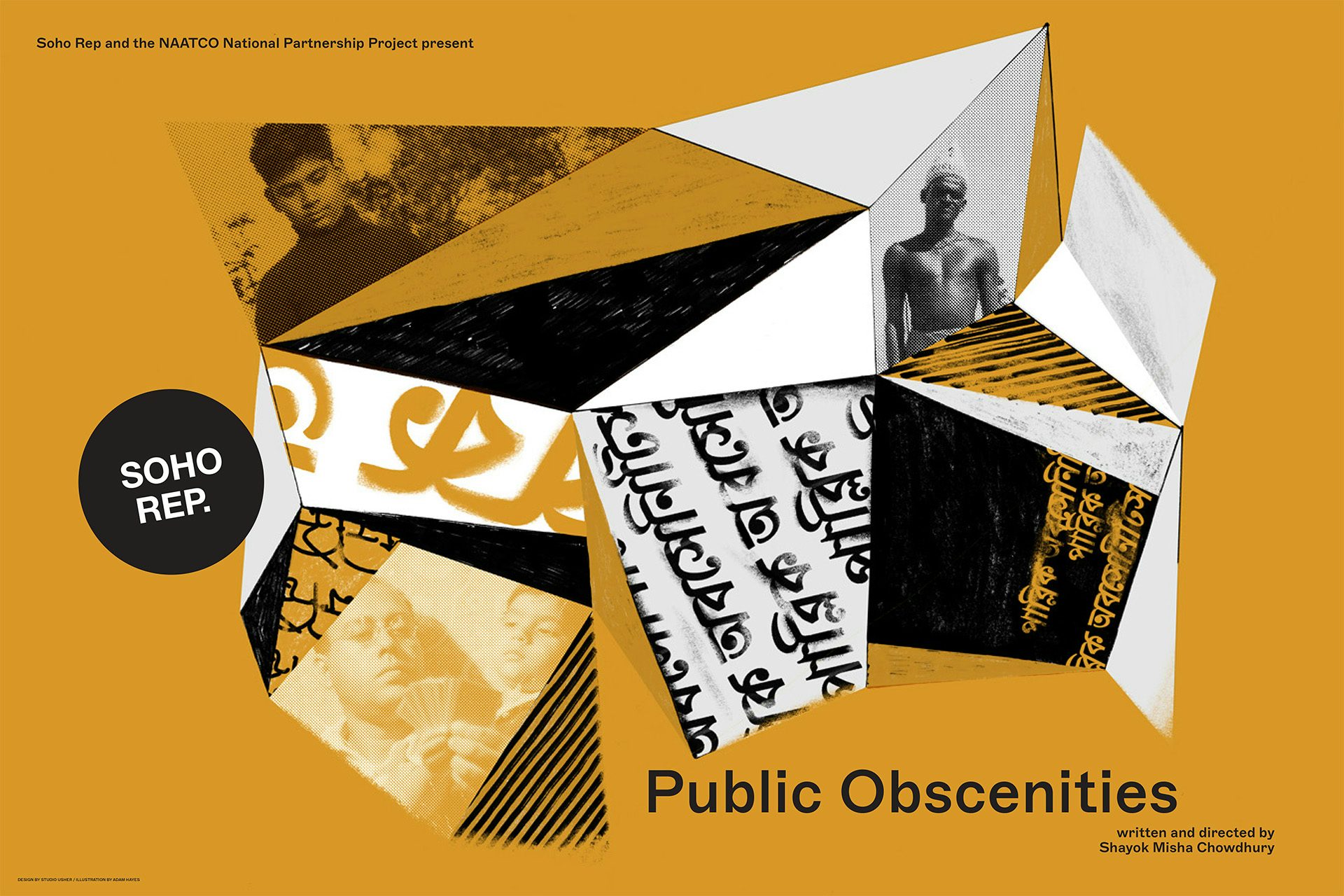
Another example is illustrator Adam Hayes’ poster for Public Obscenities (performed in both English and Bangla), for which he and Usher carried out “a fascinating exploration of letterforms”, which taught her “the complexities of designing in a language you cannot read”.
Speaking on the poster, the writer and director of Public Obscenities, Shayok Misha Chowdhury, notes: “I feel like I’m forever spoiled now, because collaborating with Naomi on the Public Obscenities key art was such a genuinely fun and surprising process. She approached the challenge of working with Bengali script – a language she’d never worked in before – not as a burden or obstacle but rather as an opportunity for aesthetic experimentation. The final poster was something I never could have dreamed up, and a piece of real art, not just a marketing object.”
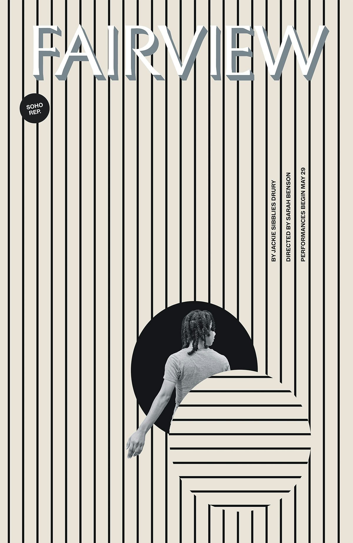
One of Usher’s more memorable experiences came with the poster for Fairview. Playwright Jackie Sibblies Drury and the show’s director Sarah Benson said “it should be bland, boring, and beige” and that “it should feel like Nordstrom”, Usher recalls. When the poster went on to be used as a book cover, she wondered if she should have gone for a more vibrant approach.
“But in the end, the key art really did reflect the tone at the beginning of the production and while there was a hint about the profound climax of the production, it did not give anything away, which was critical to the power of the play.”
It speaks to Usher’s intentions throughout her partnership with Soho Rep. “One of my ongoing goals with these posters is to make them resonate even more with the audience after they’ve seen the show. If the artwork intrigues someone to purchase a ticket and then, after experiencing the performance, they look at the poster and think, ‘Ah, I get that’, then I feel I’ve done my job. We’ve moved from an illustration on paper to being an integral part of the live theatre.”


