
A precise, modern identity for jewellery maker Sarah Eisman
Many contrasts are at play within the work of emerging jewellery designer Sarah Eisman, whose technical mastery has informed her brand’s visual identity
NYC-based Australian jewellery designer Sarah Eisman is unlike many of her contemporaries. With a background in engineering, as well as jewellery design, she brings a duality to her work that transcends the usual approach to the craft.
Her products are rooted in technical precision and complex construction, drawing on her time spent designing interiors, and yet they are still soft and ornamental.
In a recent branding project for the studio, led by Paris-based Leslie David Studio, these subtle contrasts serve as the guiding concept. “Sarah Eisman brings a unique dual perspective to her work: that of a designer and an engineer,” David says.
“Her precision and attention to detail go beyond aesthetics; they reflect the technical mastery behind each piece. This duality is what inspired us, and what we aimed to embody with the brand.”
Working with photography duo Mélanie+Ramon and 3D specialists Life on Venus, the team at Leslie David Studio developed a dynamic identity that captures the allure of Eisman’s work.
Motion, in particular, was a focus for the team, who created short animations of Eisman’s various pieces. “Sarah’s creations are intrinsically linked to motion,” notes David. “Some pieces contain hidden stones that appear based on light, others are completely articulated, so 3D was a conscious choice to do them justice.”
Softly rendered yet precise and detailed, the animations speak to Eisman’s unique style. They balance elegance with genuine appreciation for the craft, revealing layered designs. There is an overriding sense of nostalgia that positions Eisman’s work as classic and timeless, but also distinctly modern.
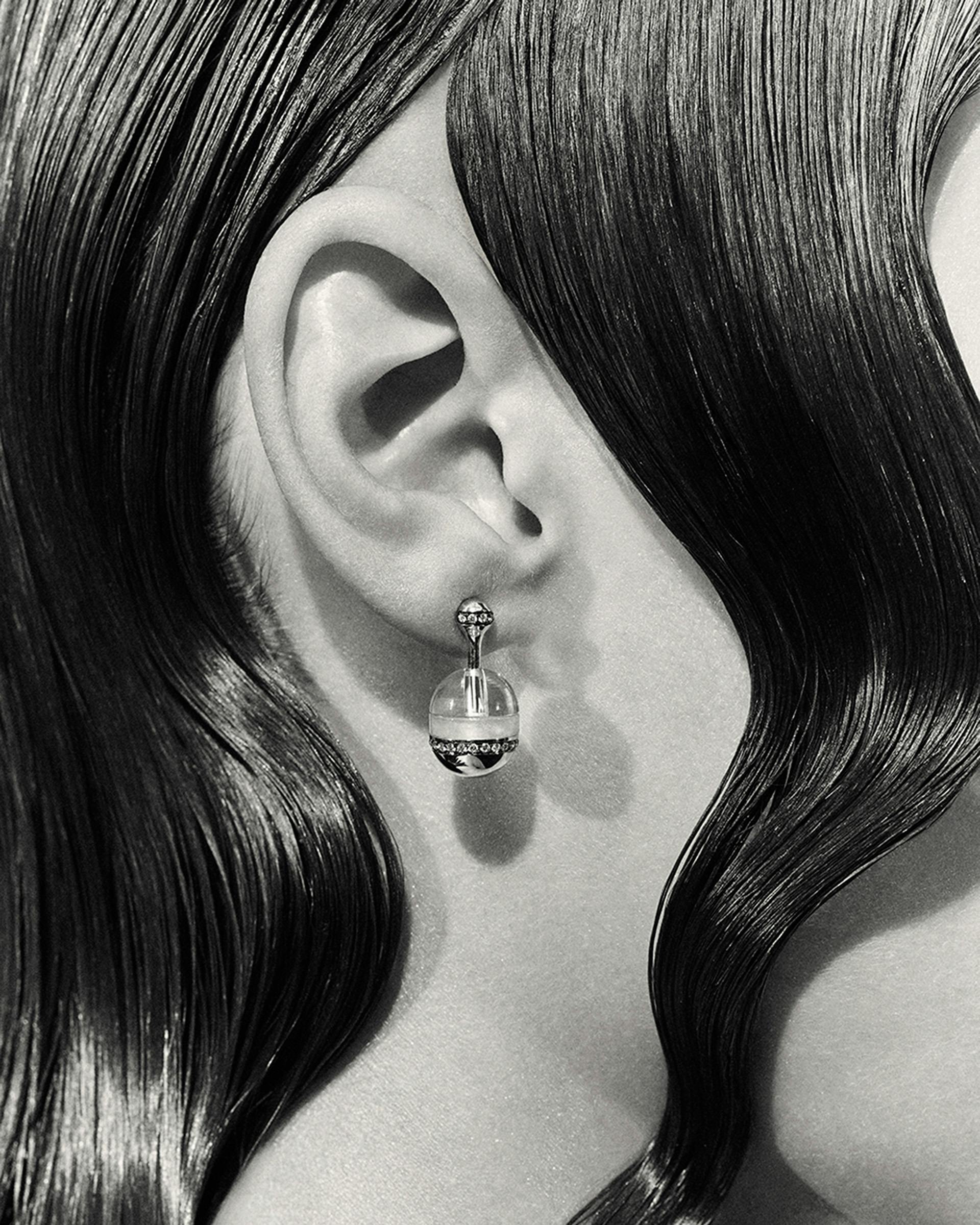
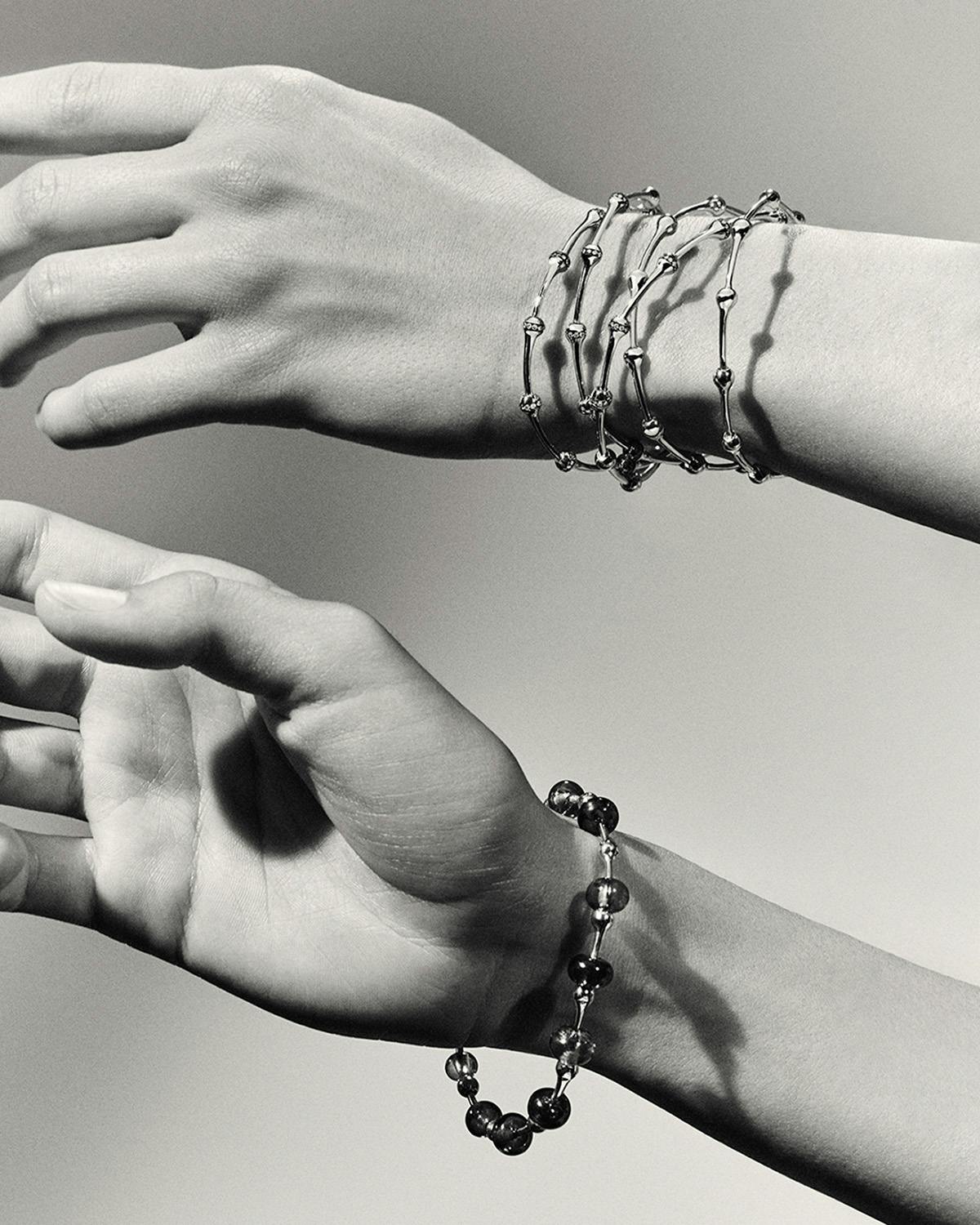
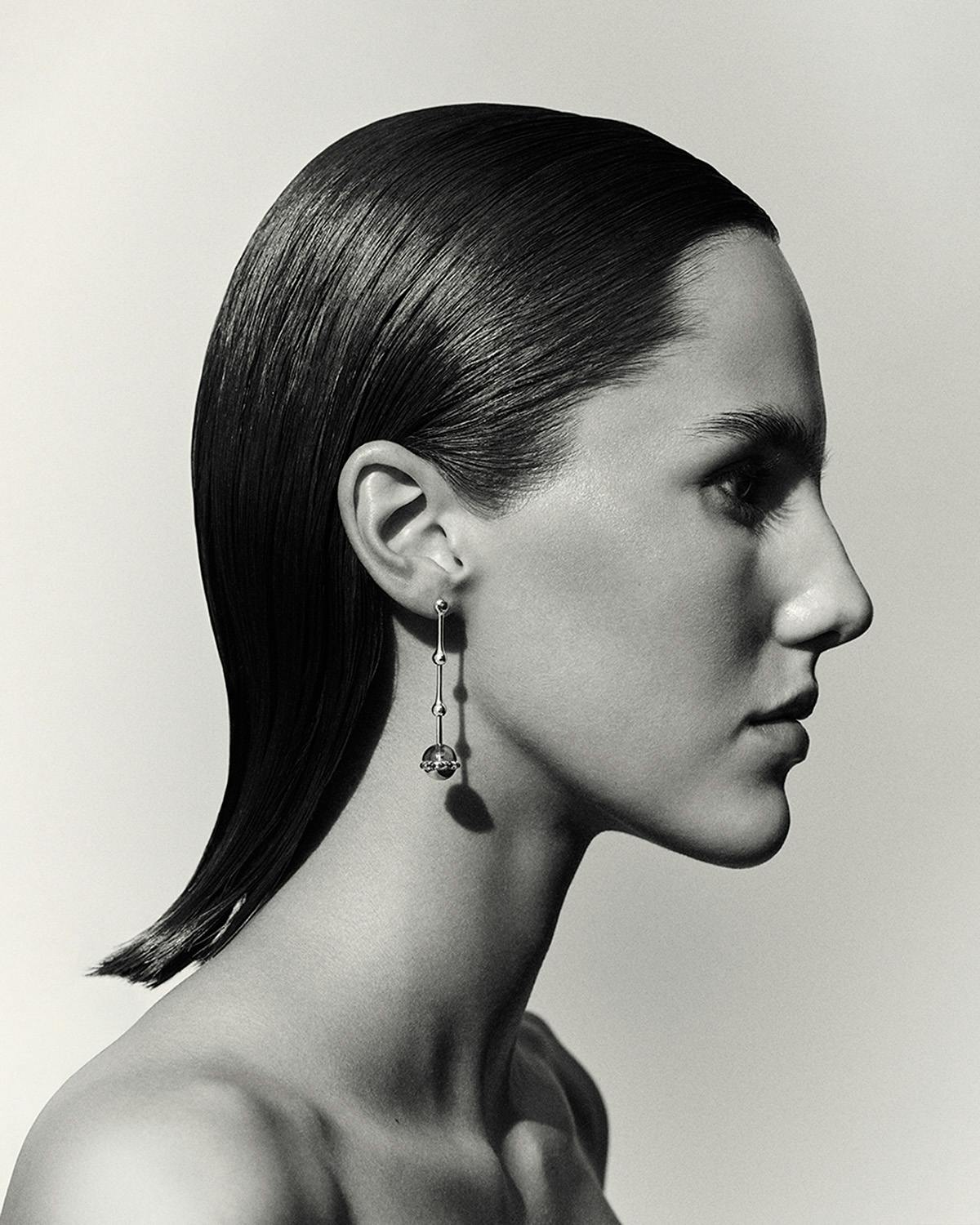
Mélanie+Ramon’s product imagery is equally luxurious yet understated. Calling the duo “masters of black and white photography”, David says that the choice to collaborate with them was driven by their deep understanding of movement, texture and light.
“We chose Mélanie+Ramon because their work perfectly captures the duality we wanted for the brand: technical precision and emotional depth. We wanted to use the statutory quality of black and white to show the jewellery not just as objects, but as statement pieces that interact with the body, the light, and the world around them.”
All of these elements are tied together by a custom logotype designed by Leslie David Studio that features a “modern sans-serif base with a unique, subtle twist”, as well as an abstract emblem made up of the letters ‘SES’.
“The goal was to create an atmosphere of thoughtful luxury – subtle, but striking – designed to appeal to an audience with a sharp, discerning eye,” David says of the project. “The brand character had to be cohesive and differentiated, one that communicates a clear sense of expertise while remaining approachable and personal. It’s not just about creating jewellery, but designing enduring pieces that feel deeply connected to those who wear them.”


