Royal Ballet and Opera raises the curtain on its rebrand
The London theatre has worked with DesignStudio on a new brand identity that honours its history
Last spring, The Royal Opera House, home to both The Royal Ballet and The Royal Opera, rebranded to Royal Ballet and Opera to help better communicate the various companies that call the London institution home. The previous naming didn’t really recognise the ballet arm and also failed to reflect that both were part of a united organisation.
To complete the rebrand, the organisation has now revealed an updated identity by DesignStudio in collaboration with the in-house creative studio, built around the idea of a ‘living timeline’ that speaks to its heritage and future ambitions.
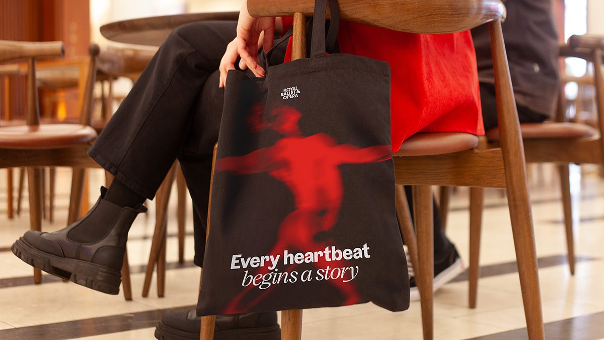
Flexibility was key to the new design toolkit to allow internal departments and future external collaborators to use the branding consistently in the years ahead.
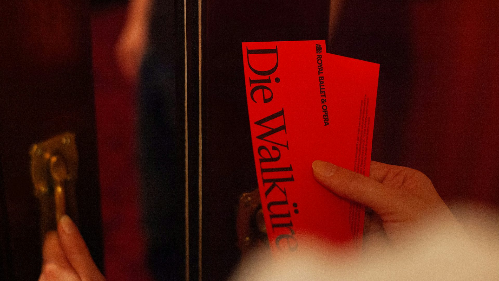
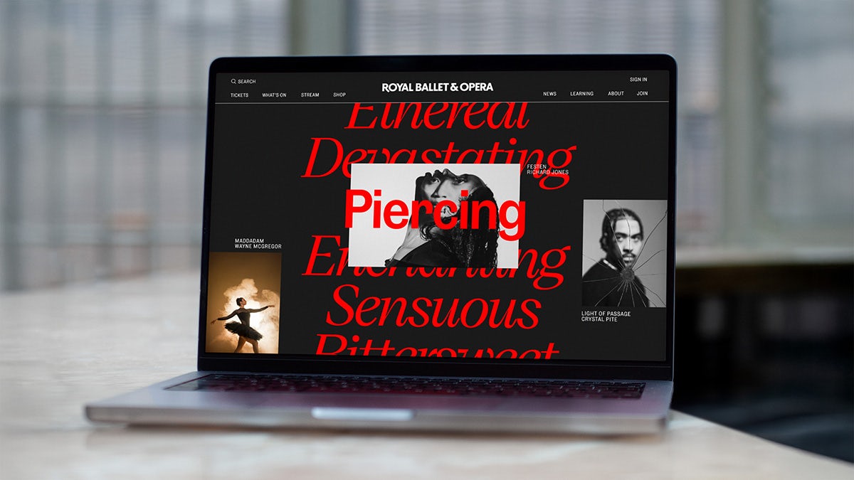
The identity includes a serif typeface with interesting tapers and swooping forms, as well as a robust grotesque typeface. Meanwhile the lettering used in the new wordmark has subtle quirks, like an elongated leg of the ‘R’ and a squat ampersand.

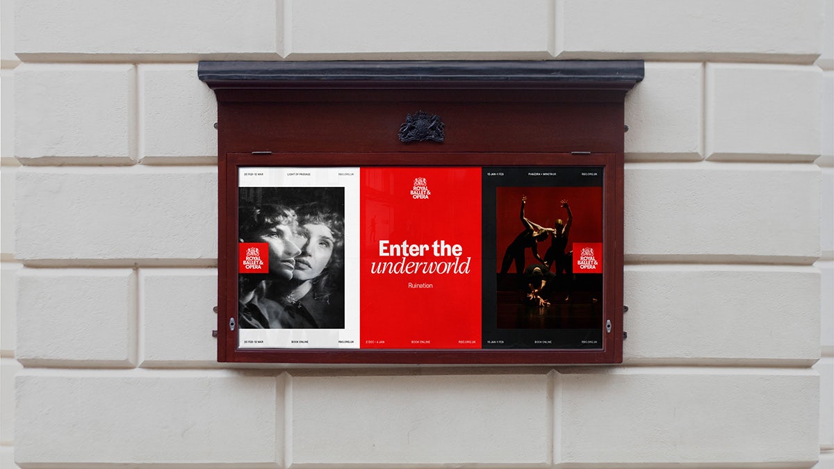
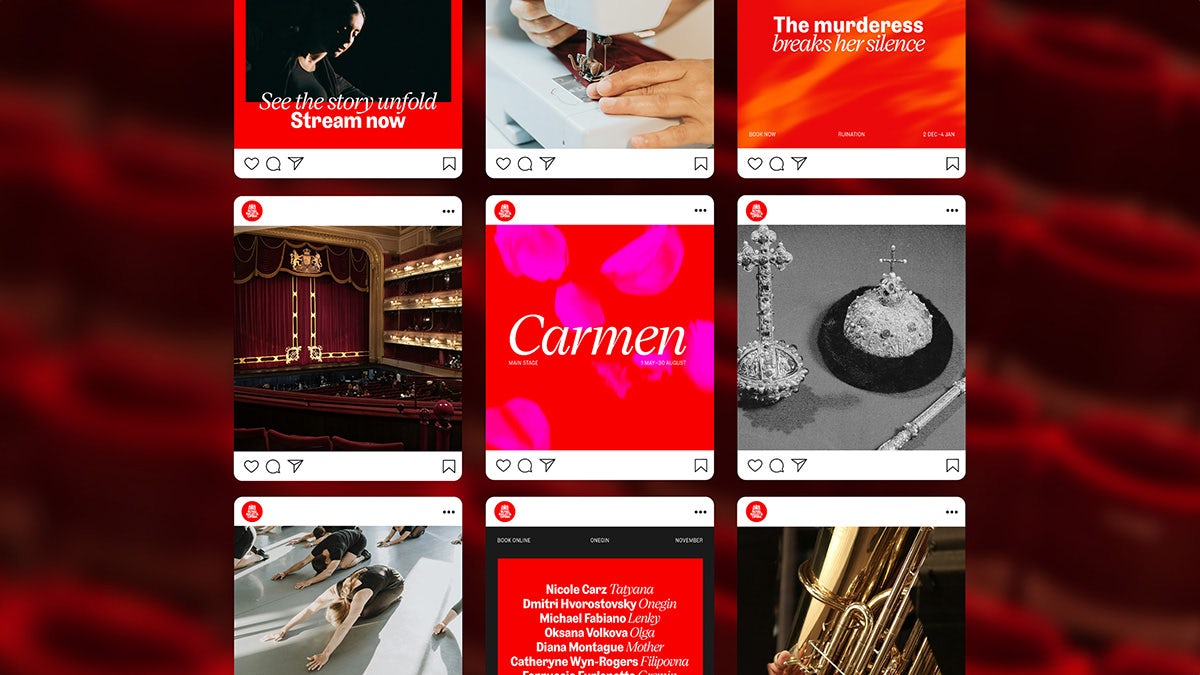
While the organisation’s classic red is still a prominent fixture of the new branding, it is given a contemporary lift when paired with a fresh art style and interesting textures. “When showcasing the art forms through imagery, we developed a system to ensure the stories reveal details, reconnect people and stories, and reimagine art forms throughout the organisation,” the studio says.
“But to address situations where imagery wouldn’t be available, we also created a texture treatment to allow for expressive and abstract solutions. This treatment uses production elements and visual metaphors to effectively represent the content.”

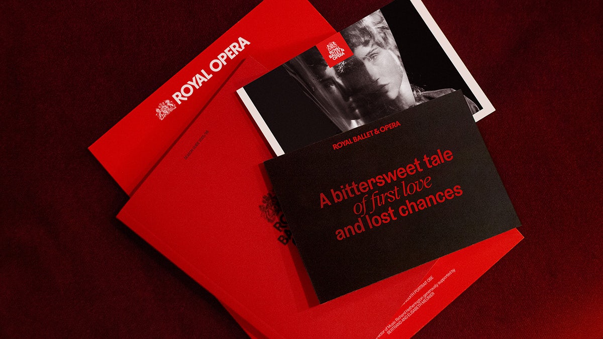
The team also worked on a refreshed verbal identity that aims to be “inclusive and flexible” while elevating storytelling, according to DesignStudio.
There aren’t any radical changes in the brand identity, but it’s worth remembering that isn’t always needed. Though the identity is cleaner, more vibrant and comes with a greater sense of character, the branding respects its place as a venue whose history dates back as far as the 1700s.
It marks the latest in a steady stream of identity redesigns launched by performing arts organisations in response to the need to transform themselves for the present day and bring in younger audiences.
