Eventbrite reveals vibrant brand refresh
The events platform has a new visual and verbal identity by Buck that hopes to take it from a faceless ticketing service to a memorable cultural hub
There’s a high chance that if you’ve ever interacted with Eventbrite, it has involved mindlessly clicking through a checkout process to buy tickets for an event. As part of a repositioning exercise, the brand is hoping to step further into the limelight and be seen as a hub for discovering live events, rather than simply a forgettable digital shopping basket for tickets.
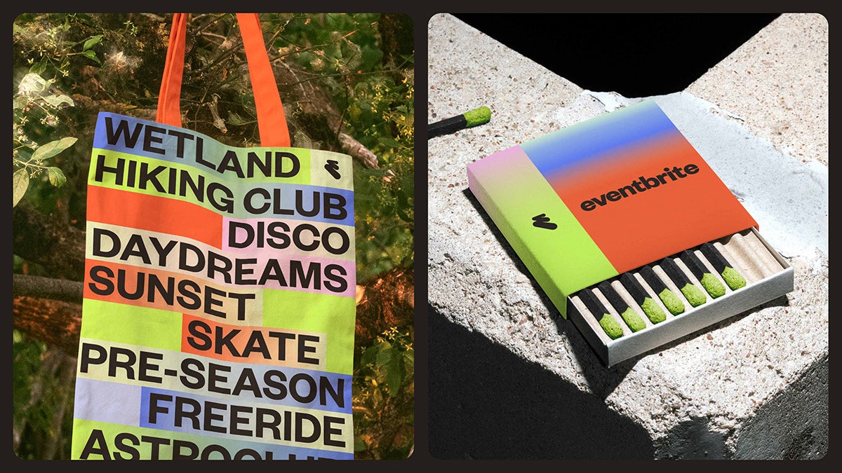
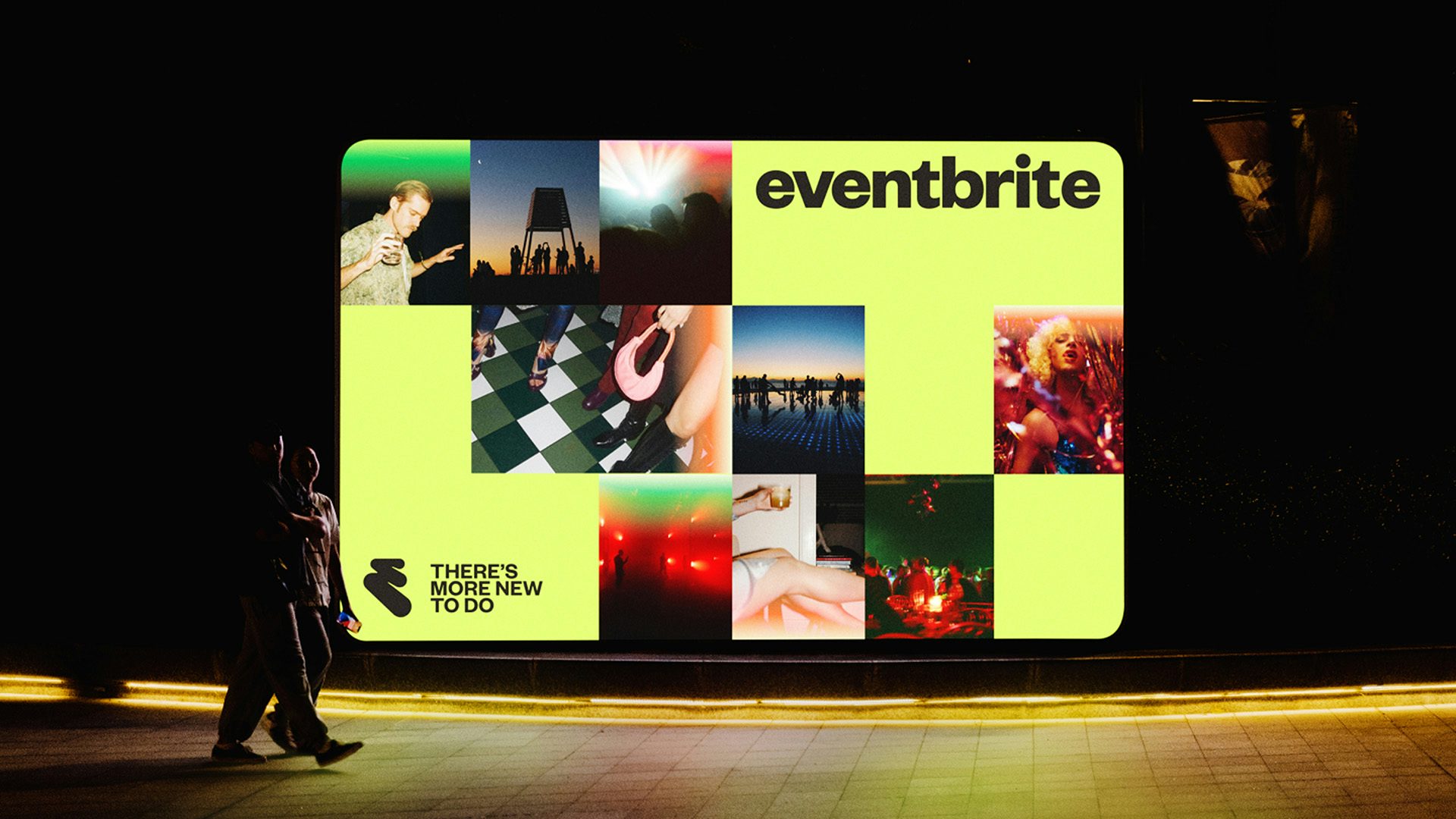
To support the mission, Eventbrite enlisted Buck to create a new visual and verbal identity. The brand’s old logo – a lowercase ‘e’ encased in a circle – has been replaced by a new monogram resembling thickly daubed paint. The winding shape has been dubbed ‘The Path’, its name and design hoping to evoke the “journey from discovery to memory-making”, according to the agency.
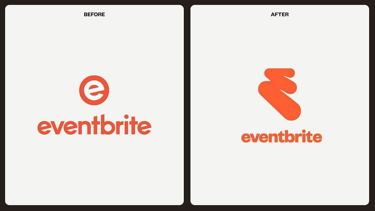
While the design is still orange (albeit a different shade to before, joining a refreshed colour palette of ‘highlighter’ neons and softer secondary shades), the new symbol can also be adapted to various alternative textures reflecting different use cases.
The wordmark lettering has also been changed as part of an updated typographic identity that revolves around Founders Grotesk, chosen to feel both approachable and contemporary. This feel carries through to the verbal identity, which aims to bring levity and playfulness into communications.
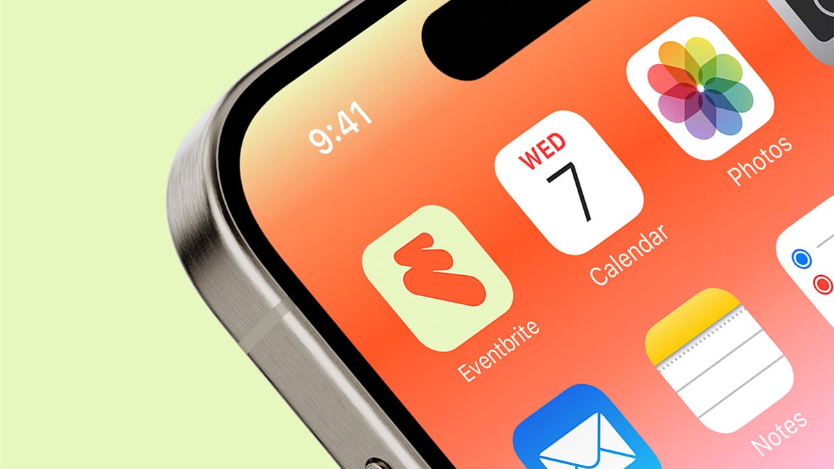
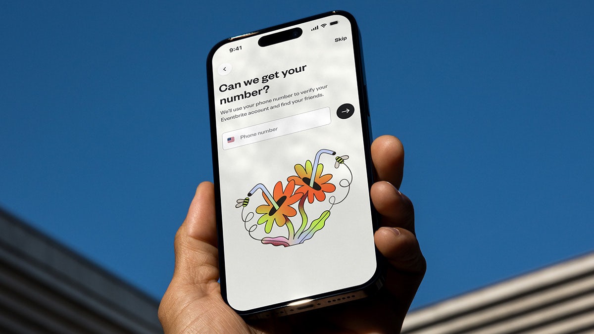
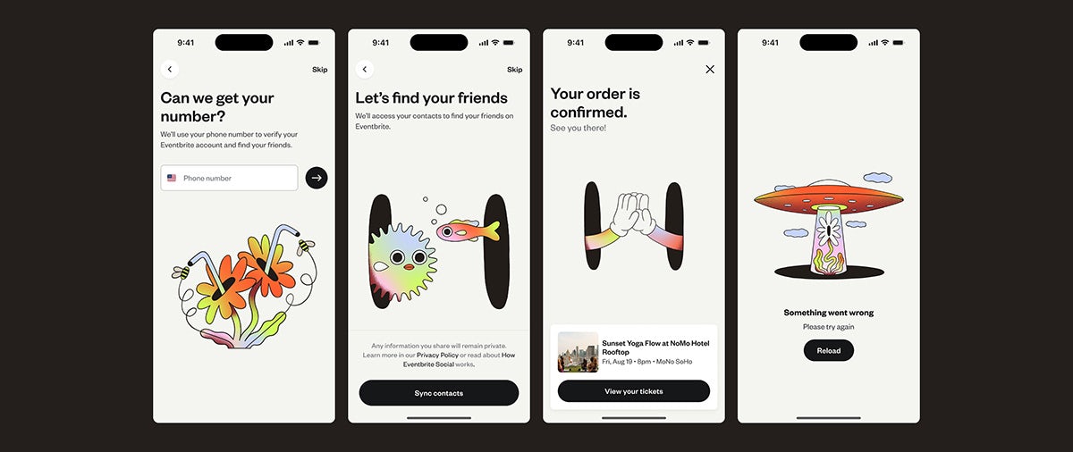
Buck has also developed a fresh illustration approach comprising two distinct styles and purposes – a library of social stickers and a suite of abstract illustrations. The latter features flat black shapes designed to evoke the idea of a portal and is set to appear across its app, redesigned by Instrument, which will come with new features such as curated lists.
“Eventbrite’s refreshed brand is about movement, energy, and emotion. We wanted to create a brand system that doesn’t just stand out but actively pulls you in – like the feeling of being in a crowd or the anticipation of a great night out,” says Buck creative director Liron Eldar. “The dynamic logo, high-energy colour palette, and layered design elements all work in harmony to reflect the electric nature of live events, while being flexible enough to adapt to any experience that Eventbrite has to offer.”