Koto creates a fashion-forward identity for Faculty AI
Featuring warm gradients and a bespoke typeface that nods to historic London street signs, the new branding aims to better articulate the company’s offering in a rapidly developing AI landscape
Founded in 2014 as a training programme to help academics become data scientists, Faculty has grown into one of the UK’s largest independent AI companies. Over the last decade, it’s worked on organisational projects ranging from crisis response systems to clean energy capture.
With the recent explosion of artificial intelligence companies and the increasing prevalence of AI washing, the brand enlisted Koto to help reaffirm what it stands for and how it differentiates itself from the competition.
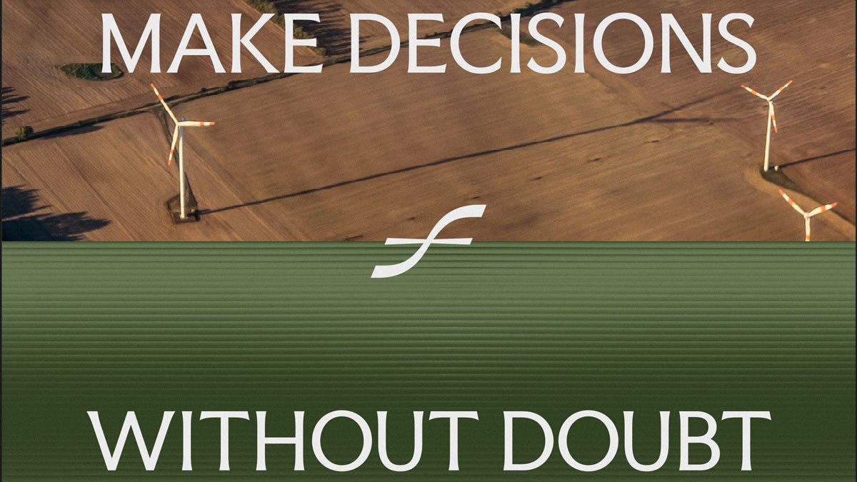
Underpinned by the brand positioning, ‘Frontier AI for the frontlines of the world’, the new visual identity distances itself from some of AI’s more overt design tropes by combining traditional, crafted elements with more contemporary features.
The redesigned logo, for instance, features a distinctive wordmark and a stylised ‘f’ symbol that serves as a shorthand for Faculty. The typography follows a similar logic with the use of two key typefaces: Faculty Glyphic and Inter Tight.
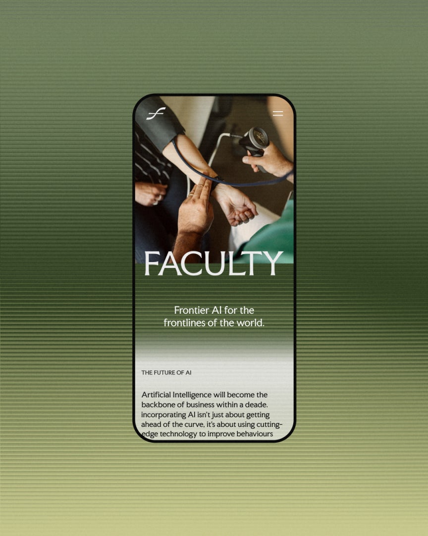
Developed by Koto, Faculty Glyphic draws inspiration from classic typeface Albertus, which has been in use on London’s street signs since 1935 and offers a subtle nod to Alan Turing’s groundbreaking work in computing during this period. Its counterpart, Inter Tight, is digitally optimised and blends classic design with more contemporary elements.
At the heart of the new design system is a dynamic graphic pattern that aims to symbolise the journey from frontier to frontline. Featuring striped gradients, it is used across various applications, from the backgrounds behind photography to integrated text-image designs.
The colour palette is grounded in neutral black and white, but also features tones of orange, blue, green and burgundy that are intended to feel fresh yet enduring. And the art direction uses similarly warm and earthy tones, with photography that highlights the stories of real people at work.
As part of the rebrand, Koto also reimagined Faculty’s website to better showcase the company’s thought leadership, the idea being it will become a space where executives can visit for the latest industry news, rather than just reading about the brand’s services.
To achieve this, the team took inspiration from classic newspaper and magazine layouts, incorporating features like bold mastheads and editorial grids. The homepage focuses on photography and case studies, using a custom typeface and grain to ensure brand consistency, while the gradients (which are generated through a custom tool developed by Koto and Planes) introduce more colour and movement.