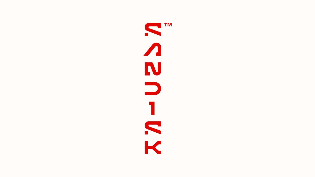
Sandisk’s edgy identity is a celebration of the pixel
The tech brand is signalling a new chapter in its business with a fresh wordmark and contemporary approach to motion design
Sandisk is livening up the world of data storage with a new visual identity designed by its in-house team and California-based agency ELA. The inspiration for the new identity came from a unit of measure, which is appropriate for the data storage company.
“By starting with the pixel, we could visually communicate the scalability and infinite potential of data – the core of what Sandisk stands for,” said Joel Davis, Sandisk’s VP of creative. “We were very intentional in creating a mark that embodies the spirit of this thinking.”

The pixel concept comes through most clearly in the ‘S’ of the wordmark, where the bottom of the letter appears to be cut away, leaving a standalone serif that resembles a pixel. It would be fair to ask questions around legibility, and the full letterform would drop below the baseline, however perhaps both these issues will be forgiven for the sake of an edgy design.
The wordmark lives up to its promise of blending angular and ‘almost mechanical’ forms with ‘humanistic’ curves. Though it’s rooted in the visual language of the tech space, the addition of chunky, quirky serif detailing lends it a fresh feel. Meanwhile the cutouts call back to, and build on, the old wordmark, which featured an open ‘D’, serving as a homage to its heritage while bringing it into a new era.
“We wanted the logo to have a sense of openness and invitation,” Davis explained. The outcome seems to work as well as a bold flat design as it does in textural 3D design, and in both horizontal and vertical layouts, illustrating its versatility.
The team developed a new colour palette, but the familiar red remains at the heart. “While the red isn’t the exact same red, we still felt that maintaining this core colour is essential. It’s a little warmer … we wanted something that feels really immediate and hot,” Davis said.
View this post on Instagram
The identity is based around the concept ‘mindset of motion’, and as expected, motion design is a core component of the new system. Early examples show just how playful and varied these could be while remaining anchored in the brand thanks to the strength of the wordmark.
The redesign signals a new chapter in Sandisk’s future; after merging with Western Digital Technologies in 2016, this year it will return to operating as a standalone entity.


