OpenAI’s brand refresh subtly signals a new era
Created by OpenAI’s in-house team in collaboration with Studio Dumbar and ABC Dinamo, the new identity aims to align the brand’s design system with its rapid business growth
Founded in 2015 as a small research lab focused on artificial general intelligence, OpenAI’s growth trajectory over the last few years has been stratospheric even by the tech industry’s standards. The company’s value has exploded from around $29 billion in 2023 to $157 billion by the end of 2024. Its best-known product, ChatGPT, is now used by 300 million people every week, and it’s increasingly expanding into new products such as its video generation model Sora.
The team behind OpenAI have recognised the importance of brand for some time now, having previously worked with New York design agency Area 17, but its newly unveiled brand refresh is clearly intended to cement its transition from niche non-profit into one of the world’s most famous AI brands.
Developed in-house by a team led by head of design Veit Moeller and design director Shannon Jager, the new identity was created in collaboration with the brand’s creative motion partner Studio Dumbar/Dept (the Rotterdam studio has worked on everything from event visuals to announcements) and Berlin-based type foundry ABC Dinamo.
The company admits the biggest challenge it faced from a brand perspective was its own rate of growth, which has rapidly outpaced its design system’s evolution. The brief for its in-house team and agency partners was to address an inconsistent visual identity, which often felt like it was representing multiple teams within one company.
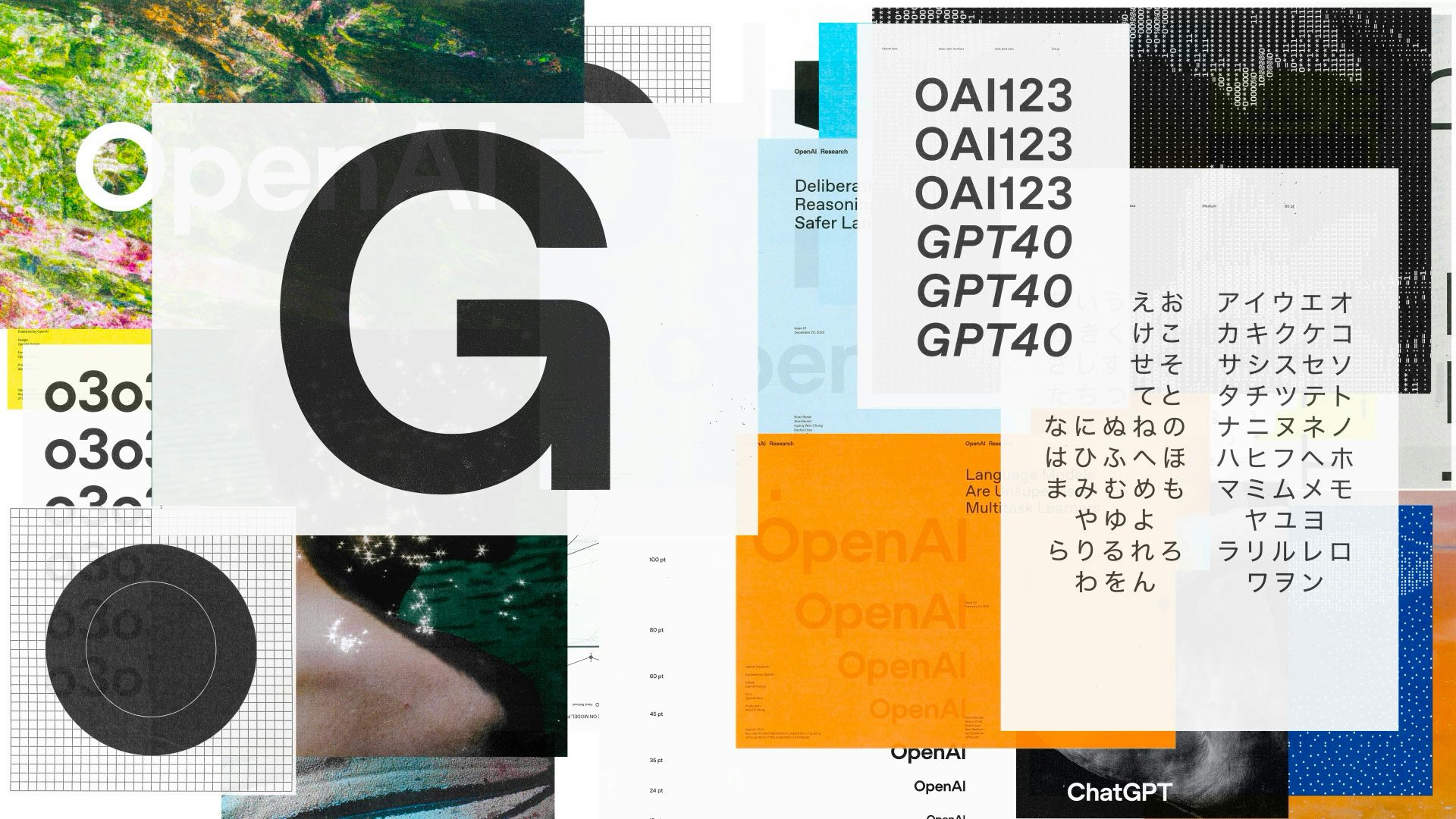
At its heart is a redesigned version of OpenAI’s distinctive ‘blossom’ logo, which dates back to the company’s early days. The three intertwined triangles seen in the brand mark have been subtly upgraded with refined geometry and differently weighted versions. To complement this, the OpenAI wordmark is reportedly going to be used more prominently going forward.
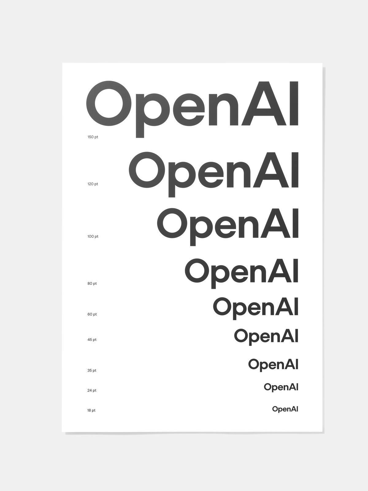
The multiple typefaces previously used across the company’s products have been consolidated into one bespoke new typeface, OpenAI Sans, with ABC Dinamo currently working on new global scripts and a mono version of the font in the coming months.
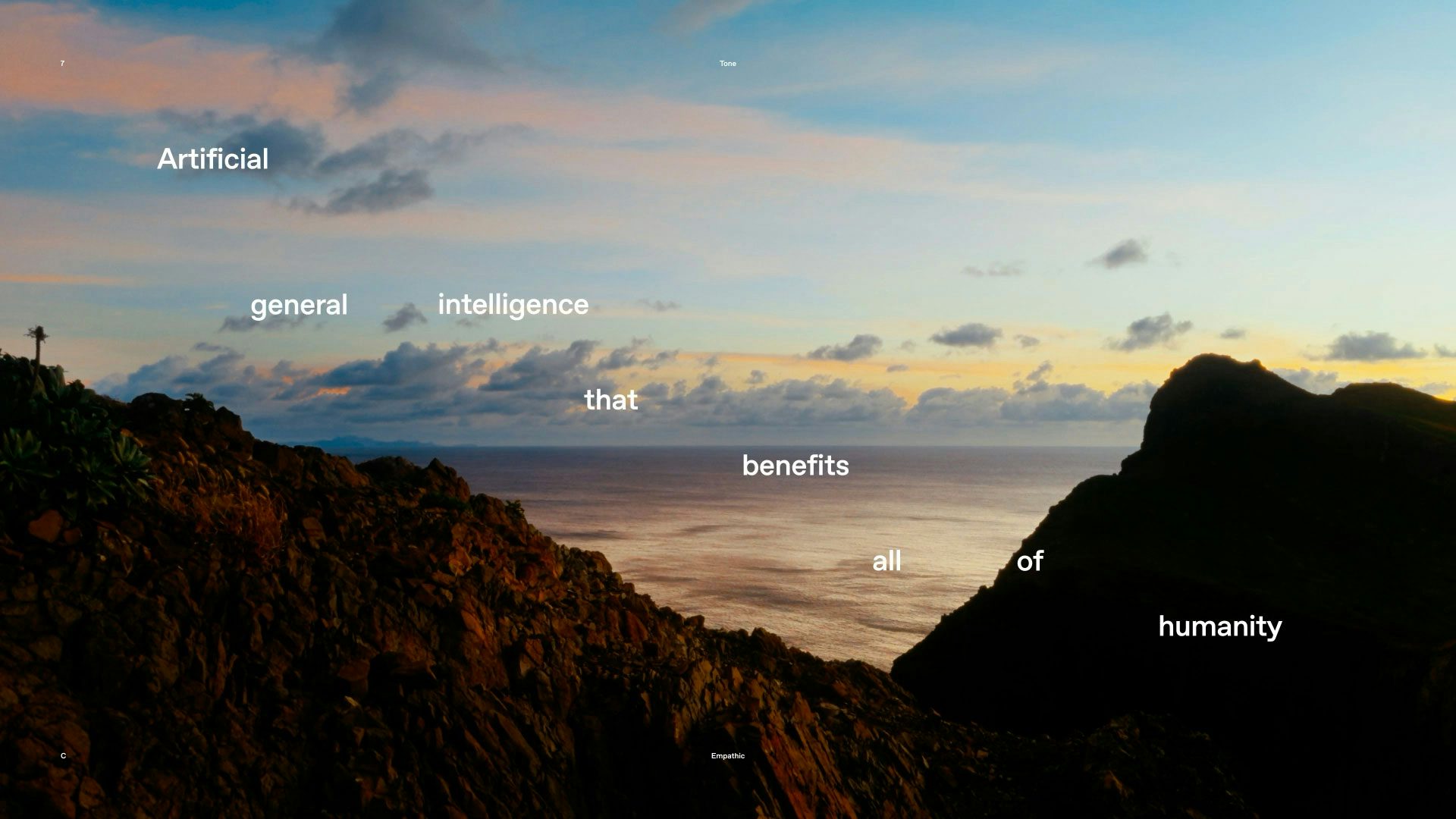
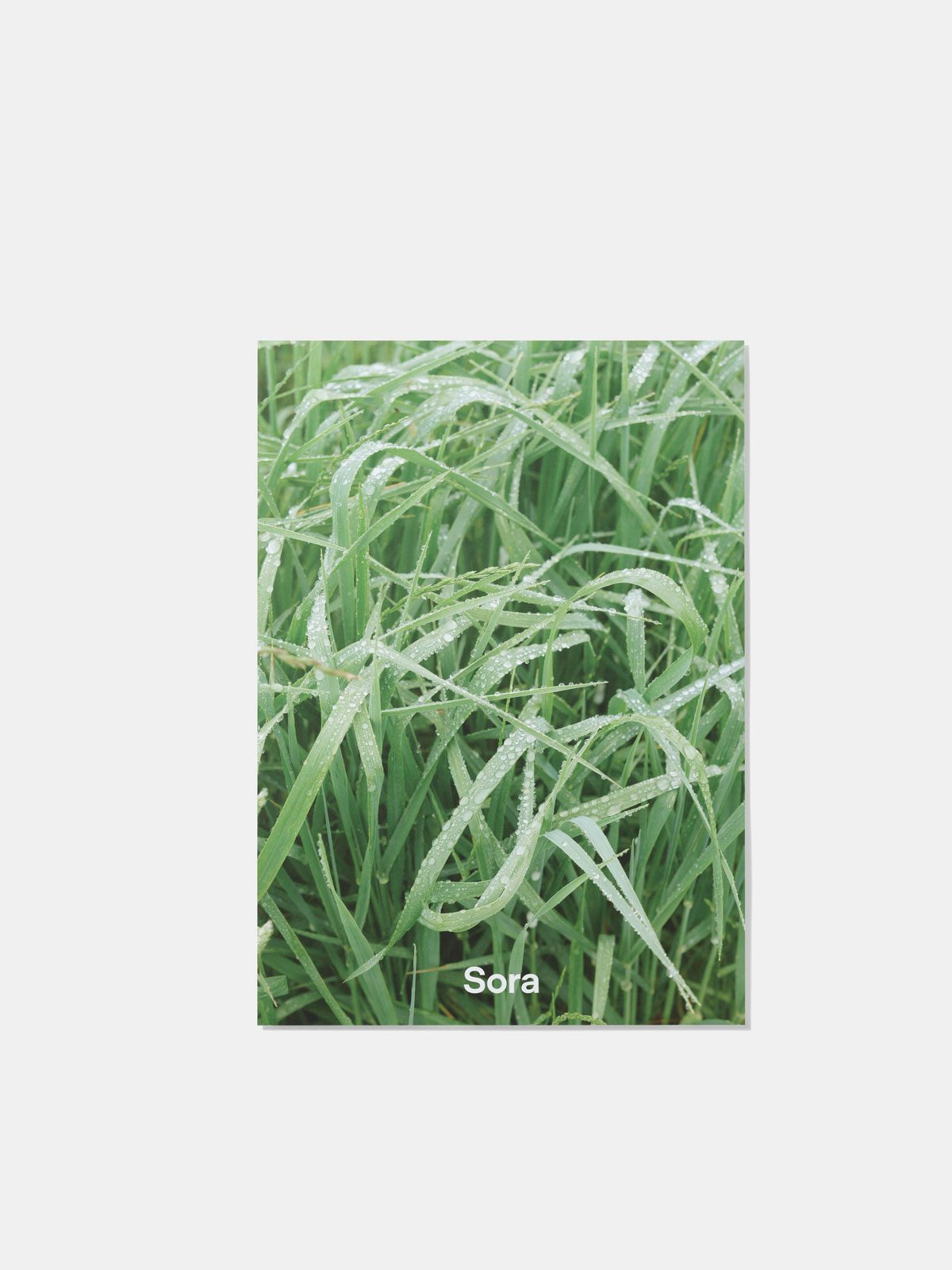
A refreshed colour palette includes a base of greys and blues, coupled with primary contrasting colours. And a new suite of imagery emphasises both human and AI creativity, featuring landscape and still-life photographs shot by established imagemakers, paired with textures and patterns created by Sora.
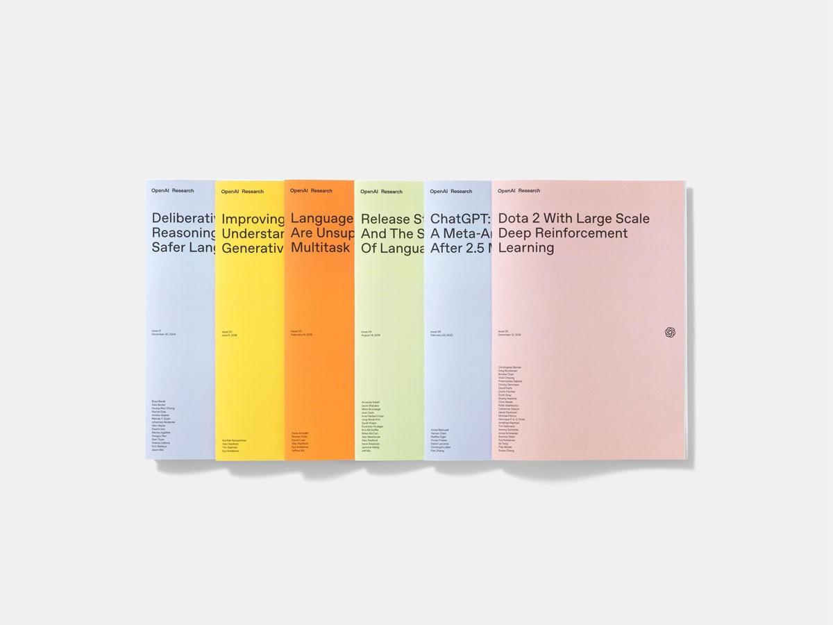
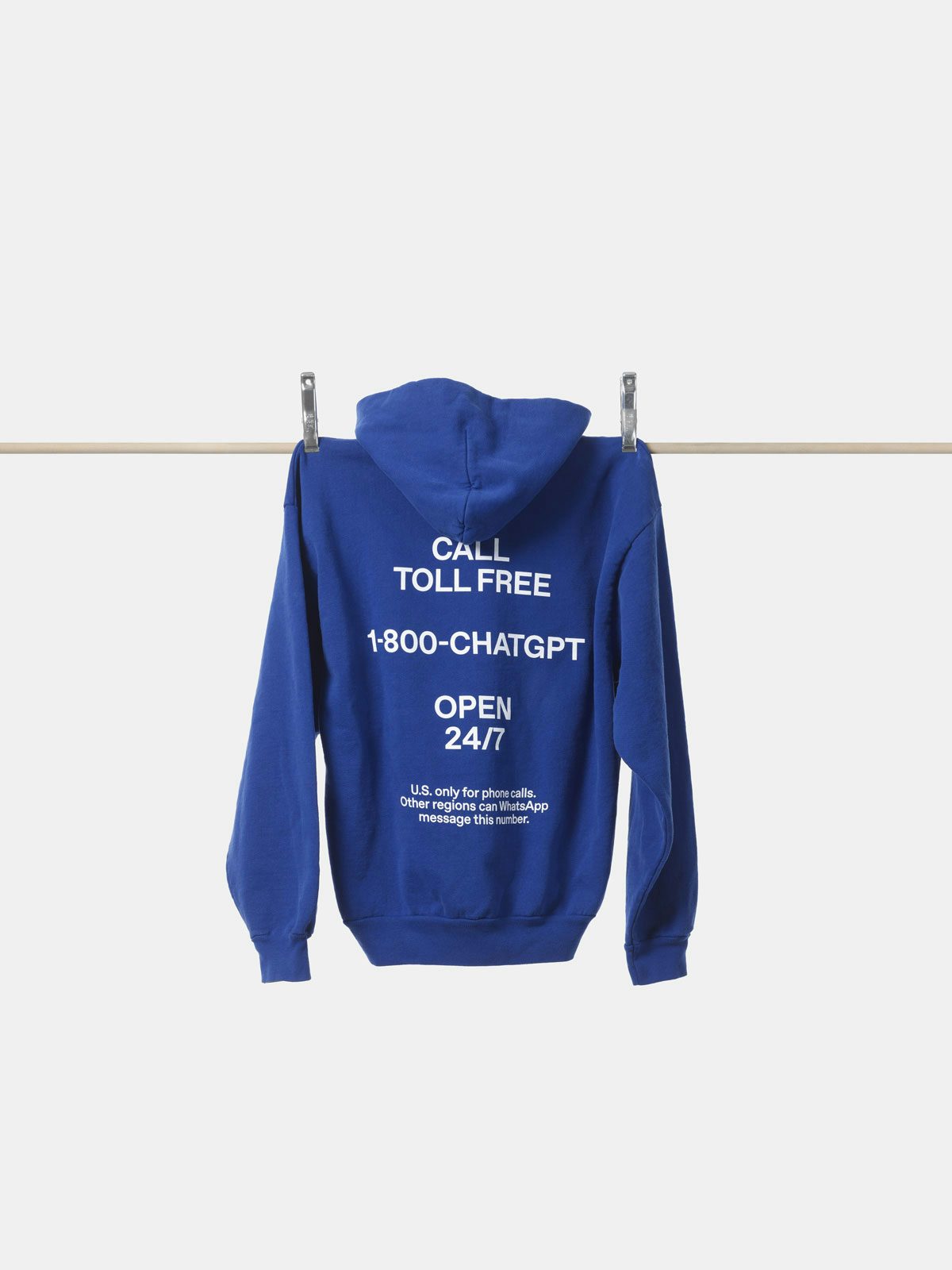
Finally, there’s the pulsing blue disc designed to be deployed across OpenAI’s products at a variety of scales as a visual representation of ChatGPT’s ‘voice’, which Studio Dumbar played a key role in developing. The new identity is rolling out across all the expected places, including OpenAI’s website and the web browser and app versions of ChatGPT, along with the company’s research papers and even a new range of merch.
It may have only been a couple of years since OpenAI’s last major brand overhaul, but there’s been a huge amount of change and turbulence in the AI market in that time. While Silicon Valley has been flexing its muscles with launches such as Google’s Gemini and Apple Intelligence, Chinese firm DeepSeek’s recently unveiled rival product has sent shockwaves through the tech world with its comparatively tiny timeline and budget – as well as its ‘friendly’ blue whale logo.
While it’s hard to know exactly how it will play out in the coming years, the brand refresh is another reminder just how fast things are moving in this space, and why branding will continue to play an important role in the AI race.