
New deodorant brand Rollr exudes luxury
Mother Design has devised the name, visual identity, tone of voice and bottle design for Rollr, looking at luxury perfumes for inspiration
When Rollr founder Milo Pinckney dreamt up a natural, sustainable, refillable roll-on deodorant that would leave pits clean and fresh, many natural deodorants were already on sale. In a world of Fussy and Wild, Rollr needed some edge to stand out in the toiletry aisle.
So Pinckney turned to business incubator Broody and branding and design studio Mother Design, both part of the Mother family, to turn his vision into a genuine product.
When Mother Design began work on the name, visual identity, tone of voice, and bottle design, a category audit found that the natural deodorant market relied heavily on sustainability cues and functionality. But what about pleasure? The team looked beyond the closeted deodorant world in the bathroom cabinet and into the proudly displayed products – luxury perfumes.
Rollr is a deodorant for the ‘conscientious hedonist’ – a persona devised by Mother Design to describe those who embrace pleasure while being mindful of the planet. Bold and expressive, the brand voice features lines like ‘Damn you smell good’ and ‘For pleasure and planet’.
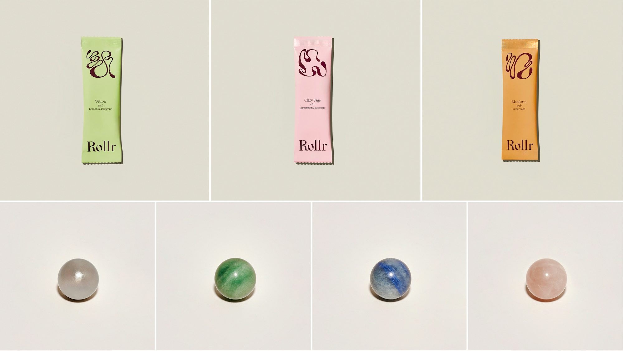
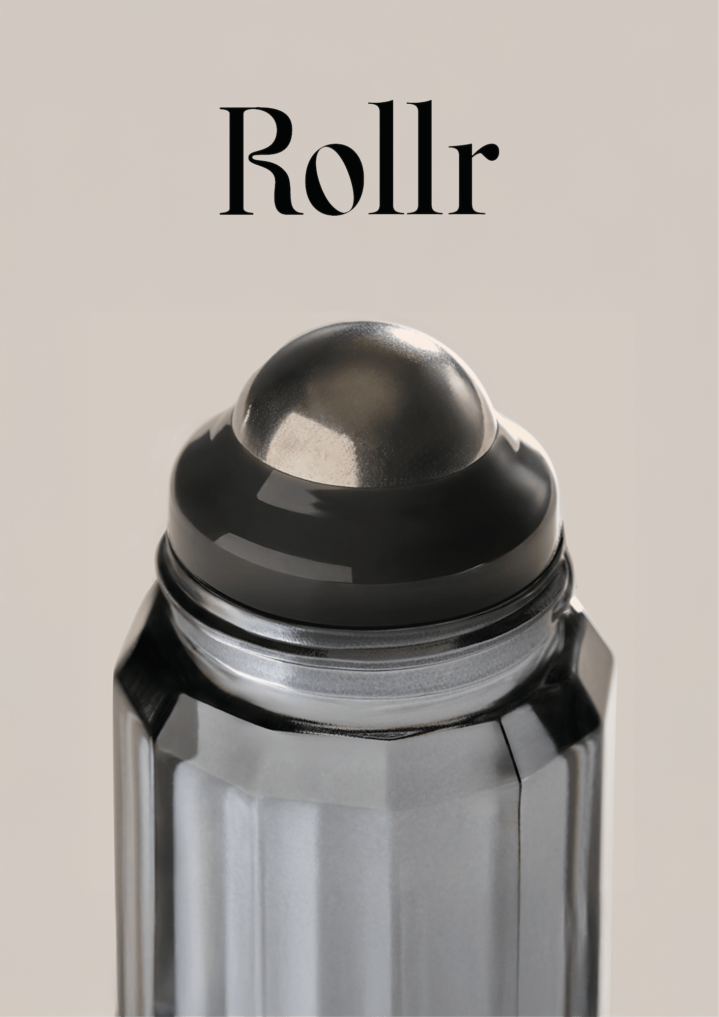
Available in mandarin, vetiver, and clary sage, Mother Design bottled the fine fragrance-inspired scents in a sculpted glass vessel ready to be refilled. Gone are the days of plastic roll-ons; the bottle is crowned with a cooling steel roller, with the option of upgrading it to gemstone balls in rose quartz, green aventurine, or blue dumortierite.
This function inspired the name Rollr, helping consumers understand its purpose. Customers then add tap water to refill sachets, which cuts Rollr’s environmental impact by 90% because it reduces the packaging required to create, ship and recycle the refills.
The custom-drawn wordmark features elegant serifs; a kink in the ‘R’ is said to echo the product’s cooling, fluid nature, and the ‘o’ suggests a rolling motion. Elsewhere, the brand uses a Kalice typeface.
Three elaborate pastel swirls, mimicking the rolling deodorant movement, help distinguish between the three scents. They are set against a rich burgundy background, which also features across brand touchpoints in print and digital.
“Deodorant has been stuck in the past – cheap, plastic and an afterthought. Rollr reinvents it as a pleasure-driven ritual, combining sustainability with fine fragrance cues and an unforgettable sensory feel,” explains Pinckney.
“Mother Design understood our vision from the outset and brought it to life with a brand identity that reflects both indulgence and responsibility. Their approach was deeply collaborative, ensuring that every aspect of Rollr, from the bottle to the brand world, aligned with our commitment to creating a refillable deodorant that feels as good as it looks.”


