Good Reads: Acacia makes a space for Muslim creativity
Creative director Arsh Raziuddin talks to us about how the magazine is a platform for voices and creatives on the Muslim left
Creative director Arsh Raziuddin cut her teeth in the media space with senior roles in the creative departments of Bon Appétit, the New York Times Opinion section, and the Atlantic, which she also helped to redesign in 2019.
Though she now runs her own design practice that tends to deal with book publishing and the art world, Raziuddin is still involved in print media thanks to her work with Acacia, a magazine that is “crafted by Muslims, yet is intended for all”.
The first issue launched at the beginning of 2024 with poignant artwork by Cassi Namoda on the cover, and pieces exploring everything from interfaith upbringings to homophobia inside its pages.
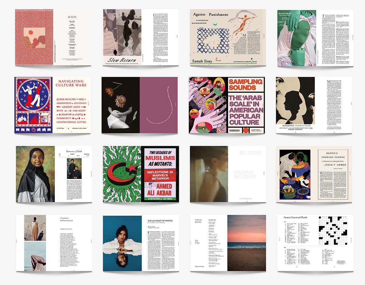
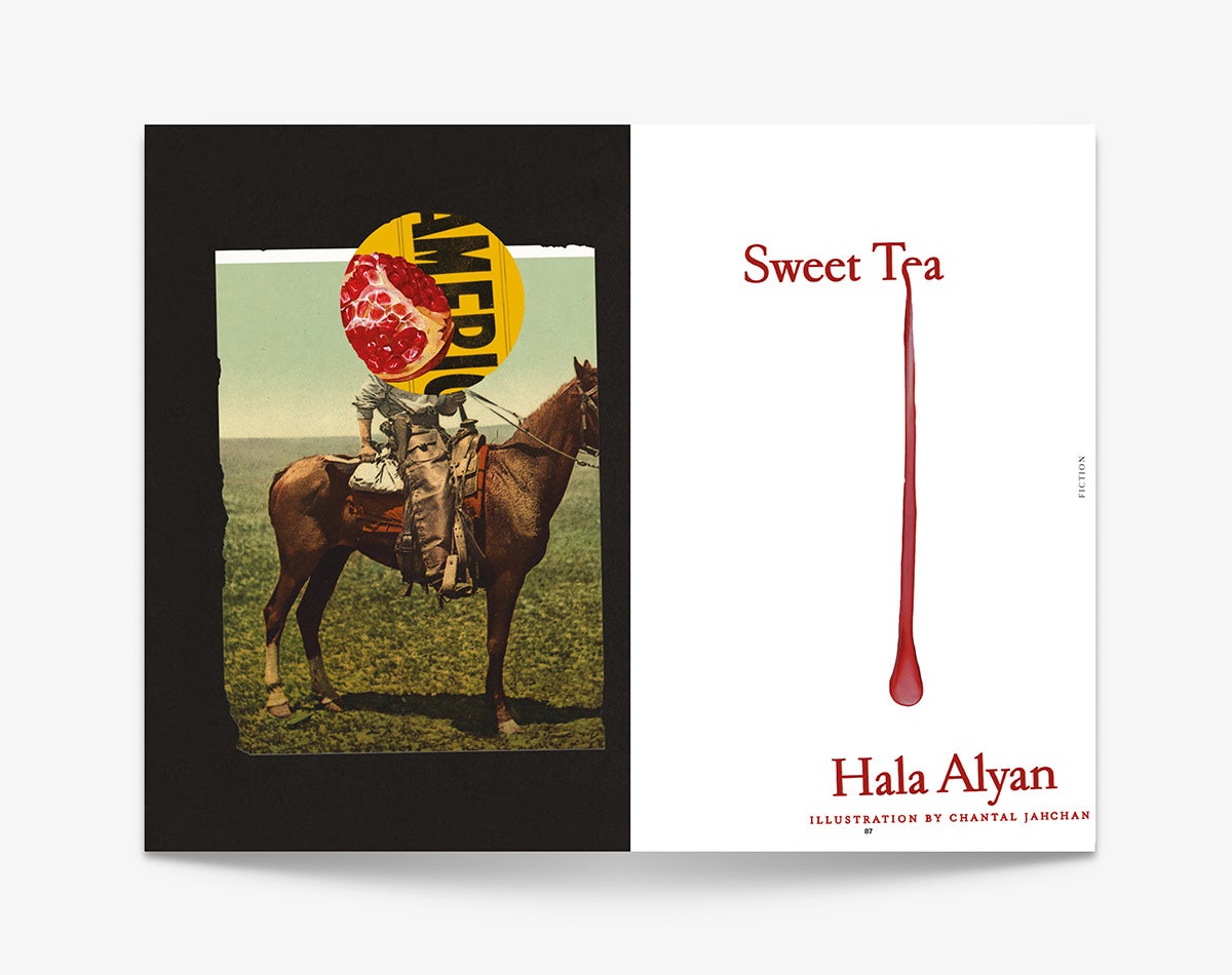
Now on its second issue, the US-based publication explores the intersections between Muslim experiences and the political left through a mixture of cultural criticism, poetry, fiction, and reportage.
The magazine’s name stems from the tree referenced in Surah al-Fath, a chapter in the Qur’an, which is said to provide refuge. “There are stories of the Prophet Muhammad gathering his early followers beneath the shade of the Vachellia Seyal, or red acacia, to seek rest, build community, and pause for reflection,” explains Raziuddin. “This tree, familiar to us in its many shapes and forms, mirrors the communities and connections we nurture now.”

This is evoked in the handpainted circle that overlaps with the masthead on the magazine cover. “Each circle symbolises the varied forms of trees, communities, and regions, and their distinctiveness in a shared experience,” explains Raziuddin.
The Acacia tree is a fitting emblem given that, like the tree, the magazine provides a form of refuge for voices on the Muslim left. “Given the current political climate and the pervasiveness of American Islamophobia, this effort feels both urgent and necessary. But Acacia inherits a legacy that far predates modern conflicts, even the sharp rise in anti-Muslim sentiment that has coloured many US-based Muslims’ lives since 2001,” Raziuddin says.
“For millennia, Muslims around the world have been artisans and artists – painters, calligraphers and architects – creating beautifully detailed works and weaving intricate textiles,” Raziuddin says.
“Yet, the richness of their craftsmanship and artistry often goes unrecognised in Western media. We must strive to preserve, amplify, and actively hire Muslim artists, not only to share stories of pain and genocide, but also to celebrate narratives of our life with people in proximity to our community.” This is emblematised by Raziuddin’s thoughtful approach to the presentation of each piece in the issue, both in the sense of her own work but also the work she features by other creatives.

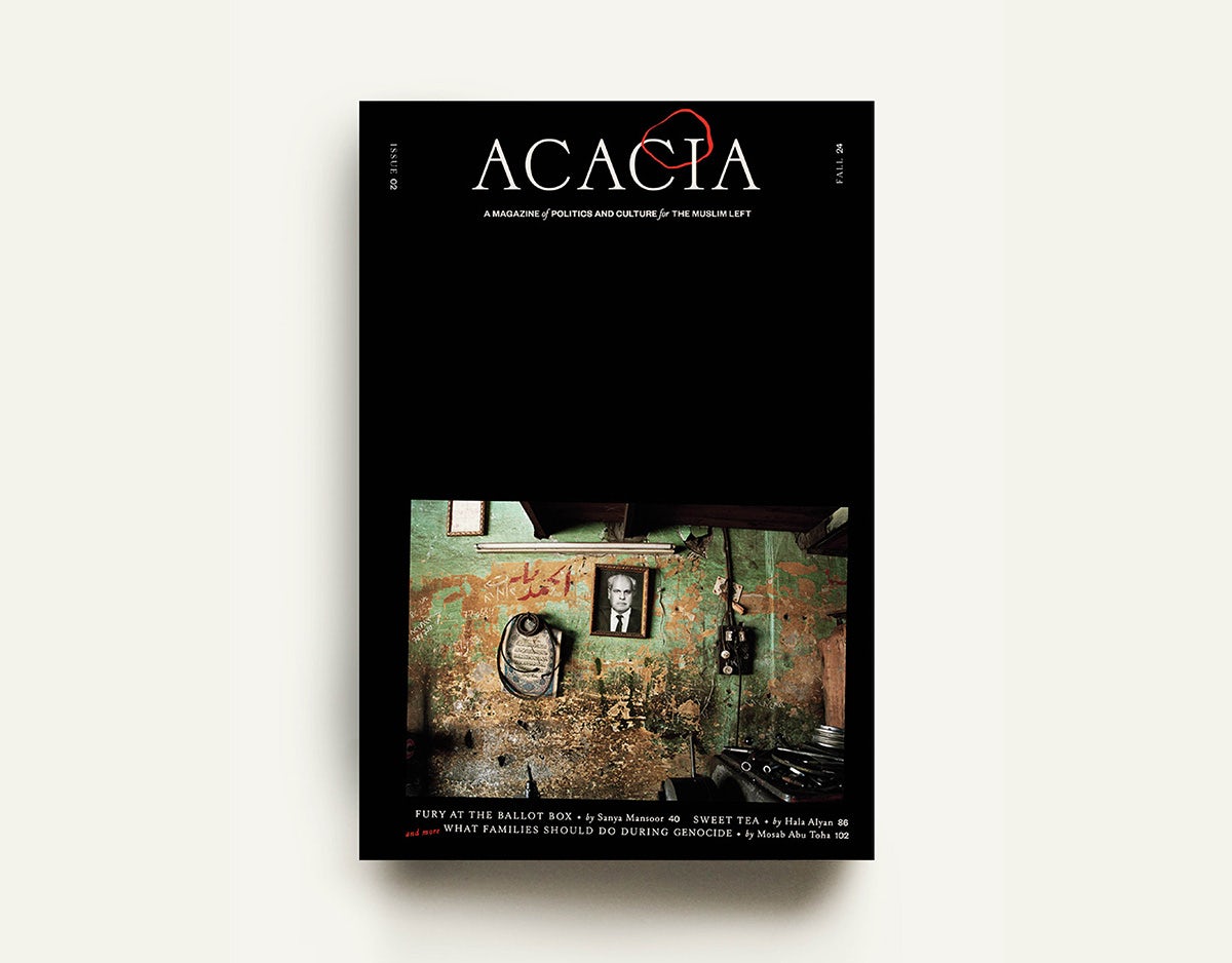
The second issue explores liberation movements around the world, from Puerto Rico to Palestine, where cover artist Taysir Batniji was born. Raziuddin says that the cover required “a delicate balance between the striking, the beautiful, and the sombre – capturing the weight of a context that is both difficult and harrowing, while avoiding any hint of superficiality.”
She has long admired Batniji’s work, and this particular image by the Gazan artist – a “haunting” photograph set in a dilapidated kitchen, taken from his 2006 series Fathers – “speaks volumes with its silence”, she says. The image has been tilted subtly on the cover to amplify the scale of recent destruction of buildings and lives.
“It’s important to me that Acacia reflects the rich cultures of those who are being marginalised, honouring their craft while also being respected by our Western colleagues. As one of the few Muslim art directors in the media, I’ve noticed that much of our design is often labelled as ‘exotic’ or ‘vibrant,’ only being used for our own stories, while European aesthetics are seen as chic, sophisticated, and the universal standard of beauty.”
In this sense, her involvement with Acacia has been eye-opening, but it has ultimately been enriching, too. “The art direction for Acacia has been both the most challenging and the most rewarding work of my career. Creating something alongside other Muslims – people who share similar values and ideas – feels uniquely comforting and collaborative.”
Acacia issue two is out now; acaciamag.com


