Kleenex reveals new branding and campaign
The tissue brand is welcoming in winter with an outdoor campaign involving ‘scrunched’ portraits and the reveal of a new global brand identity
Anyone fearing a repeat of Johnson & Johnson’s cursive-abolishing redesign can breathe (or sneeze) a sigh of relief when it comes to Kleenex.
The brand’s script wordmark is here to stay, it’s just been modestly tweaked as part of a new global identity by Turner Duckworth. The design is enclosed in a newly redrawn crown shape – a motif which had previously made a minor appearance in several but not all markets.
“This year, Kleenex celebrates 100 years of being the brand that people trust in so many of life’s vulnerable moments, and it was important to use this particular moment to reinforce that brand love and loyalty,” says Jennifer Kasmarick at Kimberly-Clark, Kleenex’s parent company. “By using the power of design – creating a cohesive, meaningful and distinctive brand identity – Turner Duckworth helped us strengthen our connections with people across the world.”
While some elements of the new identity may fall short of this promise of a distinctive identity – the illustration style arguably feels more stock than you might hope – it responds to a clear need to create a unified look and feel for the brand around the world.
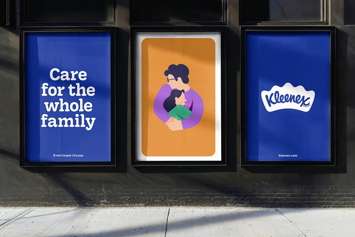
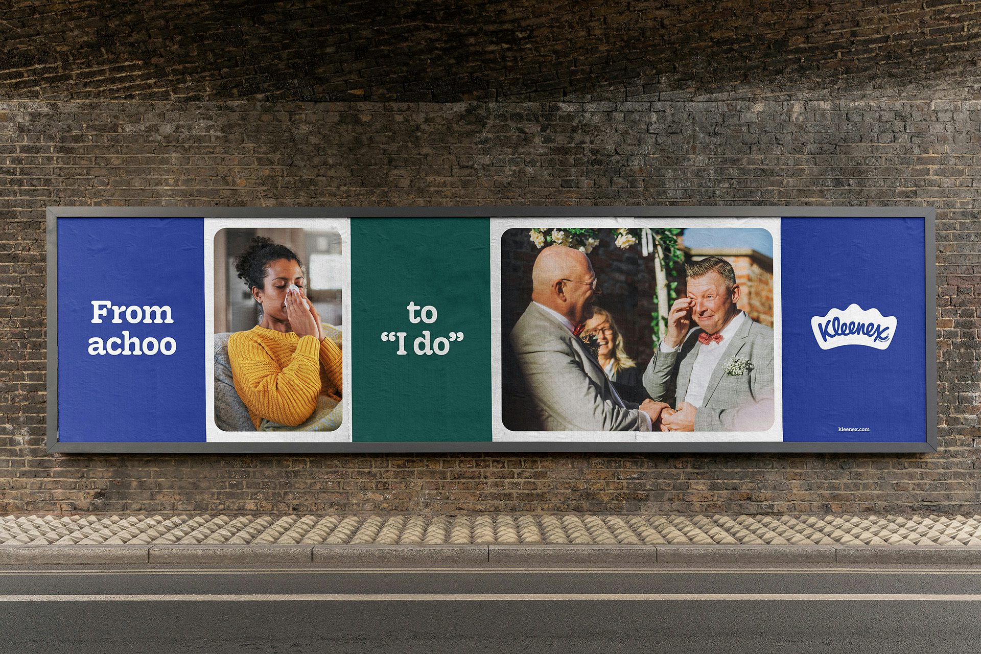
This relates to the logo, of which there had been many iterations in use around the world, but also the colour palette, which now revolves around a Kleenex Blue that’s finally set in stone and joined by ‘mature’ supporting colours.
Elsewhere is a new bespoke typeface, Kleenex Serif, developed with type designers Alec Tear and Lewis Macdonald. The typeface ties in with the soft curves scattered throughout the wider identity, such as the undulating crown logo and rounded graphic framing devices.
While the branding is initially rolling out in North America before the rest of the world, over in the UK Kleenex has launched a nationwide campaign by FCB London.
Created in collaboration with artist Alma Haser, the campaign revolves around portraits that resemble scrunched tissues, reflecting the way in which its new range of tissues release aromas when scrunched – ultimately encouraging customers to scrunch their tissues prior to using them.
The outdoor campaign is being topped with an experience at London’s Westfield centre in White City that promises, among other things, ‘scent cannons’.


Credits:
Branding Agency: Turner Duckworth
Creative Agency: FCB London
Chief Creative Officer: Owen Lee
Creative Directors: Rob Farren, Ben Perez Usher
Creatives: Vivien Decombe, Gerard Roda
Design Director (FCB): Becci Salmon
Designer (FCB): Anne-Marie
Director and Production Company: Institute Arts
Artist and Photographer: Alma Haser
Videographer and Animator: Todd Macdonald


