The New Museum launches a digital-ready refresh
This timely design update by Athletics provides a sharper focus on the museum’s visitors and patrons while future-proofing its online and offline presence
Founded in New York City in 1977 by the late art historian and curator Marcia Tucker, the New Museum prides itself on challenging the status quo and forgoing the typical stuffiness and stiffness of an art institution to forge a genuine connection with its visitors.
As part of its ongoing redevelopment, the museum has partnered with local design studio Athletics on an updated design system, guided by its commitment to creating an approachable and social space for art.
Athletics’ work on building a new identity for the museum aims to champion its progressive ethos, whilst establishing an updated visual system that can accommodate the organisation’s longer-term goals.
Crucially, however, this work does not seek to move beyond the museum’s original system, but rather build upon it, reimagining its potential for a faster-moving world.
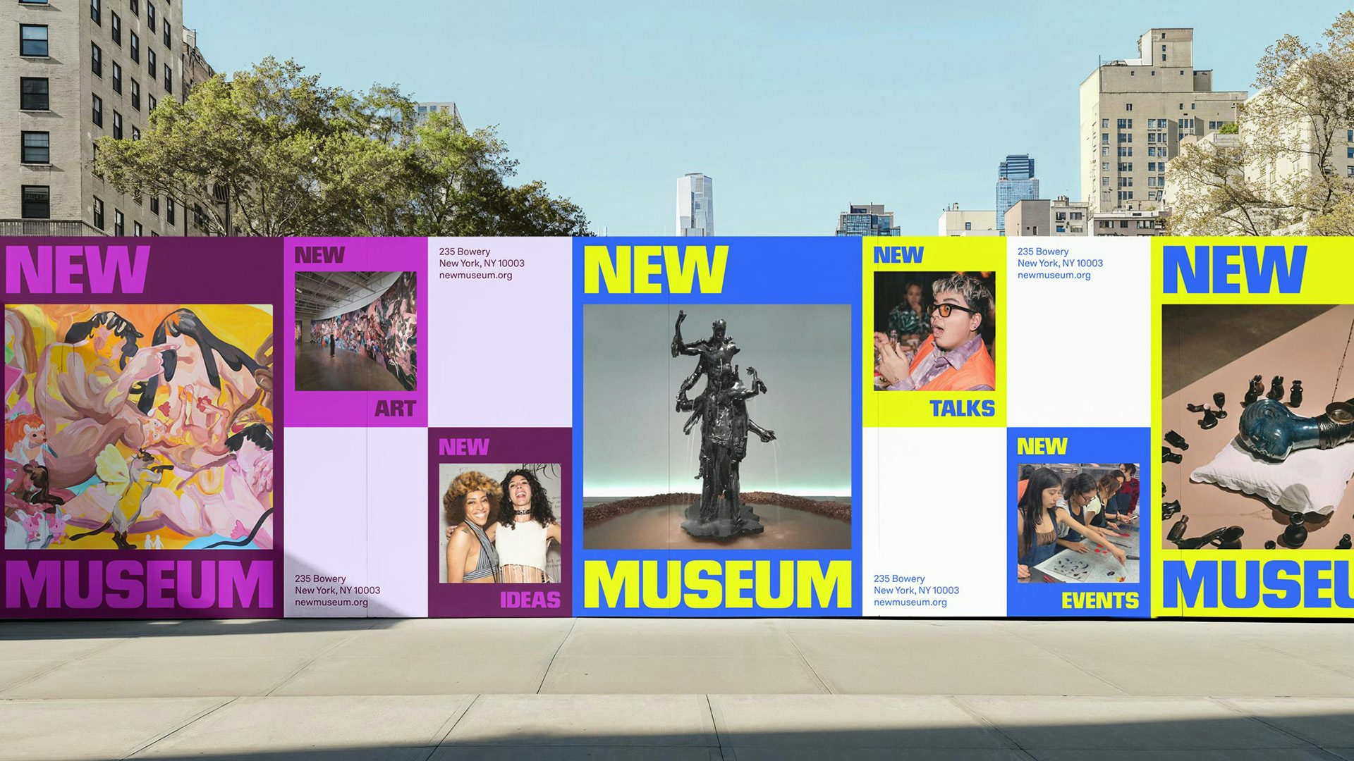
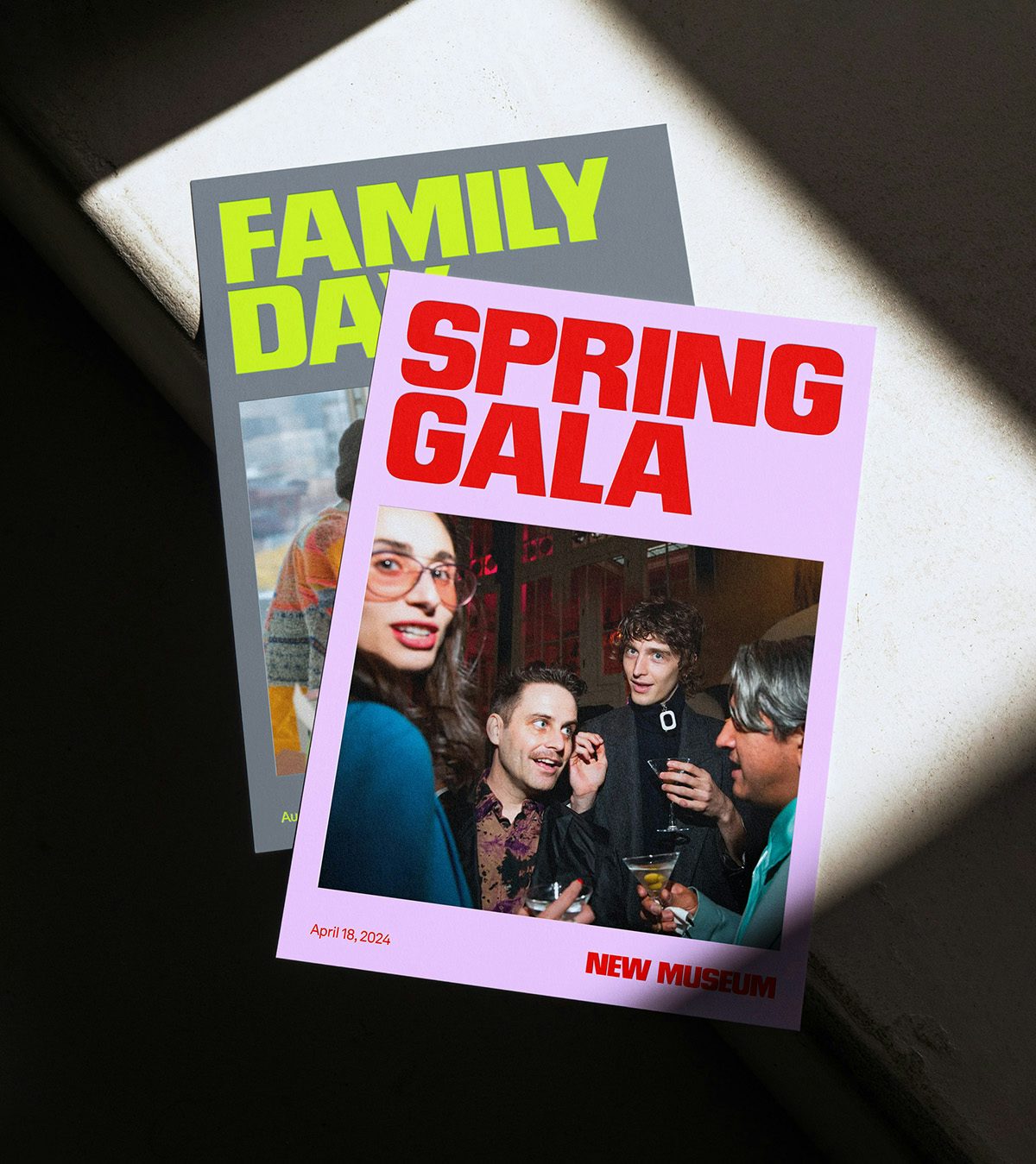
This is best exemplified by how the team at Athletics has embraced the museum’s existing bold wordmark and its use as a framing device to house supporting text.
The team has evolved this approach of using the wordmark to frame content and built a more flexible system that not only moves vertically (as before), but also horizontally and diagonally to accommodate images and video. In doing so, they nod to the Museum’s history while future-proofing its digital and physical presence.
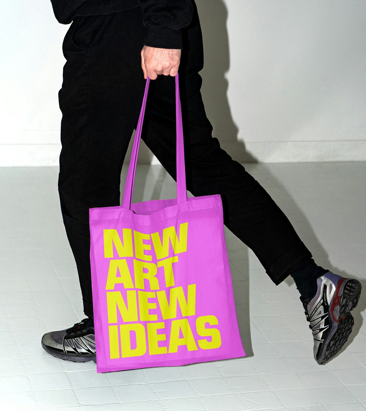
The latter was a particularly important consideration for the project, with the museum currently undergoing an expansion that promises to provide twice the amount of exhibition space. Beyond simply refreshing its online offerings, the new system flexes to fit physical contexts and can be used for interior signage, advertising and even merchandise.
Another key aspect of the update is how it embraces the museum’s long-standing focus on community, with the website in particular championing this value.
While many gallery sites opt for a more clinical appearance, with imagery of white walls and empty rooms dominating the space, the museum’s digital home offers a vibrant display of community-focused photographs, showing patrons engaging with the art and the artists themselves, as well as other events and programming.
This positions the museum as more than just an art destination. It is a social hub for connecting people from all different backgrounds, who share a mutual appreciation for great art.
The new website allows not only for details about a specific show, but also supplementary resources and material from the museum’s digital archive, serving its ambition to make art as accessible as possible.