
The Guggenheim reveals an expansive new visual identity
Pentagram’s Harry Pearce was tasked with creating a new logo and wider identity system for the “constellation of museums”, which now spans four locations around the world
Founded in 1937, the Solomon R Guggenheim Foundation is dedicated to collecting, preserving and interpreting modern and contemporary art. From the groundbreaking visions of Frank Lloyd Wright in New York and Frank Gehry in Bilbao to the stately Palazzo Venier dei Leoni in Venice, each Guggenheim museum is also celebrated as an architectural masterpiece in its own right.
Ahead of the opening of its fourth location in Abu Dhabi in 2025, Pentagram partner Harry Pearce was briefed to create a new identity system for the “constellation of museums”, which would not only unify the organisation but create a shared sense of purpose.
Surprisingly, the Guggenheim operated without a formal visual identity up until 1982, when its first brand identity was created by Italian designer Massimo Vignelli. After several evolutions, Pentagram’s Abbot Miller led the most recent identity overhaul in 2013.
In collaboration with Guggenheim’s in-house team, Pearce worked with Jane Wentworth on the new brand strategy and positioning, which is centred on the idea of “one brand, one constellation, one vision and many experiences”. The tone of voice and language used throughout aim to communicate that the Guggenheim is a museum for everyone, as well as reiterate the importance of art more broadly.
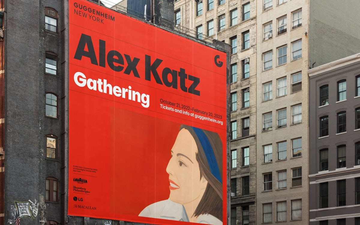
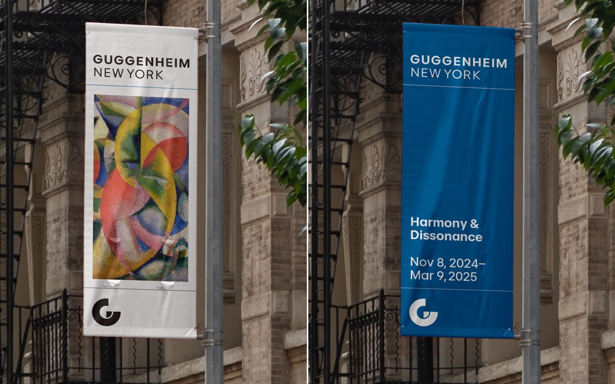
At the heart of the rebrand, the Guggenheim logo draws on the brand’s heritage of geometric typography. Based on an abstract form of the letter G, the new symbol consolidates the museum’s different locations by “holding” the constellation together.
Beyond the formal version of the mark, a series of free-form iterations can also appear as animations and static images, allowing the individual museums to show a more expressive side of their visual language.
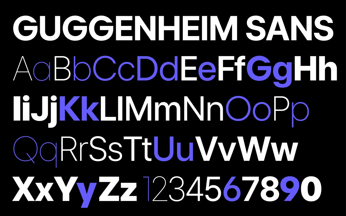
Designed to work alongside the new logotype, primary typeface Guggenheim Sans is a modern, geometric font typeface from the Open Source typeface Inter, which was originally drawn by Rasmus Andersson. An Arabic version of the typeface has been created by Debakir and TBD Studios to work alongside it.
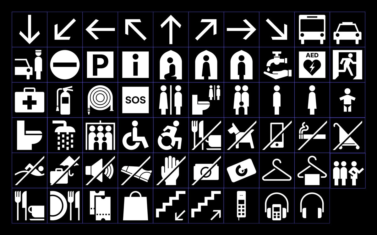
The secondary typeface, Playfair, is an Open Source typeface by Claus Eggers Sørensen, and aims to provide a refined contrast to the modernity of Guggenheim Sans. A set of bespoke icons was also created, mirroring the brand’s bold geometric forms.
Throughout the identity system, the layouts for assets such as posters and ads are built on a flexible framework with modular components, to ensure consistency across diverse formats and touchpoints. And colour is used strategically, either as an accent for emphasis or as a full background to better highlight information.
Aiming to bring greater cohesion to the institution’s global locations and honour each museum’s unique character while reflecting their shared legacy, the new brand identity seeks to remind us that the Guggenheim is “a museum for the world”.


