Base launches new identity for LGBTQIA+ non-profit Le Refuge
Base Design has rebranded Le Refuge, an LGBTQIA+ non-profit that offers support to young people in Belgium who have faced discrimination
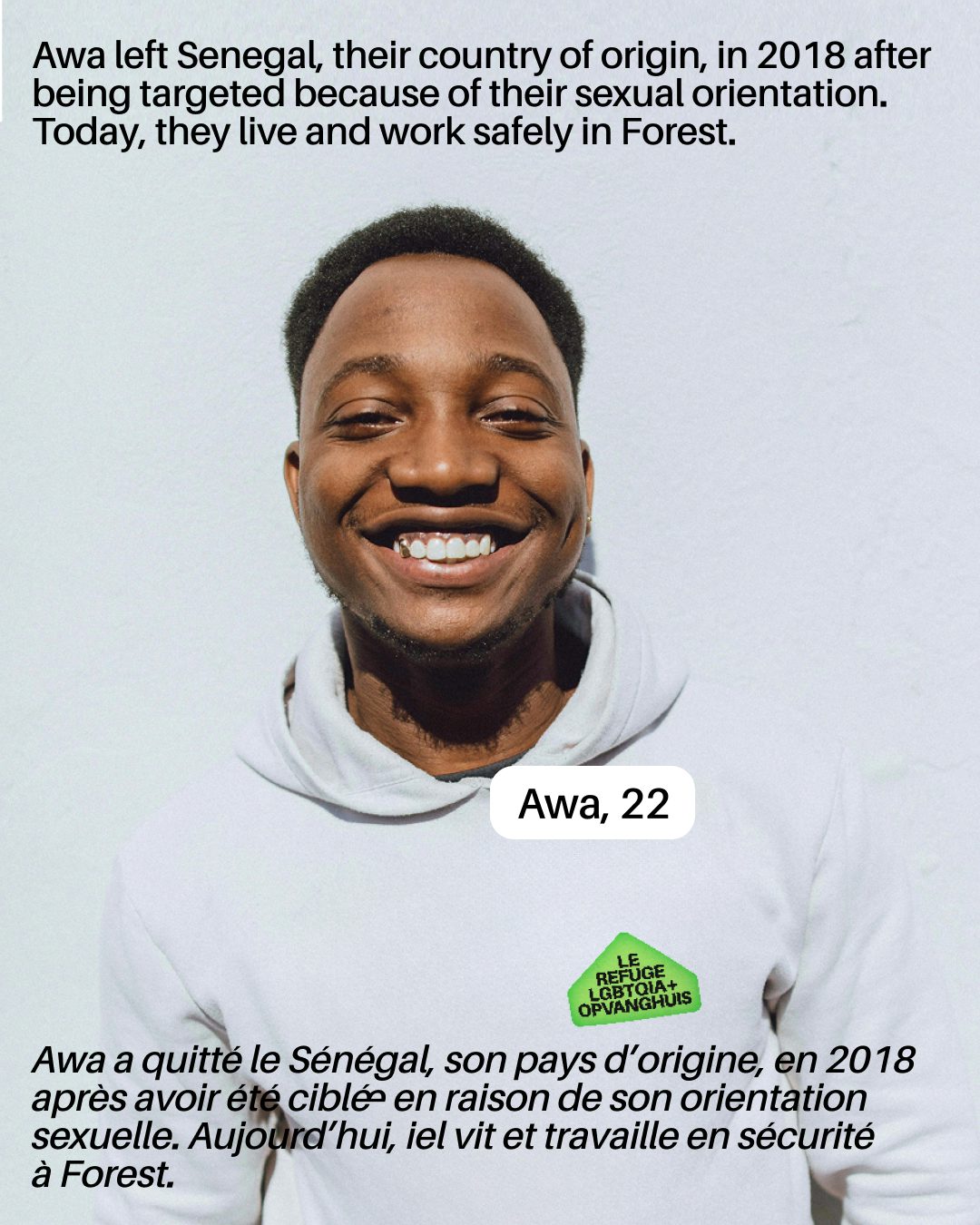
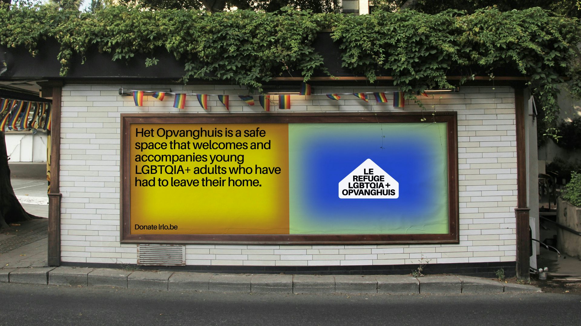
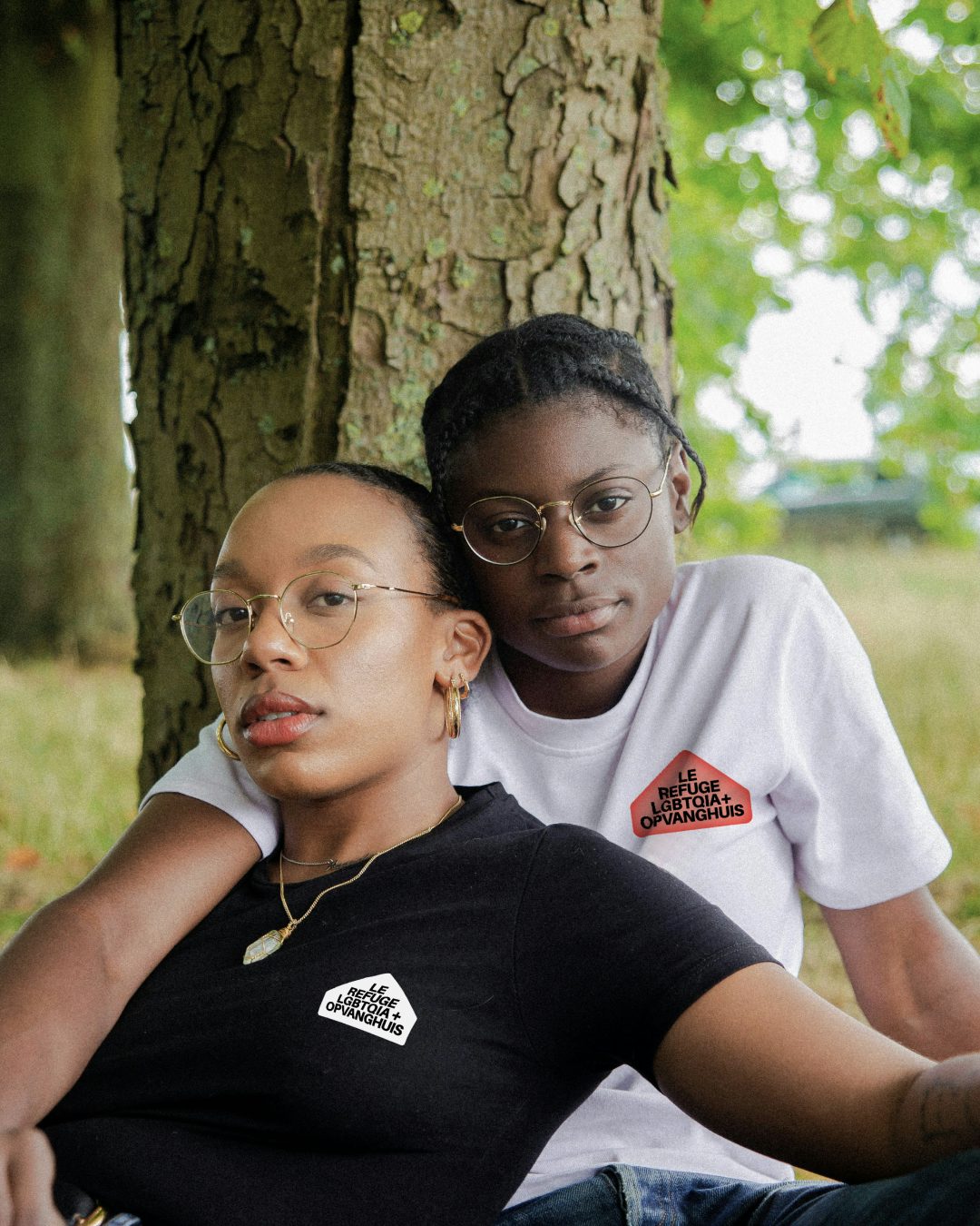
The new identity for Le Refuge (Het Opvanghuis) in Brussels aims to convey joy and pride, alongside the caring nature of the organisation, while asserting its professional vision in providing a safe space and support services for LGBTQIA+ people aged 18 to 25.
“Our mission is essential, but raising awareness among the general public isn’t always easy,” says Marc Van den Bossche, communications and awareness officer at Le Refuge. “We wanted an identity that speaks to everyone and clearly shows why our work is so important.”
According to Base, the non-profit required greater visibility and clearer vision, coupled with a visual identity that would support and sustain its future. “Our goal was to reflect the essential role of Le Refuge as a place of care, solidarity, and empowerment for queer people in vulnerable situations,” says Bruce Vansteenwinkel, senior designer at the studio.
“We wanted the tone of the identity to express institutional clarity and trustworthiness, without becoming cold or corporate, and [also] find a way to inject a sense of queer joy, but one that feels unique to them and not generic.”
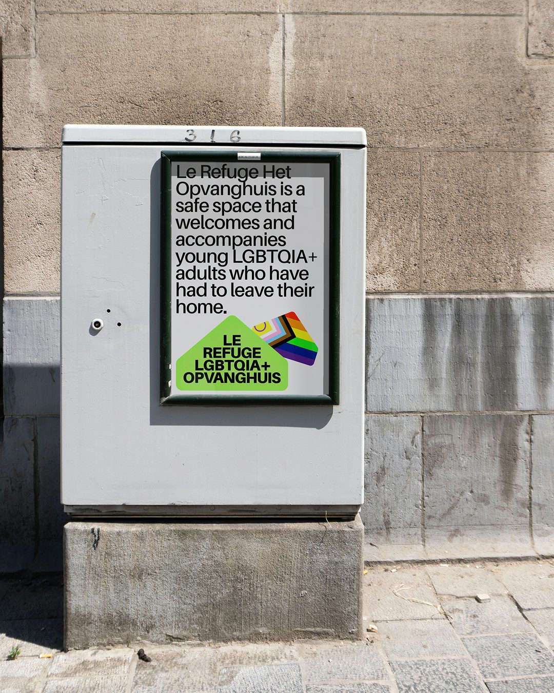
To achieve this balance, Vansteenwinkel says that both the new visual and verbal language embraced a clear and direct tone of voice, while infusing it with warmth and empathy. “Visually, the identity avoids loud or overly expressive gestures, instead using confident simplicity and thoughtful detailing to create space for the voices of Le Refuge’s community,” he says. “This approach ensured that the brand felt both credible and welcoming.”
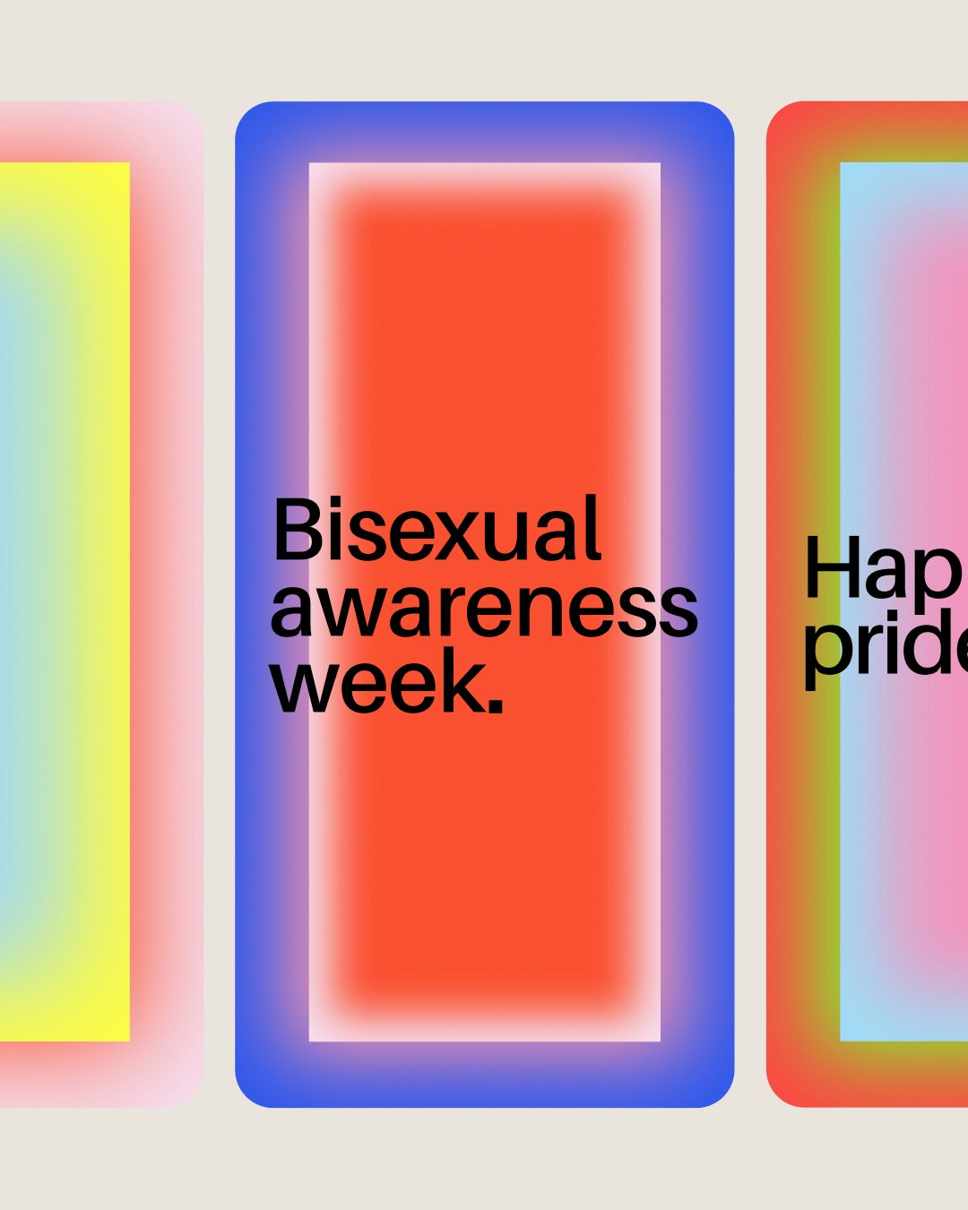
Gradients were also used to express the welcoming and softer side of Le Refuge’s supportive work. For example, some of the visual language takes inspiration from the Pride flag, but with the colours reimagined in a softer, more dynamic way, explains Vansteenwinkel.
Typography also played a central role in the project. Base selected a geometric sans-serif typeface that echoed the directness of institutional communication, while “its slightly softened shapes and contemporary rhythm contribute to a feeling of openness and approachability,” Vansteenwinkel adds.
“The typographic system is flexible, capable of expressing urgent calls for help, informational content, or community celebration, without changing tone. That consistency across use cases was key to building a recognisable and trustworthy presence.”
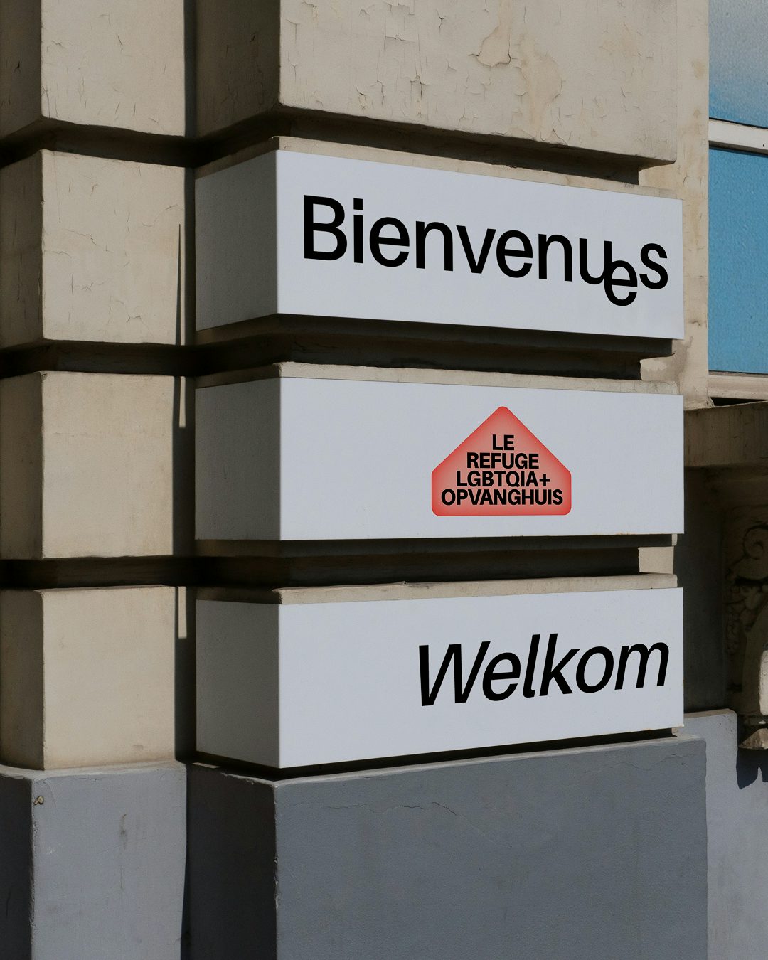
The typography also helped to convey inclusivity. As French is a gendered language, Base explains, achieving inclusive communication can be a design challenge – so they used the font Amiamie, which contains various “inclusive glyphs, typographic characters that go beyond the gender binary, developed by the collective Bye Bye Binary,” says Vansteenwinkel.
“These glyphs are part of a broader typographic research into language and visual expression for queer communities; their presence signals that this is a place where all identities are seen and affirmed. It was important to us that these glyphs were not used as decoration, but embedded meaningfully within the brand’s tools and communication.”
In addition to identity design, Base’s work for Le Refuge covered strategy, positioning, campaign development and a comprehensive communications plan. The rebranding also formed part of Base’s annual pro bono initiative, which is selected via a studio vote.
